From Async I/O to Instant Scale—Postgres Breaks the Speed Limit
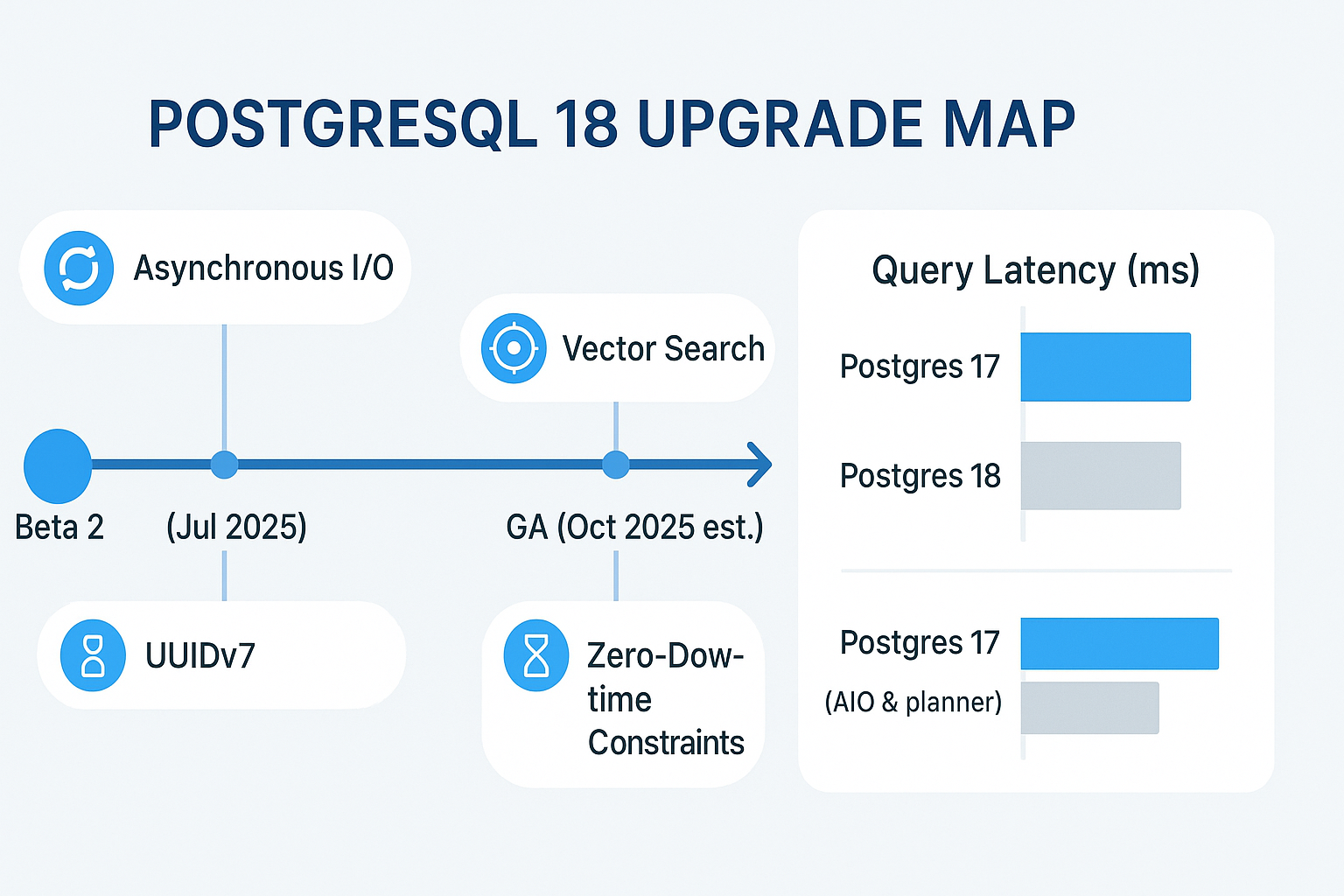
The first thing your customers will feel after a PostgreSQL 18 upgrade is raw speed. Version 18 introduces Asynchronous I/O powered by io_uring, letting backend processes queue reads while the CPU keeps working. Early benchmarks on AWS EBS volumes show read throughput nearly doubling and multi-second spikes flattening into sub-millisecond blips, especially in high-concurrency SaaS workloads. Configure it once in postgresql.conf with io_method = worker and watch batch reports and BST-heavy dashboards finish in record time.
Smarter SQL Semantics Cut Maintenance Windows to Minutes
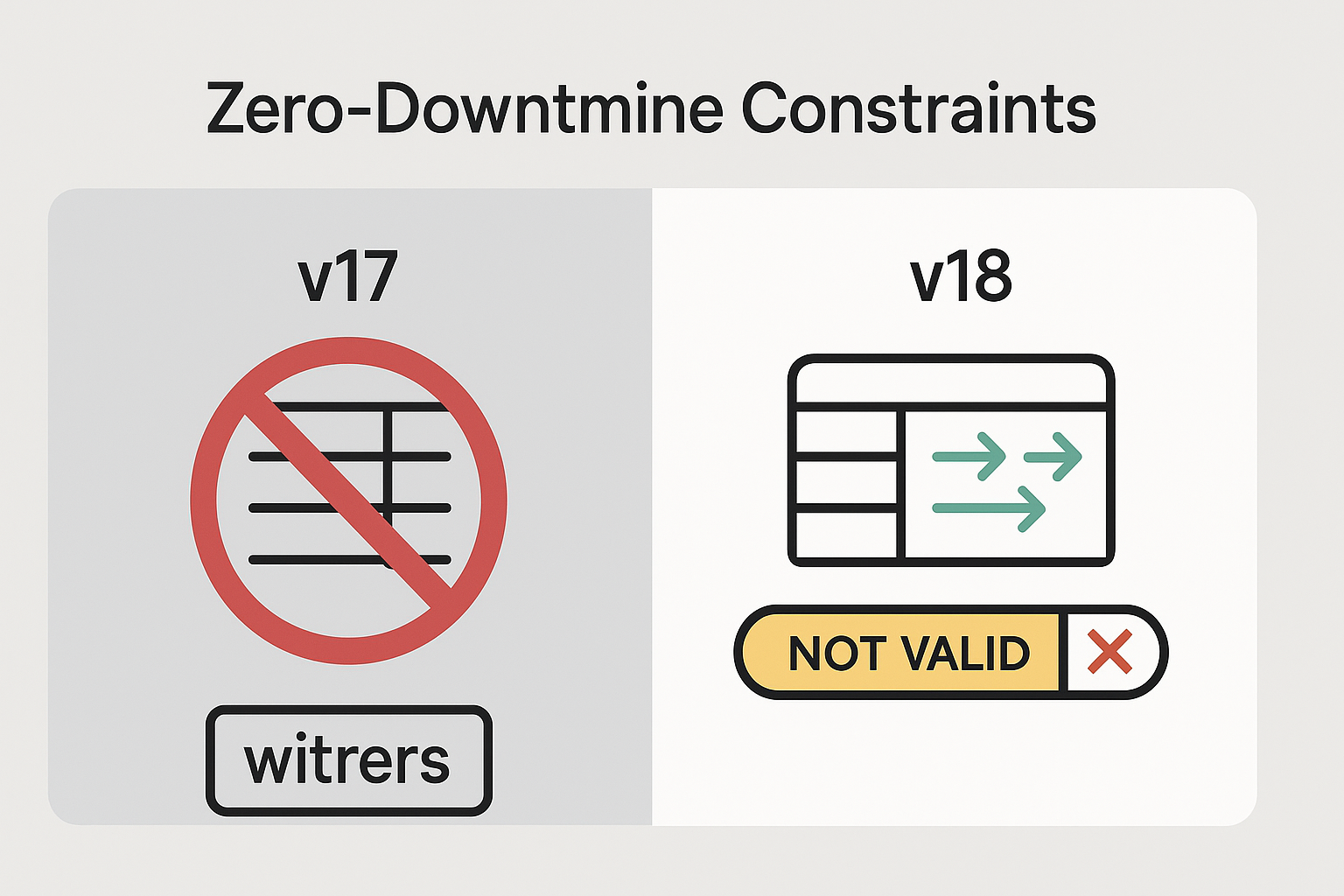
High-growth businesses dread taking the store offline for schema changes. PostgreSQL 18 offers two surgical upgrades that all but eliminate that risk. You can now add NOT NULL constraints as NOT VALID, postpone the table scan, and validate later without locking writes—perfect for datasets with tens of millions of rows.
Meanwhile, the SQL-standard MERGE statement finally behaves exactly as developers expect, with clearer conditional logic and edge-case fixes. Combined with the new ability to reference both OLD and NEW row versions in a single RETURNING clause, data migrations become deterministic and reversible—no more juggling ON CONFLICT workarounds.
For teams that love globally unique identifiers, native uuidv7() delivers sortable, time-based UUIDs that sidestep index bloat and keep your OLTP scans cache-friendly.
Built-In Vector Search Puts AI Within Reach of Every App
Postgres has flirted with machine-learning extensions for years, but version 18 embeds vector similarity search directly in core SQL. You can store high-dimensional embeddings and rank them with the <=> operator without reaching for a separate vector DB, which simplifies architecture and cuts DevOps costs. Combine that with asynchronous I/O and smarter planning and you get lightning-fast semantic search that feels native—crucial for e-commerce personalization, fraud scoring, or content recommendation engines that SMBs increasingly demand.
Why Small and Mid-Sized Businesses Should Upgrade Now—and Why Vadimages Can Help
Every millisecond shaved from checkout, every marketing query that runs without a scheduled maintenance window, and every AI-powered search that surfaces the right product is revenue in the pocket of a growing business. Yet the path to production involves nuanced tuning, phased rollouts, and rigorous regression tests on staging traffic. That’s where Vadimages steps in.
Our U.S.-based architecture team implements PostgreSQL 18 on cloud platforms like AWS RDS & Aurora, Google Cloud SQL, and Azure Flexible Server, layering high-availability proxies, pgBackRest backups, and Grafana dashboards so you can see the gains in real time. We handle blue-green migrations and replicate critical datasets with the new logical-replication hooks arriving in 18, ensuring zero data loss while you keep selling.
If your roadmap includes multi-tenant SaaS, AI personalization, or simply faster dashboards, talk to Vadimages today. We’ve helped dozens of SMBs cut operating costs and unlock new revenue streams through database refactoring, and PostgreSQL 18 is our most powerful lever yet. Visit Vadimages.com or schedule a free 30-minute consultation to map out your upgrade.