The first time a visitor lands on your website is the moment you start building digital trust. Few elements shape that trust faster—or break it more abruptly—than the cookie banner that fades in across the bottom of the screen. If it obscures half the page, uses confusing language, or offers no real choice, the visitor’s first impression is irritation, quickly followed by doubt about your integrity. Yet regulators from Dublin to Sacramento continue to tighten expectations around cookie transparency, proof of consent, and user‑friendly controls. The challenge is no longer whether to display a consent interface—every serious business must—but how to do so in a way that feels effortless, respectful, and genuinely informative. In this deep dive we explore the legal landscape of 2025, user‑experience patterns that win clicks instead of bounces, and the behind‑the‑scenes data management that keeps auditors satisfied. Throughout, you will see how the Vadimages web development studio designs, deploys, and maintains consent solutions that protect your brand while preserving conversion rates.
Understanding Consent Expectations in 2025
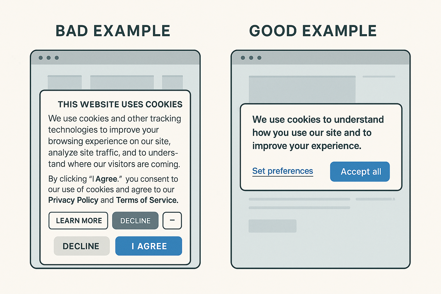
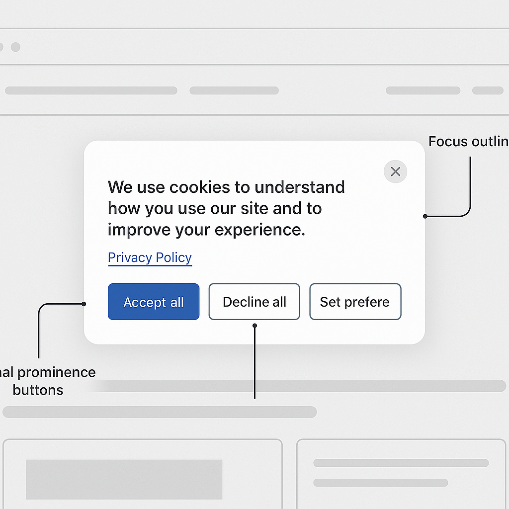
Europe’s GDPR remains the gold standard for meaningful consent: cookies that are not strictly necessary must be blocked until the user grants permission; consent must be granular, reversible, and recorded. California’s CPRA now requires similar clarity for “sharing” data, while Brazil’s LGPD and South Africa’s POPIA converge on parallel requirements. The practical consequence is a global baseline: users must be told exactly what data each category of cookie collects, why it is collected, how long it will be stored, and who receives it. Any pre‑ticked box or vague “By using this site you accept cookies” wording is no longer defensible. The European Data Protection Board’s 2023 guidelines clarified that even interface color choices can constitute “nudging,” leading to enforcement actions where accept buttons were green and decline buttons greyed out. In response, forward‑thinking businesses moved to banner designs that present accept and reject options with identical prominence, plus a “Customize” link for fine‑grained control. Rather than seeing engagement rates plummet, many discovered that transparent wording paired with clean visual hierarchy actually improves brand perception, length of stay, and ultimately revenue.
Designing Modals That Invite Action, Not Irritation
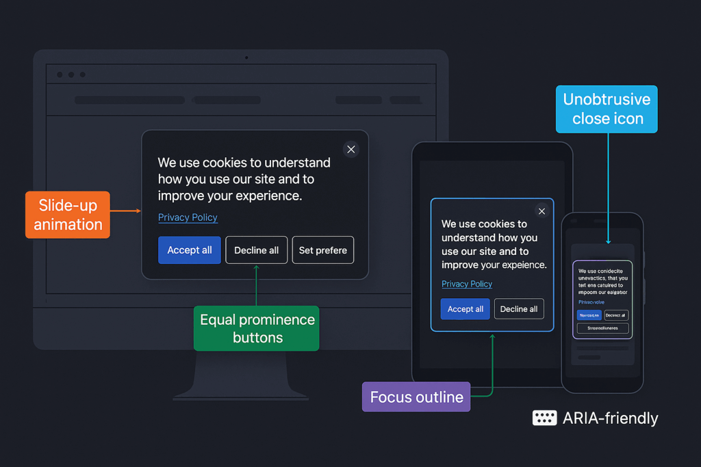
Placement and timing are everything. A full‑screen wall on first paint often provokes knee‑jerk rejection. Vadimages research shows that a low‑profile bar anchored to the bottom or a center‑screen modal timed to appear after the main hero section has loaded reduces immediate bounce by up to twelve percent. Clarity comes next. We replace legalese with conversational language: “We use cookies to understand how you use our site and to improve your experience.” Direct verbs, short sentences, and a clear link to a full privacy policy encourage trust. Equal weight buttons—“Accept all,” “Decline all,” and “Set preferences”—sit on the same visual plane, each with enough touch area for mobile comfort. Accessibility is built in through ARIA labels, focus trapping, and keyboard‑navigable toggles so users of assistive technologies can respond without frustration. Animation is subtle and swift: a single upward slide animation that completes in under 250 ms feels polished without feeling pushy.
Tracking and Storing Proof of Consent Reliably
A beautifully designed banner is meaningless if your back‑end cannot prove what each visitor consented to and when. The Vadimages consent management layer intercepts tracking scripts until permission is granted, sets consent cookies with strict SameSite attributes, and stores a hashed, time‑stamped record of choices in an encrypted database. Using server‑side Event Sourcing, every change—grant, partial grant, withdrawal—is appended immutably, ensuring forensic traceability. When regulators request evidence, a single query retrieves the exact state of consent for any session ID, displayed in a human‑readable audit log. This system scales horizontally, supporting traffic spikes without latency penalties, and integrates with leading tag managers so marketing teams can continue A/B testing carefree. For clients operating in multiple regions, geo‑routing automatically loads the correct banner variant, adjusting legal text and default cookie categories to local law. During third‑party audits, our clients routinely cut review time in half because their consent records are centralized, searchable, and crypto‑signed for authenticity.
Vadimages: Your Partner for Effortless Privacy Compliance
Cookie consent may start as a legal checkbox, but executed well it becomes a competitive edge. Visitors reward honesty; search engines now factor user trust signals into ranking; and regulators prefer businesses that demonstrate proactive stewardship instead of minimal adherence. Vadimages specializes in uniting those threads. Our UX team prototypes consent flows that match your brand aesthetics, our legal technologists map every data processor to the correct disclosure, and our DevOps engineers deploy robust monitoring that triggers alerts if any tracker fires without authorization. When your marketing department launches a new analytics tool, the consent system updates automatically, prompting returning visitors only for the new category. The result is a friction‑free journey where privacy, performance, and profit coexist. If you want cookie compliance that quietly boosts conversions rather than chasing them away, schedule a free consultation today at Vadimages.com and experience development that puts people first—front end, back end, and every click in between.
Traffic surges rarely announce themselves politely. A post goes viral, an influencer mentions your brand, or search engines reward a fresh piece of content, and within minutes the quiet hum of ordinary requests becomes a roaring freeway whose lanes fill faster than they can be cleared. Yet the chaos we perceive at the application layer begins deeper in the stack, where DNS propagation, TLS handshakes, connection pools, and database queues all compete for finite resources. The moment concurrency rises above design capacity, response times stretch, sessions time out, and frustrated visitors click away. Preventing this chain reaction starts with recognizing that every component of a modern web stack—routing, computation, state storage, and even logging—must be treated as scale‑sensitive infrastructure. When Vadimages engineers model capacity, they map not only CPU and memory ceilings but also network bandwidth, file descriptor limits, and regional latencies so that a storm in one layer cannot flood its neighbors.
Deploying Load Balancers for Predictable Elasticity
The first visible line of defense against overload is the load balancer: a gatekeeper that speaks the language of incoming protocols and translates raw demand into orderly queues across multiple origin servers. Hardware appliances once dominated this role, but in 2025 the smartest solution is usually a managed, software‑defined layer that can spawn or retire endpoints in seconds. Whether built on AWS Application Load Balancer, Google Cloud L7, Azure Front Door, or an open‑source envoy mesh, the core principle remains identical: terminate or pass through SSL at the edge, apply health checks continuously, and distribute requests using algorithms tuned to real‑time telemetry rather than static round‑robin guesses. When Vadimages implements this pattern, we pair it with autoscaling groups whose policies reference granular signals—CPU load over 60 percent for three minutes, memory pressure above 75 percent, or queue depth crossing a critical threshold—so that new containers spin up before users feel the strain. Because cold‑start latency can still bite, we keep a warm pool of pre‑staged instances and use blue‑green deployments to swap code versions without draining user sessions.
Leveraging Cloud Hosting, Edge Caching, and Database Sharding
Load balancing solves distribution, but sustained waves will topple a monolith if the back end is rigid. That is why cloud hosting matters less for its “infinite” servers than for the ecosystem that surrounds them: managed message queues, regional object stores, serverless workers, and edge CDNs that cache dynamic fragments as aggressively as static assets. A homepage assembled from server‑side rendered React can be split so that hero images and CSS files live on a content delivery network, while personalized data streams through a lightweight JSON endpoint running in a geographically close function‑as‑a‑service. At the persistence tier, read replicas shoulder analytical queries, and write‑heavy workloads fan out across sharded clusters keyed by user geography or tenant ID. When we modernize legacy systems at Vadimages, our architects decouple session storage from application nodes, replace vertical RDS instances with Aurora Serverless v2 or AlloyDB clusters, and integrate observability stacks that trace every request across microservices. This unified telemetry lets us predict saturation hours before dashboards flash red, buying precious minutes to pre‑scale or shift load to a secondary region.
Vadimages: Your Partner in Scalable Success
Traffic spikes are moments of truth: they reveal the difference between websites that merely function and platforms engineered for growth. Vadimages team has spent eighteen years hardening back ends for e‑commerce launches, media premieres, and fintech campaigns where even a second of downtime equates to lost revenue and damaged trust. From Kubernetes clusters that rebuild themselves after node failure to CI/CD pipelines that run chaos tests nightly, we bring enterprise‑grade resilience to companies of every size. If your next marketing push could draw a million new eyes, let us turn that opportunity into conversions instead of 503 errors. Contact Vadimages today, and experience a future where success never slows you down.
A website redesign can feel like stepping into new territory, especially when you realize that a digital platform must deliver more than attractive visuals. It has to communicate your brand’s personality, appeal to your target audience, and provide seamless usability. Many site owners launch a website and assume it will serve its purpose indefinitely. Over time, though, changes in technology, user behavior, and market trends inevitably make that initial design outdated, causing a site to underperform. The idea of a redesign sparks renewed excitement, but it also requires a plan to ensure each detail has been considered before you commit to a new look, structure, or strategy.
Embarking on a large-scale digital overhaul should not be limited to a superficial facelift. It is a chance to refine your online identity, streamline your messaging, and optimize your website so visitors instantly understand why your business or service is the best choice. Every element—from your logo to your navigation menus—needs a thorough evaluation. This holistic approach might involve an in-depth content audit, brand repositioning, improved visual design, advanced functionality, and updated calls to action. It is a journey that begins with objective analysis, moves toward implementing innovative solutions, and continues with consistent monitoring to sustain success in the ever-evolving digital world.
Vadimages Web Development Studio encourages businesses and entrepreneurs to see a redesign not just as a project, but as a strategic investment. A modern, high-performing website is an incredibly powerful ambassador for your brand online, and your willingness to improve is a testament to your commitment to your audience’s satisfaction. The path to a redesigned website begins with honest introspection about what is and is not working, which can reveal surprising insights into your brand’s trajectory.
While many guides rely on concise lists, a more narrative approach can illuminate the reasoning behind each stage. A typical redesign can be divided into four overarching phases: assessing the state of your current website, planning the new design, implementing your refined vision, and maintaining continual improvements. Each step intertwines with the others, forming a roadmap that ensures a strategic and well-grounded result. This post explores those phases in detail, providing you with a structured perspective to help you plan a redesign that resonates with your unique brand values.
This thorough, step-by-step overview will discuss how to analyze website performance, refine brand identity, organize or repurpose content, design a new structure, and implement technical improvements. It will highlight essential user-experience upgrades, legal compliance checks, and ongoing testing procedures that help a site remain relevant. It will also feature a segment dedicated to the importance of visually representing data and ideas with carefully crafted graphics elements that reinforce your message. Through these carefully orchestrated phases, you can transform a tired or underperforming platform into a digital experience that meets modern standards while shining a spotlight on the essence of your brand.
Vadimages, with its years of experience in web development, branding, and design, stands ready to guide you through each stage. These principles apply to any industry, whether you manage an online store, maintain a portfolio, or oversee a blog. The objective is the same: transform your website into an online environment that users enjoy visiting. This transformation starts with acknowledgment of current challenges and ends with a digital presence that reflects your vision and values. When executed skillfully, the redesign journey becomes an opportunity to grow your business, cultivate trust, and deliver a refined online experience to every visitor.
Assessing Your Current Website
Before leaping into wireframes, color schemes, or new functionalities, begin by looking at the metrics and user experience of the existing site. There are numerous signs that indicate the need for a refresh. Perhaps the bounce rate is creeping higher, or the conversion rate is dropping. Maybe it is just that your customers often mention difficulties navigating your pages. Observing both quantitative and qualitative feedback—like page-load times, responsiveness across devices, or even direct complaints from users—helps diagnose issues that you can fix during the redesign process.
It also helps to immerse yourself in a top-to-bottom content evaluation. Written text, images, and any supplementary media must reflect your brand’s current tone and style. If you rebranded your logo, changed your company slogan, or introduced a new service, it is essential that every corner of your site communicates those updates consistently. If a strong brand identity weaves through the site, it fosters recognition and demonstrates authenticity. A mismatch in style, or outdated references, can create a sense of fragmentation, which risks undermining visitor confidence.
Once you have documented your website’s shortcomings, you can more effectively shape your redesign goals. Many businesses realize during this assessment that certain areas of the site continue to resonate, whether due to user-friendly navigation, strong search engine rankings, or well-organized content that remains relevant. Identifying these positive aspects is as important as diagnosing failures. This stage is about mapping out what must stay, what needs a face-lift, and what should be removed entirely. It is a form of digital spring cleaning that streamlines the entire process moving forward.
You must also consider your competitors at this juncture. Browsing other websites in your niche, especially those that enjoy strong traffic, can offer valuable insights. Compare their layout, message, and features. Look for ways in which your site can differentiate itself and shine more brightly. That differentiation might involve distinct visuals, a bold brand narrative, or a feature set that addresses common customer pain points. Use the knowledge from this research to sculpt a refined identity rather than just replicating someone else’s formula. You want to strengthen your brand’s uniqueness, not blend into the crowded digital space.
The final piece of this assessment often involves drafting your objectives. By clearly expressing what you hope to achieve through the redesign, you keep the project on track. For some, the goal is about better lead generation and sales. Others want to streamline their content library and reduce user confusion. In many cases, the goal is to harmonize brand identity across all platforms. The clarity of these objectives shapes subsequent choices and avoids a scenario in which you make arbitrary design decisions with no direction.
Designing the Future of Your Site
With your existing website thoroughly examined, you can shift focus to crafting a design plan that addresses the discoveries and objectives outlined during your assessment. This stage can be both creative and analytical. It merges brand identity, visual appeal, and advanced user-experience considerations into one cohesive blueprint. It is wise to think about how visitors will navigate the redesigned platform from the moment they arrive to the moment they leave. Crafting a logical architecture helps them discover vital information without frustration.
You should consider how textual and visual components collaborate to enhance the visitor experience. Graphics elements, in particular, can illustrate complex ideas, highlight specific data, or set the tone of your brand. Customized infographics can turn a complicated process into something visually accessible. Diagrams can reveal relationships or structures that would look dull if explained through plain text. Photographs or illustrations can accentuate brand personality, as long as they are consistent with your color scheme and overall message. Every image or design element plays a role in communicating who you are and what sets you apart.
Remember that a redesign is an ideal time to establish or refine your visual brand guidelines. This includes selecting typography that reflects the character of your business, choosing colors that evoke the right emotional response, and unifying these elements into a polished aesthetic. A brand style guide can serve as a reference for everyone involved, ensuring consistent design across your website. Even factors such as spacing, button styles, or icon treatments can influence how polished and professional the final design appears.
When you set out to design new layouts, it is important to imagine real-world user flows. Where do users land first, and what is their likely next step? How do they discover your most important offerings? Even slight friction in navigation can cause people to lose interest. You might also consider personalization features or advanced search tools if that aligns with your industry. A modern website tailors itself to user needs, presenting calls to action at logical junctures. The plan you create here sets the stage for a well-executed development phase, so it is crucial to resolve any ambiguities now rather than later.
Vadimages offers professional design and development services that streamline this process. Their team understands how to balance cutting-edge visual trends with intuitive navigation and robust back-end architecture. If you are feeling overwhelmed by the complexities of brand consistency, user-friendly navigation, and search engine optimization, then Vadimages is an excellent resource to guide you from a conceptual plan to a compelling final design. This blend of creativity and technical expertise ensures your site is not only visually appealing but is also engineered for conversions, speed, and accessibility.
Implementation and Continuous Improvement
Once you have a solid roadmap, you can move into the actual build phase. Some organizations start with wireframes, translating the plan into skeletal layouts to verify the logical flow and structural hierarchy. After refining these drafts, you can integrate visual flourishes that elevate the brand personality. Developers then turn designs into functional pages, coding the layout, ensuring mobile responsiveness, and setting up all the necessary integrations for e-commerce, email marketing, or user authentication, depending on the website’s purpose.
Testing becomes a central priority at this stage. Performance checks ensure pages load quickly, even on devices with varying internet speeds. Compatibility testing across browsers is key to preventing inconsistent display issues that tarnish user experience. Accessibility testing makes the content available to people with visual, auditory, or motor impairments, often by validating compliance with recognized guidelines. User testing sessions, whether formal or informal, offer tangible insight into how visitors will react to the new interface. Observing how real people navigate, where they get stuck, or which features resonate can reveal unanticipated friction points that need last-minute adjustments.
After launch, it is prudent to track metrics related to engagement, conversions, and overall traffic. If your website redesign was inspired by the need to reduce bounce rates or improve sales, pay special attention to these data points. Use analytics tools to see how people move through the newly designed pages. Changes in user behavior, whether positive or negative, can guide further refinements. The best sites are rarely the ones that are launched and left alone. Frequent monitoring helps you remain agile and respond to evolving trends or user expectations.
A redesigned website can become a cornerstone of a more extensive marketing strategy. You can align your social media channels, paid ads, and content marketing efforts to drive traffic to landing pages that align with your brand messaging. It is a synergy that multiplies the returns on your investment. If new leads are flowing in, plan ways to nurture them. If sales are rising, evaluate which elements contributed the most so you can replicate similar strategies in future campaigns. Every redesign is a learning opportunity that paves the way for continuous growth and optimization.
If you are looking to transform your website into a sleek, high-performing platform that captivates visitors and clearly communicates your brand identity, Vadimages Web Development Studio is here to turn your vision into reality. Their team offers comprehensive redesign services that include in-depth assessments of your current site, personalized branding consultations, and innovative solutions that blend appealing visuals with robust technology. If you are not sure where to start, let Vadimages guide you through every step, from concept to completion. This approach takes the stress out of website transformations, leaving you free to focus on your core business while experts handle the technicalities and creative work. Reach out to Vadimages today and learn how a strategic, user-focused redesign can drive meaningful results for your brand.
Website redesigns are an essential part of sustaining a strong digital presence. They allow businesses to shed outdated designs, realign with emerging market trends, and incorporate advanced technology. By thoroughly assessing your current website, developing a well-structured blueprint for future improvements, executing a meticulous build, and regularly testing and optimizing post-launch, you can ensure that your new site fulfills the needs of both your audience and your brand’s broader objectives. The key is a disciplined, integrated approach that addresses design, functionality, content, and user experience with equal enthusiasm.
Each phase of the redesign process is an opportunity to nurture the potential of your online platform. The evaluation stage clarifies what needs improvement, from outdated brand elements to suboptimal technical performance. The design stage opens a world of creative possibilities, enabling you to rethink your visual identity and content strategy while weaving in graphics elements that reinforce your brand story. The implementation stage transforms these ideas into a tangible online environment, tested and verified to meet the standards of performance and accessibility. The continuous improvement stage ensures that the website remains a living entity, adapting to new challenges, user preferences, and technological developments.
A website that once felt clunky or off-brand can become a sophisticated portal that highlights your products or services with clarity and flair. Visitors who arrive at your homepage should instantly sense a cohesive identity, enabling them to trust your expertise and confidently explore what you offer. Navigating the site should feel intuitive, and the content should resonate in a way that encourages them to engage further, whether that means signing up for a newsletter, making a purchase, or scheduling a consultation. In many cases, the aesthetic improvements alone can evoke an emotional response, helping users feel that they have landed on a brand that truly cares about quality and relevance.
When you invest in a website redesign, you are investing in the foundation of your digital presence. Even the strongest marketing campaigns can falter if visitors arrive at an outdated or cluttered site. By taking a methodical approach, you preserve the best elements of your current platform while introducing strategic enhancements that strengthen your brand identity. The end result is more than a new look; it is a measurable improvement in how visitors interact with your content, how they perceive your credibility, and how effectively you can convert their interest into tangible results.
If this transformation sounds like the right move for your company, consider collaborating with professionals who understand the intricacies of both design and technology. Vadimages Web Development Studio is prepared to help you navigate each stage efficiently and intelligently. Whether your organization is large or small, your website deserves an overhaul that captures the heart of your brand and delivers an engaging user experience. Embrace the redesign process as a strategic initiative, and you will soon see how a well-conceived and skillfully executed redesign can elevate your business to new heights in an increasingly competitive online landscape.
Color is far more than a decorative choice for your website. It acts as a powerful conduit for emotions, perceptions, and brand storytelling. When you land on a website, you often make immediate judgments based on color schemes before you even scan the text or explore the navigation. In web design, these judgments can translate into how trustworthy, approachable, and engaging a brand appears. Studies have long indicated that consumers rely heavily on visual cues, particularly color, to form their impressions of a product or service. This means that the right or wrong selection of colors can impact the trajectory of user engagement, brand loyalty, and ultimately, conversions.
Vadimages Web Development Studio understands how important it is for a business to communicate effectively through color. In a digital world overflowing with websites, apps, and online platforms, there is little room for bland or counterintuitive color choices. Our team at Vadimages has spent countless hours fine-tuning the color palettes for clients across various industries, ensuring that each brand message shines through the design. This blog post will unravel the significance of color psychology in web design, guide you in aligning those colors with your brand identity, and highlight how consistency builds trust in your audience.
Beyond theory, color psychology is also about cultural nuances and human emotional triggers. While red may signify passion or urgency in many Western cultures, it might symbolize good luck in Eastern contexts. Such subtleties cannot be overlooked when planning a global marketing or brand strategy. Understanding the undercurrents of color ensures that your brand resonates with the widest possible audience, leveraging color associations to build meaningful connections.
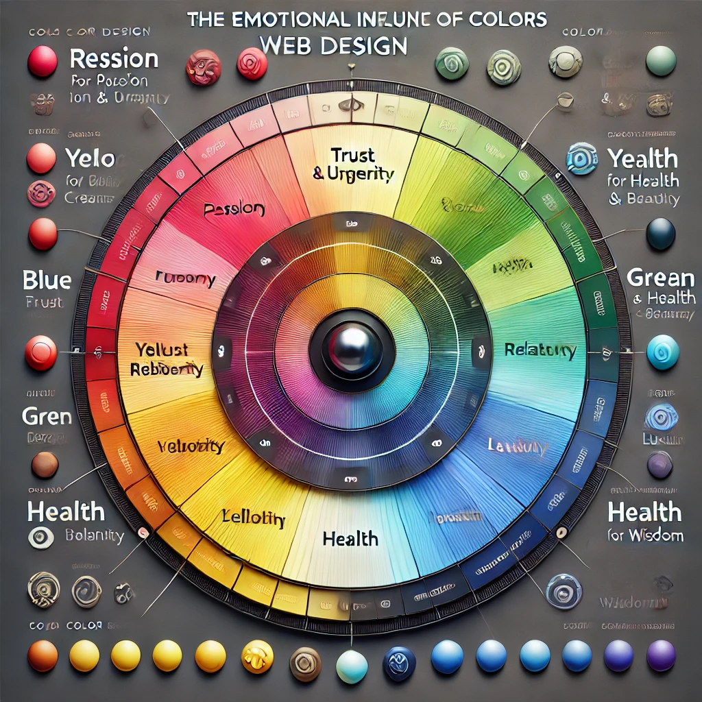
The Emotional Influence of Color in Web Design
Color triggers emotional and psychological reactions, often at a subconscious level. People may not realize it, but the reason they linger on one website and rapidly exit another can be partially traced to how comfortable or intuitive the color scheme feels. Warm colors like red, orange, and yellow can create sensations of vibrancy, energy, or urgency. Cooler hues such as blue, green, and purple often evoke calmness, reliability, and creativity. These associations are not random; they have been observed, studied, and documented across behavioral and marketing research.
When a visitor lands on your homepage, the banner or hero section typically occupies prime visual real estate. The color choices in that area can immediately set the mood. A finance or technology website might opt for various shades of blue and gray to reflect stability, trust, and innovation. An organic skincare brand might integrate greens and earthy tones to communicate nature, health, and sustainability. The central idea is to match emotional triggers with the brand’s core values and the user’s expectations.
Brand perception goes beyond mere attraction. If your website sells high-end fashion, a muted, sophisticated color palette can hint at luxury and exclusivity. Using overly bright, clashing colors might convey a sense of casualness or youthfulness, which could contradict the essence of a luxury brand. Similarly, if you’re targeting children’s products, a playful palette with brighter tones might be far more effective, as it resonates with an audience that appreciates cheerfulness and fun.
Cultural context also comes into play. While white is often associated with purity in Western cultures, it can symbolize mourning in others. A brand targeting an international audience must be aware of the symbolic weight color carries in different parts of the world. By proactively studying these nuances, you can avoid unintended missteps that could alienate potential customers.
These considerations are not confined to backgrounds and headings. Designers also need to think about how color influences the action elements on the website, such as call-to-action buttons, forms, and navigation menus. A button in a contrasting color can guide a user’s eye directly to the place you want them to click, but if that color also evokes feelings of danger or discomfort, it may create hesitation. Subtle variations in saturation, brightness, and hue can dramatically shift user behavior. By working methodically and testing different color variations, brands can hone their websites for optimal engagement.
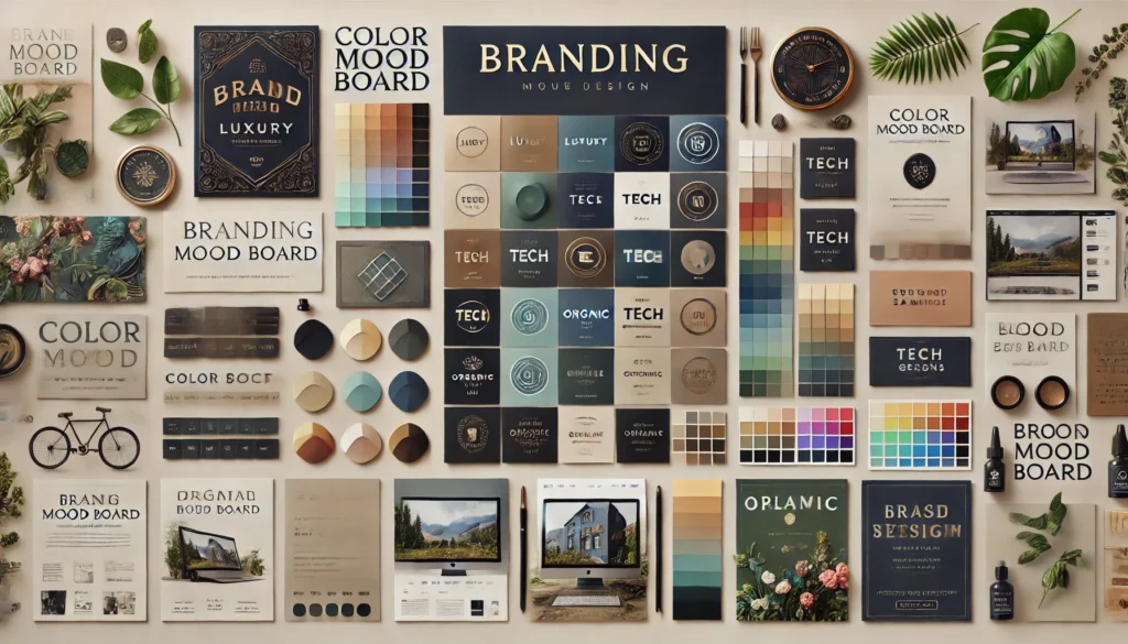
Aligning Colors with Your Brand Identity
A successful web design doesn’t randomly pick a color palette. Instead, it stems from a brand’s personality, mission, and overall visual language. Building a color palette starts with understanding your brand identity. If your brand is known for creativity, using bold contrasts and unexpected color combinations can underscore that imaginative spirit. If your image is rooted in tradition and heritage, subdued tones or timeless color schemes can reinforce that narrative.
At the core of brand identity lie elements like your logo, typography, and brand guidelines. These components interact with color to form a cohesive design. Consider how the color of your logo can determine or at least heavily influence the rest of your palette. A bright and sunny logo might look out of place on a website drenched in dark, somber shades, unless there is a strategic intention to create that contrast for dramatic effect. Consistency across all channels, including print materials, social media graphics, and signage, cultivates a sense of familiarity and trust.
Color is also important in shaping user pathways. If your brand is particularly vibrant, you might use those signature colors sparingly so they stand out against neutral backgrounds. This approach can help key elements like calls to action or important product highlights pop into the user’s focus. On the other hand, if minimalism defines your brand, integrating white space and subtle color transitions can create an environment of understated elegance. The challenge is striking the right balance, ensuring that your brand colors neither overwhelm nor underwhelm the user.
When deciding on the final palette, testing is invaluable. Gathering feedback through usability studies or A/B testing can reveal whether users find a certain color pleasing or off-putting. Audience segments might have unique preferences, especially if you operate in multiple markets or industries. The insights gleaned from such tests can inform revisions to color choices or the broader web design concept. Iteration is often part of this journey. The color scheme you start with might not be the one you end up implementing if you discover certain issues with readability, cultural connotations, or brand mismatch.
At Vadimages, we’ve found that small tweaks in color—such as adjusting the shade of a primary color by a few degrees—can make a significant difference in how users feel and behave on a website. Our process often involves multiple design prototypes to capture the nuanced interplay between color, typography, and layout. We consider emotional cues, brand alignment, and user experience fundamentals to craft color strategies that help businesses like yours stand apart in competitive digital landscapes.
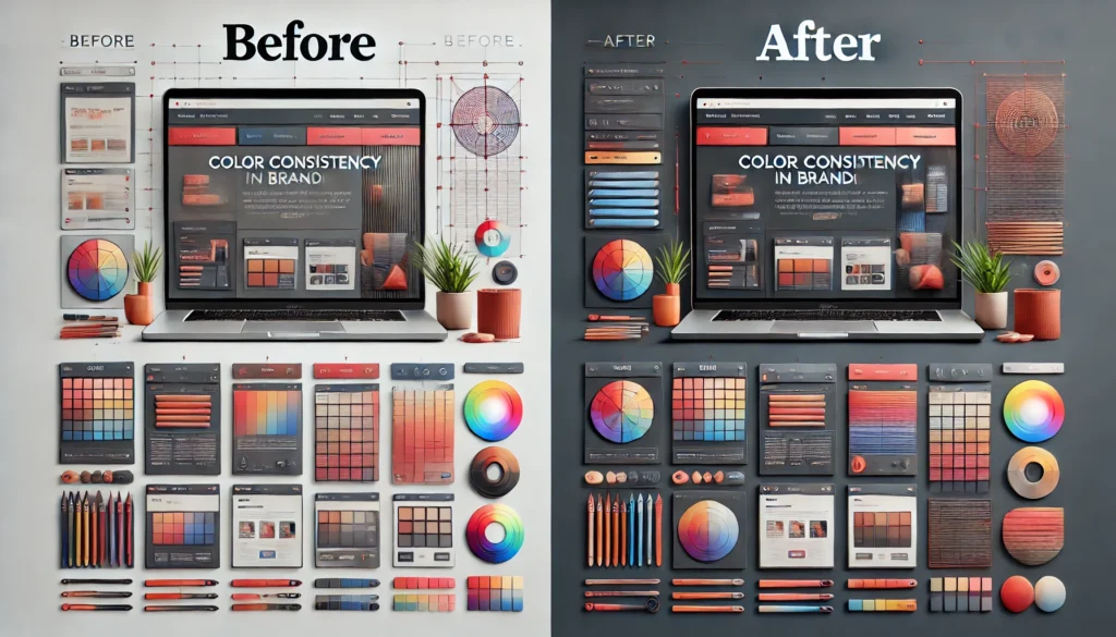
Achieving Cohesion and Consistency
A cohesive color scheme means your brand looks and feels the same across every page, landing, or subdomain. Visitors should not be confused about which website they’re on or which brand they’re engaging with. Cohesion isn’t about using the same exact shade everywhere; rather, it involves harmonizing accent colors, secondary colors, and background shades in a way that everything feels unified but not monotonous. An accent color might appear in headings or icons, while a secondary color takes on a role in navigation elements.
At the same time, maintaining consistency doesn’t mean sacrificing creativity or variety. Strategic variation in color can emphasize new sections, highlight updates, or guide user attention to calls to action. Designers often utilize color theory principles, like complementary or analogous color schemes, to ensure that variations remain visually pleasing. A monochromatic approach can also work for minimalist brands seeking a sleek, modern look, provided that each shade is purposefully chosen to differentiate content sections.
Even with a sophisticated color scheme, your website should be accessible. Some users have color vision deficiencies, and ignoring their experiences can alienate a portion of your audience. Ensuring enough contrast between background and text improves readability for everyone, not just those with visual impairments. Paying attention to color contrast guidelines can also enhance the overall aesthetic, making design elements look sharper and more intentional.
Incorporating graphical elements is a highly effective way to underscore your brand’s color palette. Imagine a diagram or banner that showcases your primary and secondary colors arranged in a stylized color wheel. This visual reference can guide users in understanding your brand’s core values at a glance. Another approach could be an interactive color mapping graphic placed on your About or Brand Story page, where visitors can hover or click to learn how each color ties into your mission and values. These creative design choices allow for storytelling that goes beyond text, transforming your brand colors into a narrative device.
Below is a conceptual example of a color wheel diagram that might appear on a design-focused website. It visually arranges warm and cool tones, with your brand’s primary color at the center. Each slice could be labeled with text describing the emotional connotation of that hue. This visual approach not only helps visitors understand the rationale behind your brand palette but also leaves a memorable impression of thoroughness and intentionality.
         (Warm Tones)
             Red
              |
  Orange  ——— [Brand Color] ———  Purple
              |
             Blue
         (Cool Tones)
In such a layout, the brand color stands as the defining element, linking all complementary or analogous colors around it. By illustrating the choices your brand has made, you create transparency and a bit of educational content that visitors can appreciate. This also helps establish trust and positions you as a knowledgeable, detail-oriented brand.
Many businesses fail to realize that color consistency goes hand-in-hand with professional appeal. When your online storefront, marketing emails, social media posts, and print materials all convey a unified color experience, potential clients are more likely to view you as authoritative and reliable. The psychological effect of consistency fosters brand recall. People start associating your particular shade of green or blue or red with your offerings, values, and style. Over time, this association cements your identity in the minds of consumers, translating into loyalty and advocacy.
If you ever find yourself in need of expert guidance to refine your existing color palette or to develop one from scratch, remember that Vadimages is here to help. Our web development studio prides itself on delivering thoughtful, research-driven design solutions. By partnering with us, you can alleviate the guesswork and benefit from a meticulous, comprehensive approach to color. We ensure that every hue on your site aligns seamlessly with your brand message, setting you up for lasting success in the digital sphere.
When you are ready to transform your website’s visual identity and make a bold, memorable statement through color, Vadimages is prepared to provide custom solutions for your brand. Our expert team brings years of experience in web development and design, using color psychology to shape user perceptions and craft memorable online experiences. Visit Vadimages to learn how we can help you build a site that captivates visitors at first glance and keeps them engaged for the long haul.
Whether your brand image is innovative and vibrant or traditional and timeless, color lies at the heart of web design’s power to influence. Deliberate, research-backed palettes can speak volumes about your brand. By understanding color psychology, aligning hues with your identity, and ensuring cohesion across platforms, you create an environment where visitors feel intuitively connected to your brand message. The next time you embark on a web redesign or launch a new product, remember that color is more than a stylistic detail. It is a foundational element that shapes user emotion, invites exploration, and ultimately forges enduring brand relationships.
Google’s Core Web Vitals have become a defining factor for modern websites seeking to stand out in search results while delivering a high-quality user experience. Since these metrics are pivotal to how Google evaluates the health and performance of your online presence, understanding and optimizing them can dramatically improve both your site’s rankings and the satisfaction of your visitors. The journey toward a faster, more stable website involves grasping what these vitals are, why they matter, and how you can leverage them to future-proof your online platform. The following exploration delves into these essential metrics, revealing their impact on search visibility and user engagement, and offering insights on how to stay ahead of the curve with practical techniques.
The Foundation of Google’s Core Web Vitals
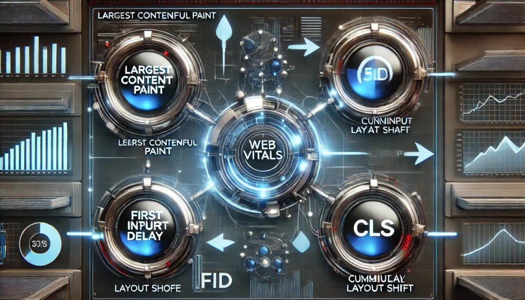
Core Web Vitals revolve around three critical measurements of a site’s performance, each focusing on a distinct aspect of user experience. The first is Largest Contentful Paint, often abbreviated as LCP. This metric tracks how quickly the main content of a page loads. A pleasingly short LCP is typically under 2.5 seconds from the moment a visitor clicks on your link. If the most significant content on your page appears rapidly, users will feel that your site is fast, even if smaller items continue to load afterward.
The second metric is First Input Delay, known as FID. It measures the time between the user’s first interaction with a page element and the moment the browser is able to respond to that interaction. For example, if someone clicks on a button, FID records how long it takes for that click to register and produce a visible result. A low FID—ideally under 100 milliseconds—helps users feel an immediate sense of responsiveness, making your site appear dynamic and agile.
Cumulative Layout Shift, or CLS, is the third pillar and addresses visual stability. Nobody wants to click on a button that unexpectedly shifts just as they tap, resulting in a misclick. CLS calculates how much the page layout unexpectedly moves during the loading process. A stable layout below a CLS score of 0.1 keeps visitors from experiencing unpredictable jumps and fosters trust in your site’s overall polish.
To give a more tangible representation of how LCP, FID, and CLS integrate, imagine three cogs in a machine: if one spins more slowly or unpredictably, the entire system suffers. Speed is essential, responsiveness is paramount, and stability is indispensable. A short load time is impressive, but if the site feels laggy during the first user interaction, visitors can feel frustrated. Conversely, a quick page that jumps around as it loads betrays an unpolished experience. When these three vitals operate in harmony, your site achieves the fluid, refined quality that not only satisfies Google’s ranking algorithms but delights your users.
Below is a conceptual illustration that visually aligns these metrics in a simplified way. Even though it’s only a basic graphic, it helps to see how each component contributes to the overall page experience:
    +-------------------------+
    |  Largest Contentful    |
    |        Paint (LCP)     |
    +----------+-------------+
               |
               v
    +-------------------------+
    |  First Input Delay     |
    |         (FID)          |
    +----------+-------------+
               |
               v
    +-------------------------+
    | Cumulative Layout Shift |
    |          (CLS)         |
    +-------------------------+
In this simplified diagram, LCP is at the top because it directly influences the first visual impression. FID follows closely, measuring how soon your visitors can start interacting effectively with the loaded content. CLS is at the bottom, stabilizing the entire experience so that no unpredictable layout changes degrade the sense of control and reliability that users crave.
Improving Web Vitals for a Better Page Experience
Enhancing LCP often begins by optimizing your server and reducing unnecessary scripts so that your main content loads swiftly. This might involve compressing images, enabling efficient caching, and streamlining JavaScript execution. The less time it takes to show essential content, the more effectively you capture user attention before they become impatient. Eliminating render-blocking scripts also ensures that page elements display in a timely fashion, preventing idle browser periods.
Lowering FID frequently centers around making your code more efficient and deferring tasks that are non-essential during initial loading. Reducing JavaScript bundle sizes can go a long way, as large scripts take more time for the browser to parse and execute. Instead of forcing the user’s device to process everything at once, you can break tasks into smaller chunks. Once the critical scripts for user interaction are loaded, visitors can start clicking, typing, and swiping without a noticeable lag.
Stabilizing CLS involves keeping a watchful eye on how elements load and ensuring they occupy reserved space, so there is no abrupt shifting. Large images or ads inserted above the fold without specifying dimensions often cause content to move around. Using placeholders or explicitly defined width and height attributes helps maintain layout integrity. Carefully designed loading transitions also convey a sense of professionalism by assuring the user that content is appearing exactly where it should.
Working on these three metrics simultaneously can transform your website into a smooth, reliable environment. The end result is not merely an improved Google ranking, but an upgraded user experience that encourages longer sessions, higher engagement, and more conversions. Whether you are an e-commerce store seeking to boost revenue or a blogger looking to retain readers, nailing these vitals sets the foundation for growth.
When it comes to measuring progress, Google provides tools like PageSpeed Insights, Lighthouse, and the Core Web Vitals report in Search Console. These resources offer detailed performance breakdowns. But for deeper, real-world data, you can rely on the Chrome User Experience Report, which gives insights based on actual user device conditions, network speed variations, and browser differences. Through iterative testing and refinement, each improvement you make can be validated with these resources, moving you closer to the ideal performance thresholds.
Now that you see the profound impact and complexity of Core Web Vitals, you might wonder how to incorporate these best practices into your own online platform. This is where a dedicated and experienced web development partner comes into play.
Your Path to an Optimized Future
Achieving high performance on Google’s Core Web Vitals calls for ongoing monitoring, strategic changes, and a commitment to a user-first philosophy. Implementing these technical optimizations in code, images, and server configurations can appear daunting, especially when you also need to manage content, marketing, and day-to-day business tasks. Maintaining top rankings and user satisfaction requires consistent tweaks, updates, and oversight. Yet the benefits are well worth the effort. Sites that excel in LCP, FID, and CLS see better organic visibility, lower bounce rates, and more robust conversions.
That is why partnering with a professional web development studio can become an invaluable asset. At VadImages, we specialize in crafting high-performing, visually engaging websites that incorporate all the latest principles of user experience and search engine optimization. Whether you are launching a new project or want to enhance an existing platform, our team can guide you through the intricacies of code optimization, image compression, server configurations, and layout stability.
VadImages offers a holistic approach to web development. We begin by analyzing your site’s current status using specialized performance tools, identifying precisely where speed bottlenecks and layout shifts are happening. Our experts then craft a step-by-step plan, which might include refactoring code, lazy-loading images, deploying content delivery networks, and streamlining front-end frameworks. Throughout each stage, we keep user engagement in the forefront, balancing aesthetics, functionality, and performance to create sites that not only rank well but also resonate with visitors.
Imagine the impact of having a page that loads its most critical elements nearly instantly, reacts to user interactions fluidly, and never jarringly shifts components around. It delivers a sense of immediate trustworthiness. Customers can focus on your products, services, or content, rather than waiting for incomplete elements to appear or reappear. Over time, this leads to increased loyalty, lower abandonment rates, and an enviable position in organic search results.
Google’s algorithmic shifts have shown again and again that websites with strong user experiences are favored. By prioritizing performance at every step, your site becomes resilient to algorithm updates because it aligns with Google’s core ethos: the best possible experience for each searcher. This future-proofs your online presence, enabling sustainable growth no matter how many times the ranking criteria evolve.
Staying at the forefront of these optimizations also fosters innovation in your design and development processes. Code reviews, performance audits, and monitoring tools become part of your regular workflow, feeding constant insights back into your platform’s architecture. This continuous loop of improvement means you never rest on past successes. Instead, you refine your site based on real-world data and emerging best practices, forging a website that is adaptable, modern, and consistently user-centered.
The path forward involves cultivating an environment that values both creativity and technical precision. High-quality visuals can coexist with quick load times. Complex interactive elements can work smoothly if they are engineered with efficiency in mind. As you adopt this mindset, the idea of achieving top Core Web Vitals metrics changes from a one-time goal to an ingrained ethos that elevates every aspect of your site.
VadImages stands ready to help you navigate this process. With our specialized web development knowledge, we can lighten the load, ensuring your site meets and exceeds Google’s requirements without sacrificing any of the unique identity or functionality that defines your brand. Our passion lies in turning advanced technology into seamless experiences that capture attention, convert leads, and cultivate lasting relationships.
This is the future of digital presence: a harmonious blend of performance, design, and usability. Core Web Vitals serve as the backbone of that future, providing tangible, data-driven goals that demonstrate your commitment to each visitor’s satisfaction. Let us help you chart a course toward a website that thrives in search rankings and makes a memorable impression every time someone lands on your pages.
If you are looking for a partner who truly understands the nuances of Google’s Core Web Vitals and is ready to integrate them into a broader vision of online success, consider VadImages. Our dedicated team is prepared to tailor solutions to your unique needs, laying the groundwork for a swift, fluid, and stable site that excels in user engagement and search engine visibility. Together, we can transform the complexities of performance optimization into a cohesive strategy that propels your brand forward.
Your website is more than an online business card—it is often the first interaction potential customers have with your brand. Ensuring that interaction is smooth, welcoming, and fast is no longer optional. It is an indispensable component of your broader marketing and customer relations strategy. When a site offers instant loading of key elements, instantaneous reaction to clicks, and a layout that stays put, visitors feel in control and engaged. They are more likely to stay, explore, and come back for more. In the end, that is the essence of a memorable digital experience: consistent, satisfying, and efficient.
With Google’s Core Web Vitals playing a major role in ranking decisions, ignoring them is a risk no serious site owner can afford. Embracing them, on the other hand, unlocks powerful advantages that extend well beyond better placement in search results. It fosters brand loyalty, encourages repeat visits, and sets you apart in a crowded online marketplace. By focusing on LCP, FID, and CLS as interconnected components of a user-focused ecosystem, you position your website to thrive under the constant flux of search engine evolution. Let VadImages be your guide on this journey, and see for yourself how a performance-centric approach can revolutionize your site.
Speed is everything on the modern web. A fast-loading site not only delivers a better experience to visitors but also influences search engine rankings, conversion rates, and overall user engagement. With mobile browsing on the rise and user patience dwindling, any delay in page load times can result in visitors abandoning a website in a matter of seconds. The pursuit of website speed optimization, therefore, has never been more critical for businesses and content creators.
In web development, certain strategies have emerged as highly effective in achieving faster page loads. Caching ensures that returning visitors spend less time waiting for content, image compression squeezes large files down to size without sacrificing too much visual quality, and code minification removes unnecessary clutter in scripts and styles. When executed properly, these techniques enhance website performance for all kinds of projects, from personal blogs to large-scale e-commerce platforms.
Here at Vadimages Web Development Studio, we pride ourselves on delivering cutting-edge solutions for online performance optimization. We have helped countless clients improve their website speeds, enhance user experiences, and ultimately increase revenues. Our expertise in caching, image compression, and code minification enables businesses to stay competitive in an era defined by split-second attention spans.
To illustrate these concepts visually, we have included a simple diagram that represents the flow of data when these optimizations are in place, underscoring how each technique plays a vital role in streamlining content delivery.
From the user’s first request to the final rendered page, every step can be fine-tuned for speed. Although there are many other factors involved in performance improvement—such as server configuration, hosting environment, and database queries—the main pillars remain efficient caching mechanisms, properly compressed images, and clean, minified code. Below, we delve into each of these three pillars in detail, exploring their intricacies and demonstrating why they matter so much.
The Power of Caching
Whenever a user navigates to a website, the browser communicates with the server to request files: HTML documents, stylesheets, JavaScript files, images, videos, and more. Without caching in place, every visit would result in a fresh download of all the required files, increasing bandwidth usage and slowing down the site for returning visitors. This is where caching emerges as a highly advantageous technique.
At its most basic level, caching stores copies of your website’s files, or entire page outputs, in temporary storage. The next time someone visits the same page, instead of pulling fresh data from the server again, the browser or a caching server can load data more quickly from this stored version. The result is a shorter trip for data, fewer server computations, and dramatically faster page load times.
Several forms of caching exist, such as browser caching, which stores resources like stylesheets and scripts on the user’s local machine, and server-side caching, which may generate static HTML versions of dynamic pages. When configured correctly, caching reduces the computational overhead on your web server and slashes page loading times for repeat visitors.
It’s essential to manage cache expiration rules properly. For instance, if you push an update to your stylesheet or script, you want the server to instruct browsers to fetch the new version rather than relying on the old cached file. Properly configured caching also helps search engine crawlers see up-to-date information without penalizing your site for stale content.
Over-reliance on caching can, in rare scenarios, lead to outdated files if cache invalidation is poorly managed. However, the benefits overwhelmingly exceed the risks, particularly when best practices are in place. Caching should be viewed as a foundational pillar of modern website performance strategies. When done right, it provides a direct boost to user satisfaction, reduces hosting costs, and cuts down on the server resources needed to handle large volumes of traffic.
At Vadimages, we integrate robust caching layers into our clients’ digital ecosystems, customizing solutions that align with each website’s architecture and user behavior. Whether we leverage built-in caching plugins for popular CMS platforms, configure advanced reverse proxy caches, or orchestrate multi-level caching with content delivery networks, our aim remains the same: to deliver high-performance websites that convert fleeting visitors into loyal customers.
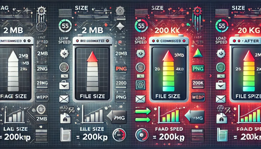
Image Compression Strategies
Images breathe life into a website, capturing user attention and conveying information in a compelling format. However, they are also among the largest contributors to page weight. Even a few uncompressed images can significantly increase load times, drive up data usage on mobile connections, and negatively impact user experience. For this reason, image compression stands out as a crucial tactic in the quest for speed.
Image compression entails reducing the file size of an image, often by removing non-essential data or optimizing how the image stores color and pixel information. Two major categories define compression methods: lossy and lossless. Lossy compression, as its name suggests, discards some information to reduce file size. When done carefully, the human eye cannot easily detect the minor differences in quality. Lossless compression, on the other hand, retains all the original data but uses algorithms to represent that data more efficiently.
Choosing the right format for your images plays a big role in how effectively you can compress them. JPEG is typically used for photographs and complex visuals where a slight loss of detail is acceptable, while PNG is perfect for images that require transparency or crisp lines, such as logos and icons. Modern formats like WebP can offer superior compression ratios, providing smaller files without a noticeable drop in quality.
For the best results, consider tools and techniques that automatically compress images during the upload or build process. Many CMS platforms support plugins that compress images on the fly. Services with built-in image optimization can further ensure that each image is delivered in the optimal format for the user’s device. Keeping a watchful eye on aspects like retina displays and responsive design is also vital, as images can be served in multiple sizes to match various screen resolutions.
Beyond compression itself, employing lazy loading can further speed up a website. This technique defers the loading of images that are off-screen until the user scrolls to them, reducing initial load times. Coupled with responsive image settings, lazy loading guarantees that users only load what is immediately visible and relevant.
Effective image compression not only speeds up page loads but also conserves bandwidth for mobile users on metered data plans. This helps ensure a frictionless user experience, inviting visitors to browse and explore more of your content. Vadimages specializes in integrating compression workflows into development pipelines, ensuring every image is optimized from the moment it’s added to a site. Our clients see measurable improvements in loading speeds, reduced bounce rates, and often improved conversions when high-quality images no longer slow down the user’s journey.
Embracing Code Minification
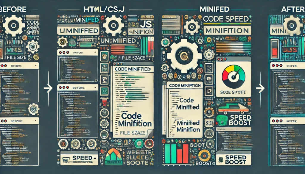
HTML, CSS, and JavaScript files are the structural backbone of any website. Over time, as developers add features, track analytics, or embed third-party services, the size and complexity of these files can expand significantly. When poorly managed, bloated code becomes a primary culprit in sluggish website performance. Code minification addresses this problem directly by stripping out all the extraneous bits—like whitespace, comments, and line breaks—that are necessary for human developers to read and maintain code but serve no purpose to browsers.
Minification is a process that can reduce file sizes without altering the code’s functionality. A typical CSS file, for example, might include generous spacing and inline comments to make it more readable during development. After minification, all of that extra space and commentary vanish, leaving only the raw text required for the browser to interpret styles.
In the realm of JavaScript, minification also shortens variable names, further shrinking the file and accelerating download times. Coupled with other tactics like concatenation (merging multiple files into one), the result is fewer server requests and smaller overall file sizes. This seamless approach to optimization significantly lowers page load times and is generally straightforward to automate using build tools or plugins.
Code minification should be implemented carefully to avoid introducing errors. It’s best to maintain separate development and production environments, where code in development remains readable, while the production version undergoes minification automatically. This ensures that developers can still work with understandable code, while site visitors enjoy faster load times thanks to compact, efficient scripts.
Minification is a part of the broader category of front-end optimizations that includes bundling and compressing all manner of assets. It’s often one of the easiest steps to take for an immediate performance gain. Combining minification with caching and image compression yields a comprehensive performance strategy that covers the main content and static resources a website requires.
At Vadimages, we bake these optimizations into every project from the outset, ensuring clients reap the benefits of a clean, minimal codebase. Our developers leverage modern frameworks and best practices that prioritize performance at every step. By embracing code minification from day one, we reduce the potential for performance bottlenecks, laying a foundation that supports future updates and expansions without compromising speed.
Bringing It All Together
A properly optimized website showcases the art of balance: it provides visually engaging media, dynamic functionality, and a seamless user interface without sacrificing speed or reliability. Caching accelerates repeat visits and offloads much of the processing from both servers and user devices, image compression tackles one of the biggest performance pitfalls on the web, and minified code ensures that every byte traveling between server and browser is necessary and streamlined.
Together, these techniques form a triad of efficiency that directly impacts user satisfaction and business outcomes. Faster page loads correlate with improved user engagement, higher search engine rankings, and better conversion rates. Brands that overlook these optimizations risk losing their audience to competitors who offer a slicker and more efficient online experience.
When seeking professional guidance on implementing such techniques, partnering with experts can make a profound difference in both the short-term and long-term performance of your site. Our team at Vadimages Web Development Studio stands ready to integrate caching, image compression, and code minification strategies tailored to your site’s needs. We believe that no single approach works for every scenario, so our solutions are always designed with your brand identity and business objectives in mind.
Additionally, as you continue to refine and evolve your website, staying informed about the latest optimization tools and methodologies is key. Web technologies continue to advance, and new best practices emerge regularly. The core principles of effective caching, selective image compression, and thorough code minification remain timeless, but the details and tools you use to implement them can evolve.
By entrusting your website to performance-focused professionals, you can rest assured that it will remain both functional and fast, prepared to adapt to new platforms and meet user expectations across devices. Given the impact that even a second of delay can have on user retention and search rankings, speed optimization is not optional; it is an essential investment in your business’s digital presence.
For those who want a partner in this journey, Vadimages is here to help. Our expert developers, designers, and analysts work collaboratively to ensure that every aspect of your website—down to the last line of code and the smallest image file—is tailored for performance. We invite you to contact Vadimages for a consultation. Let us evaluate your current setup, identify specific improvements, and implement a cohesive optimization strategy that unlocks the full potential of your online presence.
Unlock your website’s true capabilities with caching, image compression, and minified code. Embrace speed as a competitive advantage and reap the rewards of happier users, improved visibility, and a stronger bottom line. The web demands excellence, and by optimizing your site’s performance, you’ll stand out in an increasingly crowded digital marketplace.
Vadimages Web Development Studio offers comprehensive speed optimization services. Our team of highly skilled developers specializes in modern frameworks, custom solutions, and proven techniques like caching, image compression, and code minification. We tailor our approach to your business goals, ensuring that your website remains fast, efficient, and visually captivating. If you are ready to transform your online presence, partner with Vadimages and discover the difference that high-performance web development can make.
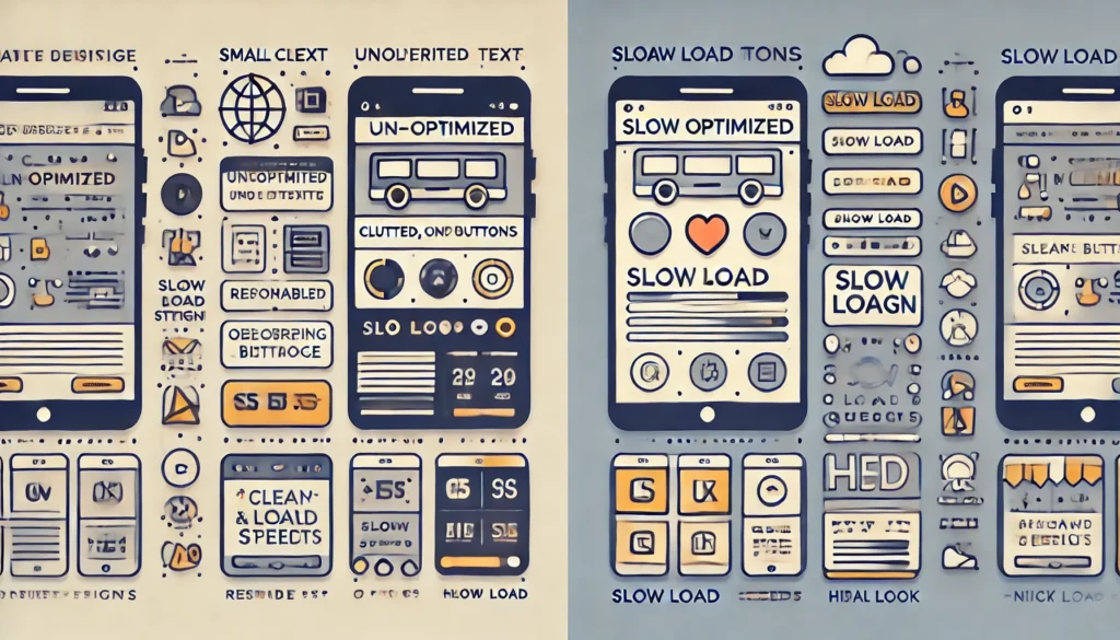
In a digital landscape crowded with endless content and fierce competition, a website’s loading speed can mean the difference between a loyal customer and a fleeting glance. The importance of speed for search engine optimization (SEO), user retention, and overall user experience cannot be overstated, especially when consumers demand instant access to the information or products they desire. A fraction of a second can define the user’s perception of your brand, influence your visibility on search engines, and ultimately determine the success of your online presence. From major tech companies that spend millions perfecting the speed of their websites to individual bloggers looking to improve bounce rates, everyone has realized that performance is not just a technical criterion—it is the heartbeat of every modern digital venture.
This discussion unpacks the essential role that website speed plays in current online ecosystems. It explores how faster loading times contribute to higher search rankings, increase user retention, and create a positive user experience. In addition, you will discover how investing in professional web development services, such as those provided by Vadimages, can supercharge your site’s performance. When website speed meets expert design, the possibilities become limitless.
Speed in the Modern Digital Ecosystem
The moment users land on a website, they expect it to load without delay. Pages that dawdle for more than a few seconds risk being abandoned, as online audiences have grown accustomed to seamless digital experiences. High-speed internet connections, advanced mobile devices, and powerful desktop hardware have collectively raised the bar for website performance. A ten-second wait in the early days of the web was tolerable, but today even four seconds can feel like an eternity, prompting the user to close the tab in frustration.
However, the significance of speed goes beyond mere convenience. In a world where people rely on their smartphones to make purchases on the go, check the news, and communicate with loved ones, any hint of lag can disrupt the daily flow. A slow-loading shopping cart page can cut into a business’s revenue because impatient customers may abandon their carts before completing the purchase. A slow-loading blog post can discourage a reader from diving deeper into other articles on the site.
Website speed has become not only a standard by which users judge the credibility of a brand but also a crucial factor in forming lasting impressions. If users experience delays, they might suspect the site is insecure or outdated, regardless of the actual content or service quality. That initial feeling of trust or distrust can linger, affecting future visits and word-of-mouth referrals.
The rapid evolution of devices and connection speeds has also encouraged frameworks, content delivery networks (CDNs), and other optimization strategies. Modern web development places a premium on fast rendering, compressed data, and minimal overhead. Developers track metrics such as the Time to First Byte (TTFB), First Contentful Paint (FCP), and Largest Contentful Paint (LCP) to evaluate how quickly a website becomes interactive and visually complete. These data points provide valuable insights into user engagement and shape optimization decisions.
For anyone aiming to keep pace, the question is not merely whether a site should be fast, but how to ensure it remains fast at all times. Even the most efficient websites can suffer speed setbacks when traffic spikes occur or when updates introduce code bloat. The dynamic nature of the internet requires continuous vigilance, routine performance checks, and a readiness to adapt.
The Powerful Influence on SEO
When discussing website speed, one of the most pressing concerns for businesses and marketers is how it influences SEO. Search engines consider a variety of signals to rank sites, including mobile-friendliness, content relevance, and overall user experience. Speed has become an increasingly critical part of that formula. A website that loads quickly reduces bounce rates and keeps visitors engaged, which sends positive signals to search algorithms.
Long gone are the days when SEO was solely about keyword density and metadata. Modern algorithms analyze user behavior, including how long visitors stay on a page and how many pages they view before exiting. A slow site can lead to immediate departure, robbing search engines of crucial engagement signals and pushing the site further down the results pages. In many ways, speed is both an indirect and direct SEO factor: it affects how visitors interact with your content and stands as an independent ranking consideration in certain search engine updates focused on user experience.
Search engines aim to deliver the best possible results to their users. If a site cannot keep pace with expectations, it is less likely to be recommended at the top of the search results. This is especially critical for mobile users, who often operate under constraints like limited bandwidth. Since mobile usage continues to expand, an uncompromising approach to performance optimization becomes a necessity. Failing to adapt could mean losing valuable ground to competitors who have made site speed a top priority.
Focusing on SEO without addressing speed is like building a house on quicksand. No matter how strong your content and keyword strategy might be, a sluggish user experience can undo your efforts. Optimizing images, minifying scripts, leveraging caching solutions, and employing a reliable web hosting environment are all strategies that help maintain fast load times. For websites that experience consistent growth in traffic, the scalability of the hosting environment must be considered as well. Performance bottlenecks and slowdowns become more pronounced when a site experiences sudden spikes in user visits, and search engines do not offer leniency for such dips.
The link between SEO and speed has grown stronger as search engines prioritize user satisfaction more than ever. Thus, investing in performance optimization pays dividends not just in keeping your audience around longer but also in boosting your site’s chances of ranking higher. A truly comprehensive SEO campaign must integrate speed as a foundational pillar, bridging the gap between technical efficiency and high-quality content.
Retaining Users in a Fast-Paced World
In the realm of user retention, speed can make or break the visitor’s decision to remain. If people land on your homepage and face lengthy load times, many will bounce away before the first line of text even appears. This is a universal truth, whether you run a personal blog or an international e-commerce platform. The faster your site can display valuable information, the more likely users are to continue their journey and explore what you have to offer.
Every second of delay stacks up, whittling down your chances of making a memorable impact on your audience. Repeatedly slow performance can cultivate negative brand associations. Visitors may perceive your platform as lacking credibility or modernity if the experience feels sluggish. These emotional responses become even more vital when you rely on return visitors, subscription-based services, or consistent engagement through comments and community interaction.
Consider the scenario of a new online store vying to compete with well-established giants. Even if the new store offers compelling prices and unique products, the friction caused by slow page loads can be enough to send prospective customers elsewhere. If a user cannot efficiently browse product listings, filter items, and finalize a purchase, the store’s potential success diminishes drastically.
User retention is intricately tied to how smoothly a site operates during complex tasks, such as database queries, real-time product updates, or dynamic content generation. A site may load its homepage quickly but flounder when users begin exploring deeper sections. This discrepancy can create an inconsistent experience, resulting in lost customers who might have been on the verge of making a purchase or signing up for a newsletter.
An essential part of retaining users is building trust in every interaction. When your site loads quickly and responds to clicks and scrolls without lag, visitors feel empowered and in control. That sense of ease encourages exploration, social sharing, and conversions. In a digital environment saturated with alternatives, the slightest obstacle can divert traffic to a competing platform. Ensuring high-speed performance at every step fosters loyalty, as people learn they can depend on your platform for prompt, reliable service.
Crafting an Exceptional User Experience
User experience (UX) encompasses every facet of a visitor’s interaction with your website, from the visual design and intuitive navigation to the perceived responsiveness and reliability. Speed underpins each of these elements. Even the most elegant design cannot compensate for page loading delays. The moment your layout or content takes too long to appear, aesthetic appeal loses its allure because the user’s frustration overrides appreciation.
A seamless user experience begins with pages that load at lightning speed and continue to respond fluidly as the visitor interacts with different site features. This quality instills an immediate sense of professionalism and competence. People often subconsciously associate swift performance with a higher level of care and expertise from the website owner or brand. Fast websites remove obstacles to browsing, allowing the user’s focus to remain on the content or products. This approach yields tangible benefits, such as fewer abandoned carts, higher satisfaction ratings, and increased chances for repeat visits.
Designers and developers use layout shifts, preloading strategies, and optimized code to ensure that the user sees meaningful content as quickly as possible. These techniques reduce the dreaded blank screen phase, giving visitors a strong reason to remain engaged. Audiences may not be aware of all the behind-the-scenes work, but they notice the difference in how smoothly everything runs.
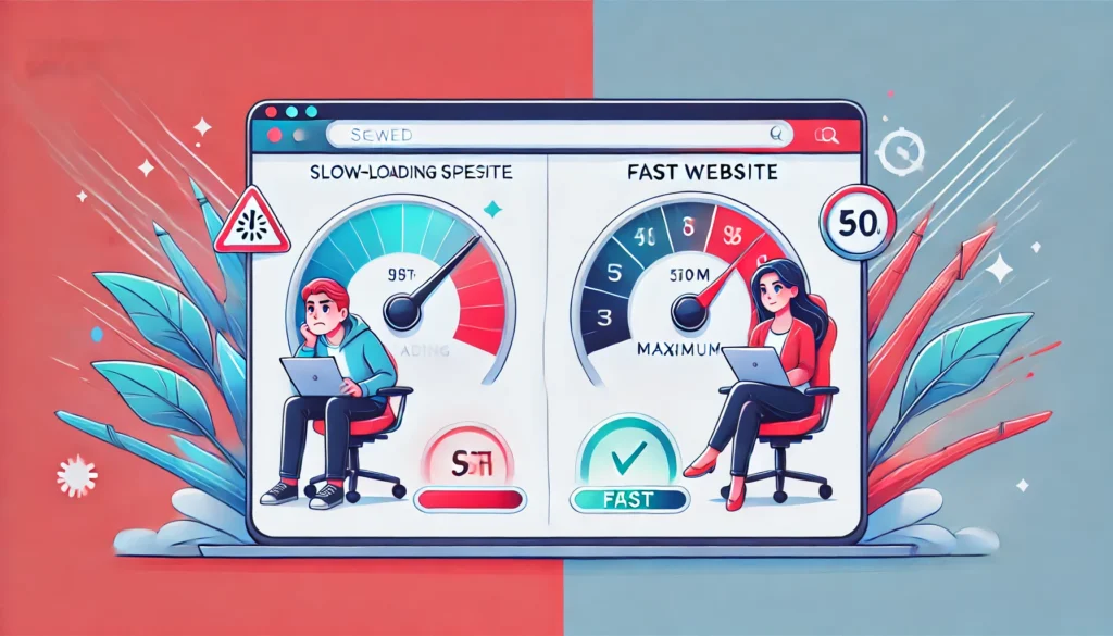
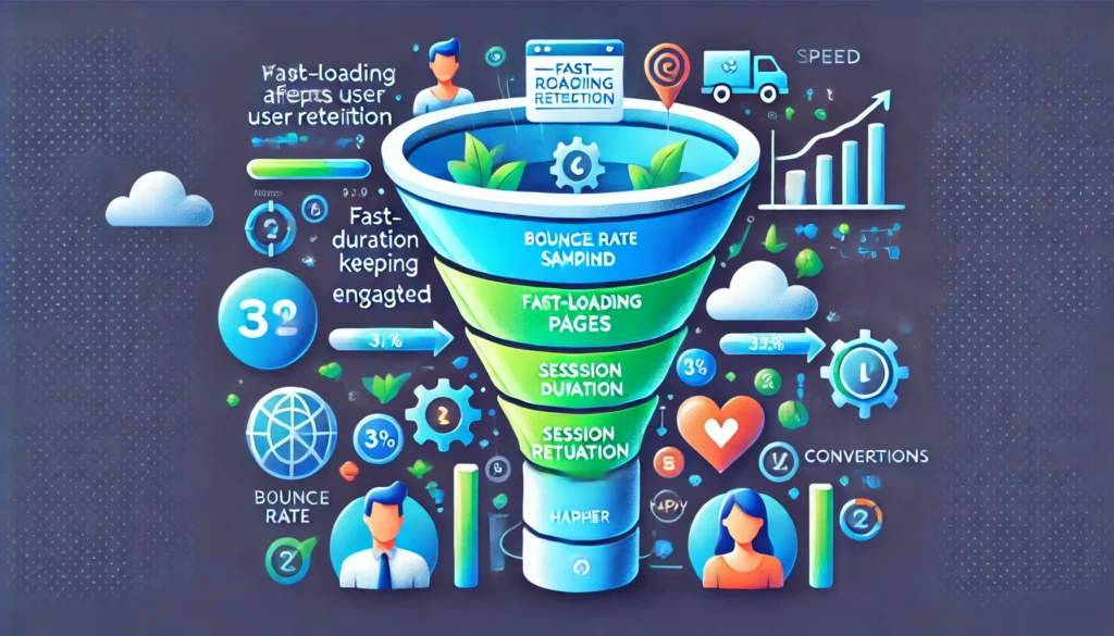
For those who want to illustrate the impact visually, consider a simple graphics element that shows the process of a user loading a website.
  Fast Loading Website  --->  Positive First Impression  --->  Longer User Engagement
                                                        \
  Slow Loading Website  --->  Frustration and Abandonment  --->  Traffic and Revenue Loss
In the above simplified diagram, you can see the stark contrast in user behavior. Quick loads funnel audiences into deeper engagement, while slower experiences prompt an almost reflexive exit. By delivering a fast experience, you are effectively guiding users into a more positive cycle that includes exploring additional pages, completing actions, and potentially sharing content on social media.
When speed, design, and usability intersect, the outcome is a digital environment that feels natural, pleasing, and rewarding. Creating this environment often requires collaboration among web developers, UX designers, content creators, and marketing teams. Everyone must work in harmony to ensure that images are optimized, code is lean, and hosting solutions are robust. Accessibility, security, and device compatibility also become integral to a truly inclusive experience.
Yet, this level of cohesion can be challenging to achieve without the right partner. That’s where Vadimages comes in. Our web development studio, accessible at vadimages.com, is dedicated to crafting high-performing websites that excel in every aspect of user experience. From lightning-fast load times to visually captivating designs, Vadimages prioritizes your site’s success in a competitive digital marketplace.
If you are looking for a reliable partner to develop or enhance your website, Vadimages offers comprehensive solutions tailored to your brand’s unique needs. Our experts use the latest frameworks, performance optimization techniques, and design trends to ensure your audience enjoys a fast, intuitive, and secure browsing session every time. Whether you need a brand-new website built from the ground up or want to fine-tune your existing platform, our dedicated team is ready to transform your online presence.
At Vadimages, we understand that every second counts. Our streamlined workflow ensures minimal downtime, and our performance-centric development approach systematically removes bottlenecks that slow down your site. By partnering with us, you not only gain a visually polished platform but also a strategic edge in today’s crowded digital sphere. We welcome you to join our growing roster of clients who have discovered the value of professional web development services that focus on speed, user experience, and long-term growth.
Conclusion
Website speed is more than just a fleeting technical concern; it is a vital pillar that supports SEO, user retention, and the entire user experience. Fast-loading pages score higher in search engine rankings, keep visitors coming back, and create an inviting environment that encourages exploration and conversions. In contrast, sluggish load times undermine credibility, reduce engagement, and harm your brand’s bottom line.
By giving website speed the attention it deserves, you can elevate your online platform from a mere presence to a dynamic force that captivates its audience. Expert services like those offered by Vadimages help you tackle speed issues head-on, ensuring your site maintains optimal performance. If you want to stay ahead of the curve, maintain user loyalty, and climb search rankings, there is no substitute for a fast, reliable, and intuitive user experience. The time has come to transform your website into a high-performing hub that reflects the best of what your brand has to offer.
The digital era has seen a dramatic shift in how people interact with websites, services, and each other. At the heart of this transformation stands the smartphone, a device that has steadily replaced the desktop computer as the primary tool for internet access. Once considered an optional addition to any digital marketing or web development strategy, mobile optimization is now the central focus of forward-looking businesses seeking to remain competitive. The mobile-first approach places smartphone and tablet users at the forefront of the design process, ensuring that every feature, every layout, and every piece of content is crafted to be seamless and intuitive on smaller screens. This philosophy goes beyond mere technical optimization. It is about reimagining the user’s journey so that navigation feels natural, text is easily legible, and interactions remain simple and engaging. When you embrace a mobile-first mindset, you acknowledge that for the majority of global users, the smartphone is no longer a convenience but an essential component of daily life.
The inception of the mobile-first trend was not simply an arbitrary decision by designers and developers. It arose out of necessity. As mobile usage skyrocketed in the past decade, users began demanding experiences that required fewer pinches and zooms, reduced load times, and layouts that did not break on smaller displays. Early adopters of the mobile-first concept recognized that if websites were structured with smartphones in mind from the start, they could scale effortlessly to larger screens. Designers who continue to treat mobile optimization as secondary may find their websites struggling with high bounce rates and dwindling engagement. This reality underscores how mobile-first is not just a buzzword. It is a crucial principle that shapes the future of online experiences.
Another powerful driver behind the mobile-first philosophy is the global reach of mobile devices. In many parts of the world, mobile phones are more accessible than desktop computers. Millions of people have experienced the internet exclusively through mobile. For them, the smartphone is the internet, meaning any site that fails to load quickly or display correctly can instantly lose credibility. This has created a new global standard for user experience, one that prioritizes connectivity on the go, data efficiency, and immediate access to key features. By starting design and development with the smallest screen in mind, teams align themselves with the way countless individuals already browse the web. Instead of fighting these evolving user habits, savvy businesses harness them to open doors to new audiences, build loyalty with existing customers, and stand out in a crowded digital marketplace.
Eye-Opening Stats on Mobile Usage
Mobile usage statistics paint an unmistakable picture of how deeply smartphones have become ingrained in everyday life. According to various industry reports, a significant share of global internet traffic now flows through mobile devices. In recent years, analysts have observed that well over half of all website visits originate from smartphones and tablets, and this share continues to climb. These figures demonstrate a profound reversal from just a decade ago, when desktop traffic dominated and businesses paid scant attention to the mobile experience. The pace of change has been so swift that many legacy sites were left scrambling to retrofit their designs for the mobile era, often with mixed results. The shift toward mobile usage has also shattered many misconceptions about user behavior, such as the notion that people only prefer to browse on desktops for more complex tasks. On the contrary, studies reveal that consumers are increasingly comfortable researching, shopping, and making important decisions using nothing more than their smartphone. This is especially pronounced in regions where desktop computers are scarce or prohibitively expensive.
Another revealing statistic is the amount of time people spend on their mobile devices. The average adult in many developed countries devotes multiple hours a day to smartphone-related activities, whether that involves browsing social media, catching up on the news, streaming videos, or making purchases. In countries where mobile is the main form of digital access, these numbers can be even higher. The convenience, immediacy, and growing power of smartphones encourage users to rely on them for everything from banking to business communications. Recognizing this trend, major search engines like Google have shifted to mobile-first indexing, giving higher priority to the mobile version of a site when determining its rank in search results. This underscores the undeniable reality that if a website is not optimized for smaller screens, it is likely missing out on both traffic and potential conversions.
To illustrate how rapidly this transformation has happened, picture the evolution of mobile phones from simple communication devices to versatile mini-computers. A decade or two ago, websites were rarely planned with small screens in mind. Today, it is normal to see individuals accomplishing tasks once reserved for desktop applications, such as editing documents, attending virtual meetings, or completing a design project, all from a phone. This radical change in computing habits has influenced user expectations, making them less tolerant of poorly designed mobile experiences. Think about the inconvenience of landing on a page where the text is too small to read, or the layout is so cramped that buttons overlap each other. Such frustrations often prompt users to exit quickly and seek out competitor sites that offer smoother, more comfortable experiences. In a data-driven era, these metrics become evident through high bounce rates and abysmal session durations. Conversely, sites that are mobile-friendly create strong engagement and encourage repeat visits, a factor that can be pivotal for brand growth.
Below, imagine a graphics element depicting a world map where the rising curve of mobile usage percentages sweeps across continents. The illustration emphasizes how different regions experience varying levels of smartphone saturation, yet all share the collective trajectory of mobile growth. This visualization helps drive home the point that no matter where your audience resides, they are likely connected to your business or organization via a handheld device.
Crafting Optimized Interfaces for Smaller Screens
Designing for mobile means confronting various constraints head-on, from limited screen real estate to the different ways users interact with their devices. When you approach these challenges from a mobile-first perspective, you begin by focusing on the essentials that make your site both functional and appealing on a small display. This involves carefully considering the layout, navigation, typography, and media elements. It also means paying attention to how users hold their devices, often relying on their thumbs for navigation. Every tap, swipe, and pinch should feel organic, and crucial tasks must be easily discoverable without unnecessary scrolling or complicated menus. Since mobile users can be on the go, site loading speed often becomes an even greater priority. Slow load times on mobile can cause significant drop-offs, due to the limited patience people have when they are using their phones outside their homes or offices.
An effective mobile-first design also scrutinizes the content hierarchy. Text and images must be structured to highlight the information users need most at first glance. Overcrowding a small screen with too much content can be overwhelming, leading to a cluttered experience and confusion about where to click next. Text should be large enough to read without zooming in, and the color contrasts should be crisp so that essential elements stand out. Media elements, such as images or embedded videos, should be optimized to maintain quality while minimizing data usage, because many users rely on mobile data plans that can be costly or slow. In this context, thoughtful design choices go a long way in enhancing both performance and user satisfaction.
In addition, consider how mobile-first design influences the development of forms and interactive elements. Nobody enjoys filling out long, complicated forms on a small device. By limiting the number of required fields, using autofill features, and keeping input actions to a minimum, you create a smoother experience that reduces user friction. Interactive features like carousels or collapsible menus should be tested extensively on multiple devices. Developers must ensure that any JavaScript or CSS functionalities do not create lags or inconsistencies on mobile browsers. These elements, while visually appealing, can hinder performance and usability if not implemented with mobile device capabilities in mind.
Moreover, the strategic use of space is a hallmark of good mobile design. White space, or negative space, might seem like a waste of screen real estate at first glance. However, it is essential for reducing visual clutter and guiding the user’s focus to key calls-to-action or important text. Buttons and links should be sized and spaced out so that users can tap them accurately without zooming. Incorporating gestures such as swiping or double-tapping can also enhance navigation, as long as they are integrated intuitively and do not disrupt the overall browsing flow. By carefully balancing aesthetics with functionality, you create an interface that feels inviting rather than intimidating on a smaller device.
The final outcome of a mobile-first approach is a cohesive, streamlined design that gracefully expands to larger displays. Scaling up is easier than scaling down because once the core features and layout are perfected for mobile, they can be adapted for desktop by adding extra design elements that enhance, rather than clutter, the user experience. This approach ensures design consistency across multiple devices, strengthening your brand identity and building trust with users who may interact with your content on different screens throughout the day.
The Road Ahead and How Vadimages Can Help
The future of mobile-first design continues to evolve. Innovations in hardware and software push the boundaries of what is possible, making smartphones more capable each year. App-like web experiences, progressive web apps, and advanced capabilities such as augmented reality have begun to transform the notion of what users can accomplish on their phones. Folding phones and other experimental form factors add new dimensions to mobile design, emphasizing the need for flexible interfaces that can handle dynamic screen sizes. Voice interaction and artificial intelligence also have significant implications for how content is displayed and navigated, giving rise to experiences where users speak their way through a site as easily as they would tap through it. This accelerating change means businesses must regularly evaluate their mobile experience to ensure that it meets or exceeds emerging standards.
In this climate, adopting a mobile-first perspective is no longer optional. It is a strategic imperative that can differentiate your business or project from the crowd. An impeccably designed mobile interface can boost customer satisfaction, increase conversions, and solidify brand loyalty. Conversely, ignoring mobile optimization risks marginalizing a vast segment of potential users who simply will not return after one frustrating experience on your site. Balancing creativity with ease of use is a fine art, and it takes continuous refinement to keep your web presence fresh, relevant, and aligned with user expectations. If your website feels slow, unresponsive, or ill-suited for handheld devices, it is time to consider a comprehensive overhaul guided by robust mobile-first principles.
If you are seeking expert guidance in transforming your online presence, look no further than Vadimages. Our studio specializes in web development that places mobile users at the center of every decision, from layout and navigation to performance optimization. We believe that compelling design can live harmoniously with a seamless user experience, and our team brings years of expertise to each project. By choosing Vadimages, you gain access to cutting-edge design methodologies, thorough usability testing, and an unwavering commitment to innovation. We understand that every pixel counts on a small screen, and our goal is to craft digital platforms that not only look great but also function flawlessly for users on the go. Our portfolio spans diverse industries, reflecting our adaptability and passion for excellence. Whether you are launching a new site or revitalizing an existing one, we stand ready to help you seize the vast opportunities that mobile-first design can offer.
Picture a final, eye-catching graphic element showing a smartphone screen gracefully scaling up to a desktop display. The design remains consistent, the branding unmistakable, and the user interactions cohesive across all sizes. That is the vision mobile-first design strives to achieve, and it is precisely the kind of experience Vadimages excels at delivering. We invite you to explore our services at Vadimages.com, where you can learn more about our approach, view our past work, and discover how we can collaborate with you to build a web presence that thrives in today’s mobile-driven world. The future belongs to companies ready to meet their audience where they are—in the palm of their hand.
The world of web design never stands still for long. As the internet becomes more ubiquitous and digital experiences continue to evolve, businesses and brands are challenged to stand out in an increasingly crowded marketplace. Web design is no longer just about putting information online; it now revolves around storytelling, user engagement, and clear brand communication. That is precisely why forward-thinking studios like VadImages Web Development Studio continually research and adopt the latest techniques to ensure their clients’ websites leave a memorable impression. While it can be tempting to jump on every new idea that surfaces, not all trends hold the same transformative power or long-term value. The trends that prove most impactful are those that serve the end users’ needs while also amplifying a brand’s core message.
In today’s design landscape, minimalism, micro-interactions, and bold typography are emerging as powerful creative forces. They shape the way a site looks, feels, and performs, helping brands stand out when used judiciously. These three design approaches offer unique benefits, from enhancing clarity and intuitive navigation to fostering emotional connections and trust. Websites that employ these concepts often strike the perfect balance between functionality and aesthetic appeal. They provide the visual and experiential consistency that modern audiences demand, while also promoting a memorable user experience that encourages visitors to return. Embracing these trends can be the catalyst that propels a brand to new heights, allowing businesses to communicate more effectively and position themselves as leaders in their industries.
The Rise of Minimalism
Minimalism, as a design philosophy, has been influencing various creative fields for decades. In web design, it has grown from a fringe concept into a mainstream standard that many leading websites employ. At its core, minimalism involves focusing on essentials and stripping away excess elements. This means removing needless ornaments, large blocks of dense text, and any clutter that distracts from the primary goal of the site. By leveraging white space and only including the most necessary content and features, minimalistic websites create a sense of calm and clarity. The user’s attention is guided more purposefully, allowing them to focus on a product, service, or message without the friction that arises from excessive or irrelevant components.
A crucial advantage of minimalism is the way it enhances usability and performance. Websites that rely on fewer elements can load faster, particularly when images and code are optimized. This speed is critical because users are increasingly expecting near-instantaneous page loads. A delay of even a second or two can impact how visitors perceive a site’s credibility. By contrast, a quick-loading, elegantly simple design sends an immediate message of efficiency and user-centered thinking. From an aesthetic standpoint, clean lines, generous spacing, and strategic color palettes emphasize the brand’s identity and create a modern image that is easy to scale across different devices.
Designing in a minimalistic way goes beyond just a visual style. It requires thoughtful planning of user journeys and site architecture. Every clickable element, piece of text, or media asset must serve a real purpose. Rather than cramming everything onto a homepage, minimalism nudges brands to distill what truly matters, making sure each interaction has value for the user. This uncluttered environment reduces cognitive load, helping visitors absorb information more easily, move through the website more swiftly, and ultimately convert at a higher rate. Companies that implement minimalism correctly can communicate authority by proving they understand both their audience and the best user experience practices.
VadImages Web Development Studio adopts minimalistic principles precisely because they speak volumes without saying too much. When done right, minimalism doesn’t look barren; it looks efficient. It places the brand’s story front and center and ensures that every single design choice, from color accents to navigation menus, contributes to the narrative. This cohesive visual language can boost recognition and encourage user trust. As digital users continue to reward clarity, navigability, and strong storytelling, minimalism will likely remain a pillar of modern web design for years to come.
Micro-Interactions as a Vital Tool
While minimalism emphasizes clarity and the removal of fluff, micro-interactions insert moments of delightful engagement that can elevate a user’s experience. These small details—such as subtle animations when a visitor hovers over a button, a gentle vibration when they complete a form on a mobile device, or a change in an icon when toggling a feature—might seem minor on the surface, but they significantly influence how users perceive a brand. The reason micro-interactions have become so widespread is because they offer instant feedback and keep users engaged without demanding too much of their attention or time.
The heart of micro-interactions lies in human psychology. People have an innate desire for interaction, and when they use a website, they are far more likely to feel confident navigating it if the site responds in intuitive, almost friendly ways. When a visitor clicks a button, any immediate visual or tactile cue that acknowledges the action provides reassurance. These small moments of interaction guide the user journey like signposts, confirming that certain steps are being completed correctly. Consequently, the entire experience becomes more conversational. It is not just a static page; it evolves into a dialogue between the user and the interface.
Micro-interactions can also strengthen brand identity by adding distinctive elements that feel unique and fresh. Sometimes a well-placed animation, color transition, or playful sound can speak volumes about a brand’s personality. It can bring to life attributes such as fun, reliability, or innovation. Properly deployed, these details help visitors remember the site long after they have closed the browser tab. However, there is a delicate balance between adding engaging micro-interactions and overloading a page with extraneous effects. Excessive or poorly conceptualized animations can frustrate users, slow down performance, and overshadow content. That’s why strategic planning is crucial. Designers must identify the key interactions where subtle feedback would genuinely benefit the visitor. The goal is not to bombard users with flair but rather to create moments of genuine utility and delight.
For a forward-focused agency like VadImages, micro-interactions are an essential component of modern user experience design. By enhancing a site’s overall responsiveness and illustrating a keen attention to detail, these small touches reinforce a sense of professionalism and sophistication. Users often judge a website’s quality based on how each interaction feels. If the design responds smoothly and accurately to user inputs, it fosters trust and a sense of seamless exploration. Micro-interactions blend naturally with minimalism; the open spaces and straightforward interfaces characteristic of minimalist designs set the stage for these engaging elements to shine. The brand’s message remains crystal clear, complemented by interactive flourishes that guide and reward the user in intuitive ways.
Standing Out with Bold Typography
The written word remains fundamental to online communication. Even in a world increasingly dominated by videos and images, text remains one of the most direct ways for brands to articulate their value propositions. What has changed significantly in recent years is the way typography is leveraged. Designers are moving beyond simple, conservative type choices and exploring more creative fonts, large-size text, and typographical hierarchies that instantly capture attention. Bold typography does more than just enlarge words on a screen. It can serve as an anchor for a site’s visual identity, and in some cases, it becomes the main design element that people remember.
In a minimalist design framework, typography can carry enormous weight because there are fewer images or ornamental details vying for attention. A distinct typeface or an oversized headline can immediately set the tone for the brand. It might convey elegance, modernity, playfulness, or authority, depending on the chosen style. By emphasizing specific words or phrases in an eye-catching manner, the designer can guide visitors to the site’s most important messages. This focus on bold text not only ensures that the user knows what to read first but also encourages them to continue scrolling to discover more about the brand or product.
Selecting a memorable font can help a website stand out in a sea of generic designs. When audiences see the same typefaces used everywhere, the uniqueness of the brand can become diluted. By carefully picking a distinctive font—perhaps a contemporary serif for a refined feel or a striking sans serif for a modern edge—designers can build a strong typographic brand language that resonates with target users. Such choices should always align with the brand’s persona and mission, ensuring that the user’s first impression is both visually compelling and consistent with what the brand stands for.
Bold typography also forms a symbiotic relationship with micro-interactions. A simple hover effect that subtly changes color, size, or spacing can breathe life into text, capturing attention and inviting exploration. Combined with minimalistic layouts, strong typographic choices ensure that each word stands out exactly as intended. Bold typography also benefits accessibility, as users with visual impairments often appreciate larger, clearer text that is free from excessive decoration. A carefully planned site typography hierarchy guides these users as they navigate, showing them which sections are most critical and where key information can be found. This inclusive approach is more than just a design trend; it reflects a mindful consideration of every potential user’s comfort and needs.
VadImages often prioritizes typography early in the design process because it unifies content and visuals. It’s one of the fastest ways to make a statement about a brand’s character. When visitors land on a page and see carefully chosen headings that jump out in a compelling way, it heightens curiosity about what lies below. As they scroll, the interplay between headlines, subheadings, and body text can create a smooth, captivating narrative. The brand’s story comes through clearly, delivered in a manner that is both aesthetically pleasing and functionally sound. This blend of style and substance leaves a lasting impact, prompting users to engage deeply with the website’s offerings.
Wrapping all these threads together, a website that merges minimalism, micro-interactions, and bold typography is positioned to create a lasting imprint on visitors. Such a design not only pleases the eye but also streamlines navigation, enhances usability, and establishes a brand voice that resonates. The objective is to deliver experiences that are delightful and memorable, something today’s digital-savvy users have come to expect. A meticulously crafted site sends a subtle but powerful message: this brand respects my time, understands my needs, and is willing to innovate in order to connect with me in a compelling way.
At VadImages Web Development Studio, the goal is to translate each client’s unique story into a digital environment that captures and holds attention. With minimalism, we reduce visual noise and put the spotlight on what matters most. Through micro-interactions, we build trust and add a dash of human warmth to every click, scroll, and tap. With bold typography, we underscore the brand’s message in a manner that is not easily forgotten. When woven together thoughtfully, these trends form the backbone of a modern, powerful digital presence. They serve as proof that effective design isn’t just about looking contemporary—it’s about shaping a website that remains relevant, engaging, and distinctly on-brand, no matter how quickly the digital landscape changes.