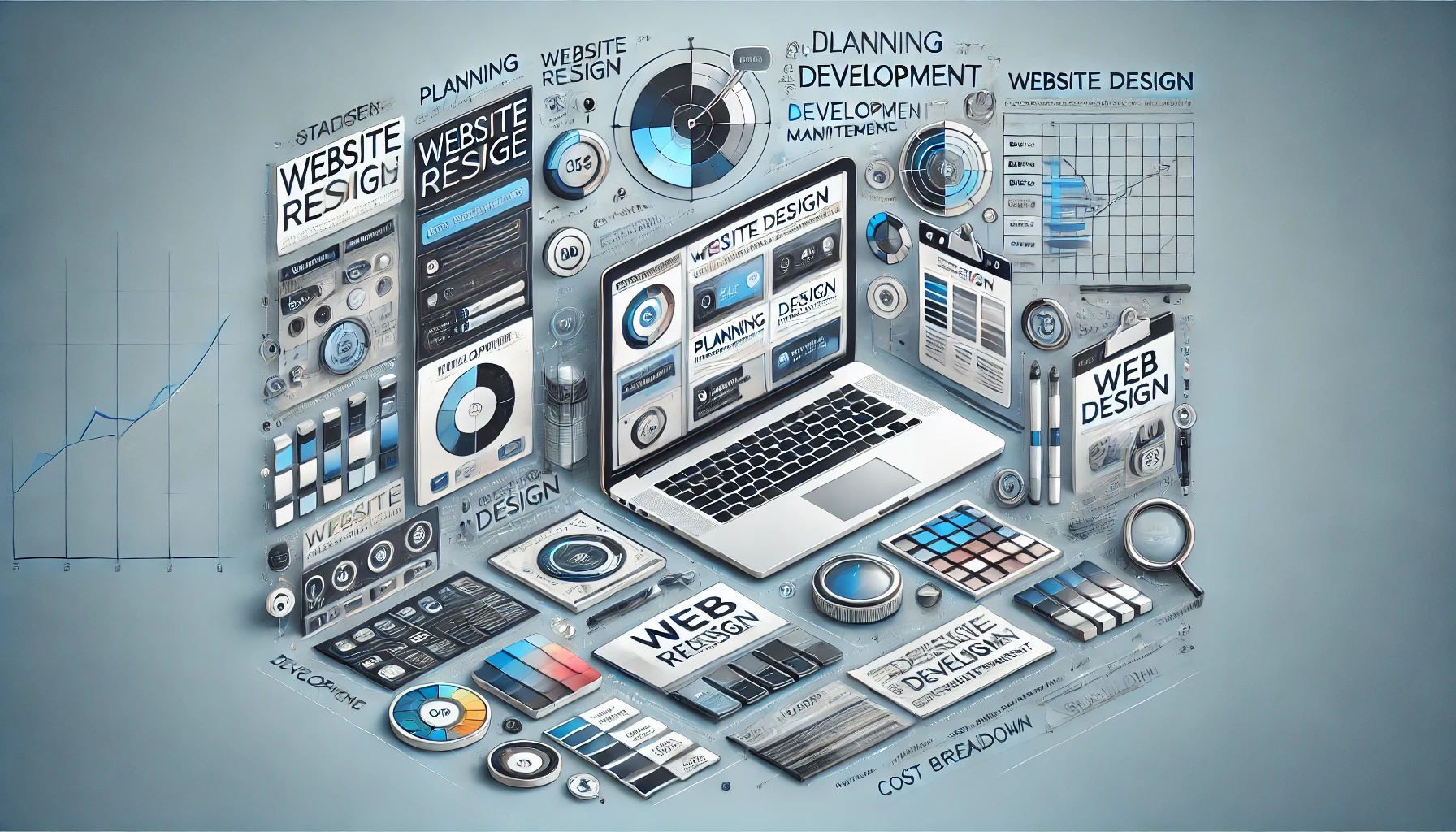
A website redesign represents an opportunity to transform the way visitors experience your brand online, potentially leading to greater engagement, improved conversions, and better search engine visibility. To achieve all of these benefits, however, it’s essential to begin with a thorough understanding of the scope of your redesign project. Some websites only need a fresh coat of paint to revitalize their look and feel, while others require a complete overhaul of their architecture, functionality, and integration with external systems. Although this process may sound straightforward, various hidden factors can influence the final cost.
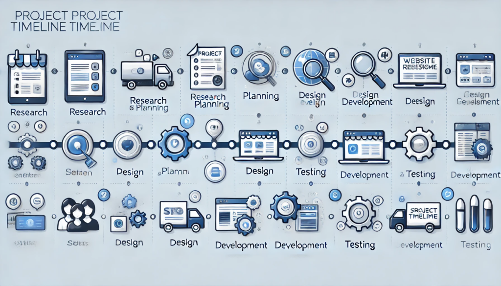
When you start planning, it’s helpful to consider elements such as the number of pages you wish to update, the complexity of the features you want to incorporate, and whether you plan to migrate existing content or create entirely new materials. The cost implications can vary dramatically between basic, static sites and complex, dynamic platforms with e-commerce functionality or custom user experiences. Even before you consult a professional, you can estimate how extensive your redesign will be by mapping out all the tasks that need to happen behind the scenes. This planning stage can help prevent unnecessary spending and keep your overall budget in check.
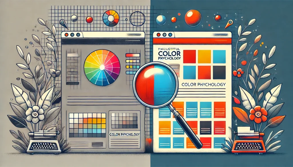
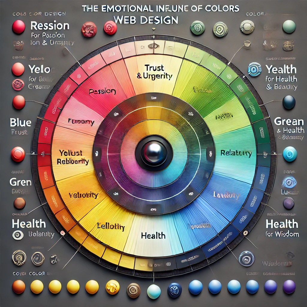
As you conceptualize the new structure, you may also want to think about opportunities to add or revise graphical elements. For instance, you might employ distinctive illustrations that match your brand identity, infographics that convey data in an engaging way, or decorative images that enhance the site’s emotional appeal. All of these potential features can affect the time and effort needed for the redesign. They can also lead to significant returns if executed correctly, as they enrich user experience and encourage longer site visits.
What truly makes budgeting for a website redesign challenging is that there’s no single, standard price. Agencies or freelancers can charge by the hour or offer a fixed rate based on the project scope. Regional differences, team expertise, and technology stacks can also shift the overall price. In short, there is no universal blueprint. Instead, clarity about your project’s vision helps anchor your spending decisions. When your goals are well-defined, you can approach web development studios—like Vadimages—and receive accurate proposals tailored to your requirements.
The path to a successful redesign must also anticipate hidden costs. A typical website relies on third-party services such as plugins, software integrations, or external API connections for payments, shipping, and data analytics. Each of these items carries its own price, whether in the form of one-time purchases or recurring subscriptions. Failing to plan for them from the start can lead to budget overruns, so you’ll want to account for them in your initial estimates.
You should also keep in mind the prospect of additional functionality being requested partway through the project. Even well-planned redesigns sometimes encounter changes once stakeholders or focus groups see the work in progress. By setting aside a contingency budget, you can tackle unexpected demands without compromising quality. Typically, professionals advise reserving ten to twenty percent of your total budget for these unanticipated adjustments.
Ultimately, your first step is always to define your site’s ultimate purpose and map out the necessary steps to achieve your business goals. When you work with an experienced partner, you’ll receive valuable guidance on how to maintain coherence between design choices, content strategy, and advanced features. At Vadimages, we pride ourselves on offering personalized consulting that ensures you invest in exactly what you need—no more, no less.
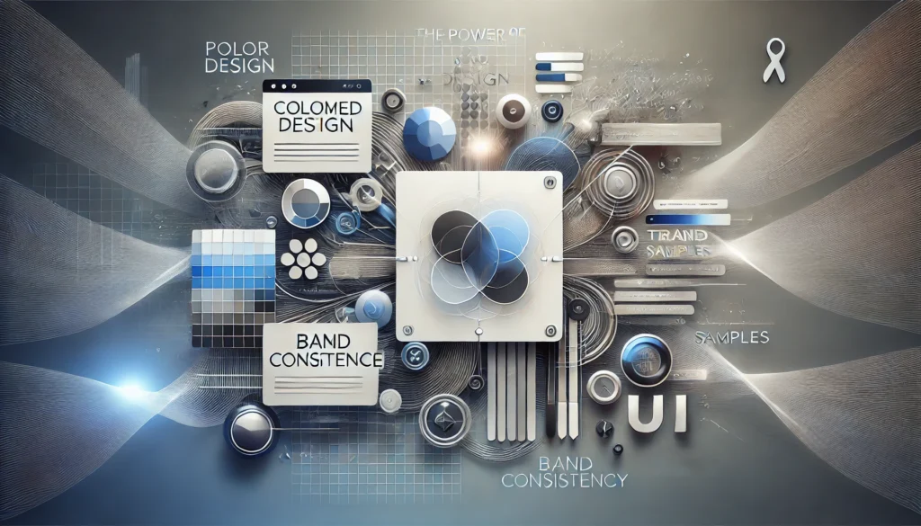
Design and Brand Identity
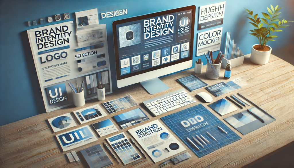
The visual presentation of your website is about more than just pleasing aesthetics. It’s a translation of your brand’s identity into a digital medium. A well-considered design resonates with visitors and communicates your core message before they even read a single line of text. As a result, design holds a significant place in the overall cost of a website redesign, often encompassing multiple components, from the general layout to the finest details of typography, color schemes, button shapes, and transitions between pages.
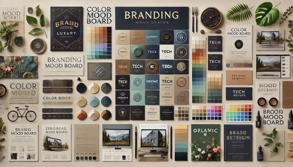
Budgeting for design means recognizing that truly great branding requires strategic thinking. A new layout might look incredible in a mockup, but if it doesn’t align with your brand ethos or target audience, it won’t serve your long-term goals. Sometimes, your existing brand identity remains perfectly viable, and you only need superficial touch-ups or improved navigation to modernize the website. In other cases, you may find that your site needs an updated or entirely new logo, fresh color palette, or refined set of typography guidelines. Integrating these elements seamlessly takes time and expertise.
Alongside your brand identity, graphical elements like icons, banners, illustrations, or background patterns can drive up costs if you need them custom-made. However, such details can yield considerable benefits, as they enhance user engagement and set you apart from competitors. Graphics can be more than mere decoration. They can inform users about complex concepts, highlight services, or add a sense of personality to the digital environment. While premade icon sets and stock photos are cheaper options, leveraging bespoke designs ensures uniqueness and authenticity.
Positioning the redesign to reflect your company’s growth may also require specialized photography or videography to show off products, staff, or facilities. Investing in professional visuals can be expensive, but these visuals often have a lasting impact. For instance, updated images or videos that highlight your team’s expertise help cultivate trust and reinforce credibility. Prospective customers form an opinion within seconds of arriving on your site, so you want those first impressions to speak of quality, professionalism, and brand consistency.
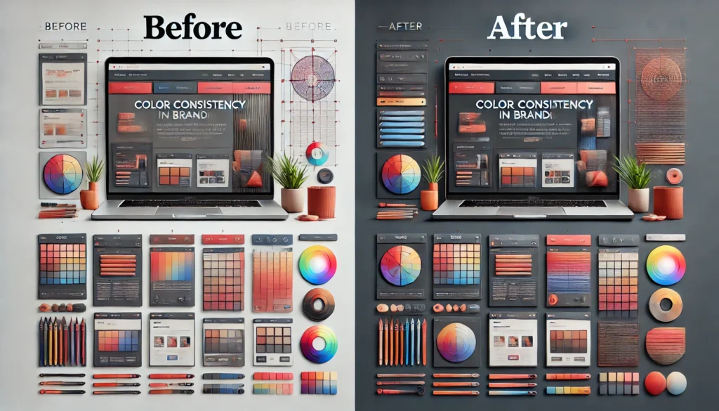
As you move through the design process, remember that revisions and feedback loops factor into the timeline and cost. If you engage an agency like Vadimages, our project managers and designers work closely with you to provide iterative updates and gather your input. Each revision or tweak in layout, color, or user interface must be methodically implemented to ensure nothing gets overlooked. Although each revision may slightly alter the budget, refining the visual aspects of your site can pay off tremendously, transforming casual visitors into long-term customers. When you factor design into your overall budget, aim to maintain a margin that allows you to make thoughtful improvements without worrying about every minor modification.
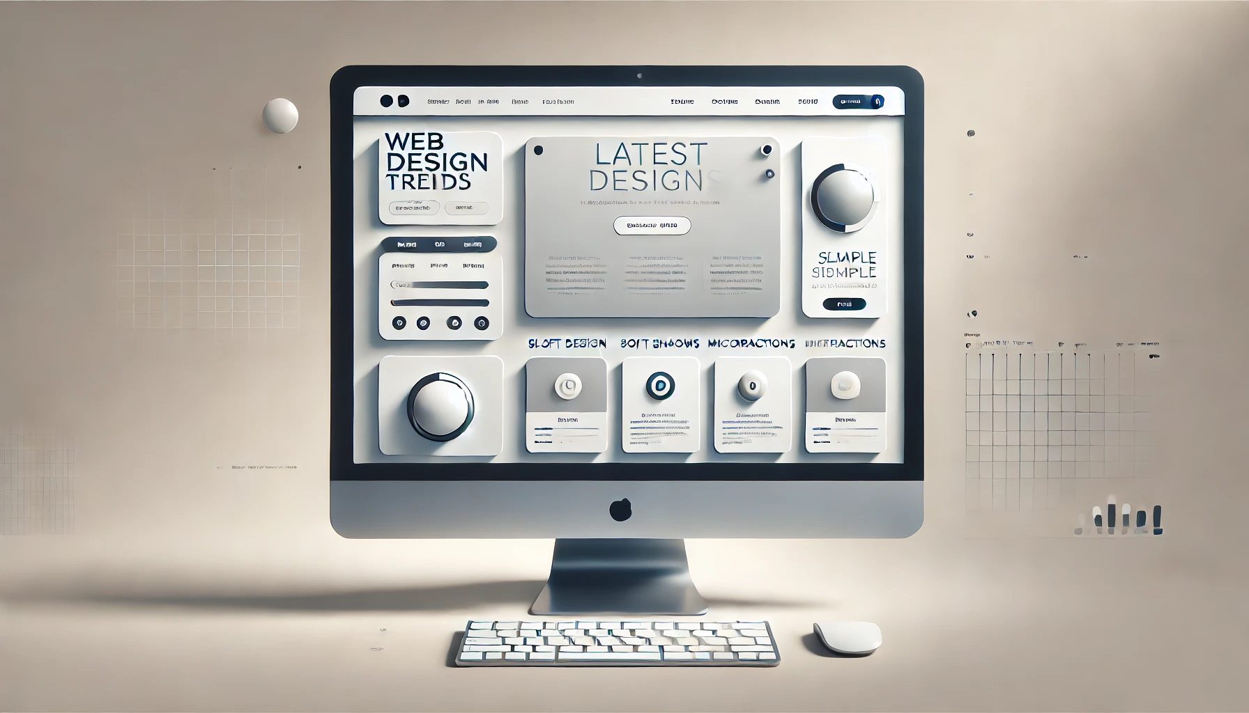
Balancing aesthetics with functionality is also a crucial part of design budgeting. Your redesign must remain accessible to all users, regardless of device or screen size. This means employing responsive design best practices, where visual elements adapt fluidly to different resolutions, ensuring consistent experiences for visitors on desktops, tablets, or smartphones. The additional time and skill needed for responsive or even adaptive design can affect the final budget. However, ignoring mobile users is not an option in today’s digital environment, where most traffic arrives from smartphones.
When it comes to broad strategy, a redesign can modernize not just your look and feel but also how your audience perceives the entire business. With a meticulously crafted brand identity, your site can become a powerful marketing asset that communicates your brand’s distinct character and value proposition. The design phase is your chance to integrate everything from subtle animations to inspiring hero images and carefully laid-out text that collectively reinforce your brand voice.
Development and Hosting
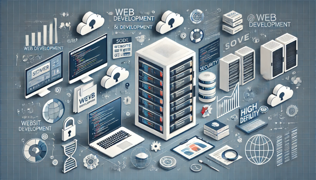
While design captivates visitors and shapes their emotional reaction, development is the structural engine that supports every feature on your website. Code quality, frameworks, content management systems (CMS), and plugin integrations all fall under this umbrella. Much of your redesign cost emerges from the complexity of the functionality you want to incorporate. E-commerce components, custom portals, membership systems, interactive data visualizations, and even dynamic forms each require specialized work.
Web development teams generally charge based on the time and difficulty of implementing your requested features. If you want to revamp your site on a robust CMS such as WordPress, you might pay less than if you choose to build a custom solution from scratch. However, employing a common CMS is not a guarantee of cheap development, because the complexity of third-party plugins, security enhancements, and custom styles can accumulate. On the other hand, if your project demands a highly unique user experience, opting for custom code might be the right choice, even though it can lead to higher upfront costs. The trade-off often pays off in the form of greater performance, scalability, and flexibility.
Choosing a trustworthy web hosting provider is another essential investment. Hosting fees can vary significantly, ranging from basic shared hosting plans at relatively low cost to more robust solutions like virtual private servers or dedicated servers with higher monthly fees. As your project grows, you might also explore the benefits of cloud hosting solutions for scalability and uptime guarantees. The monthly or annual expenses for hosting are usually an ongoing commitment rather than a one-time cost. Factoring these fees into your budget is critical for long-term sustainability.
Domains, SSL certificates, and necessary security measures add additional layers to your budget, but you should see them as non-negotiable elements. Modern consumers expect sites to load quickly, respond to their device type, and handle data responsibly. An SSL certificate instills trust by encrypting information, which is especially important for e-commerce platforms or any website where visitors enter personal details. If you compromise on hosting or security, the entire redesign can be undermined by slow load times or data breaches that tarnish your brand’s reputation.
You may also need to consider the costs of advanced integrations with external APIs. For instance, you might connect your website to a payment gateway, shipping calculator, or a third-party marketing automation system. Each connection requires development time, and if the APIs charge usage fees, those expenses become recurring. Planning for these integrations at the start helps avoid disruptions and ensures your site continues to function seamlessly once it goes live.
During the development stage, testing is paramount. The more complex your site, the more rigorous the tests must be. This includes cross-browser testing, responsiveness on multiple devices, performance checks under different network conditions, and security assessments. Each round of testing and subsequent fixes adds to the total cost. However, skipping this step is never a wise budget cut because any significant bug discovered after launch can be more expensive to fix and can cost you valuable business opportunities.
Optimizing your site for search engines from a technical standpoint is also part of development. Clean code, fast load speeds, properly structured data, and relevant metadata can all influence how search engines rank your content. Whether you opt for minimal SEO implementation or advanced strategies, you should allocate some portion of your budget for these tasks if you want to be competitive online. Even if you decide to invest more heavily in SEO later, laying a strong technical foundation during the redesign is vital.
For those who lack the time or in-house capability to oversee a complex development project, hiring a full-service web agency—like Vadimages—provides a streamlined solution. We coordinate designers, developers, and testers so that every detail aligns with your vision and brand standards. By entrusting the entire project to professionals, you can reduce the administrative overhead and focus on driving your business, confident in the knowledge that you’ll receive a high-quality end product.
Marketing, Maintenance, and Post-Launch Growth
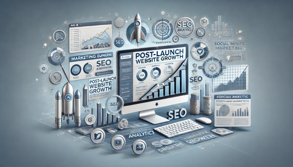
Securing an impressive redesign with solid design and development is only part of the story. Your website’s true return on investment emerges through strategic marketing, ongoing maintenance, and a continual cycle of improvement once the new design is live. Without a plan to attract, retain, and convert visitors, your site’s full potential may remain untapped.
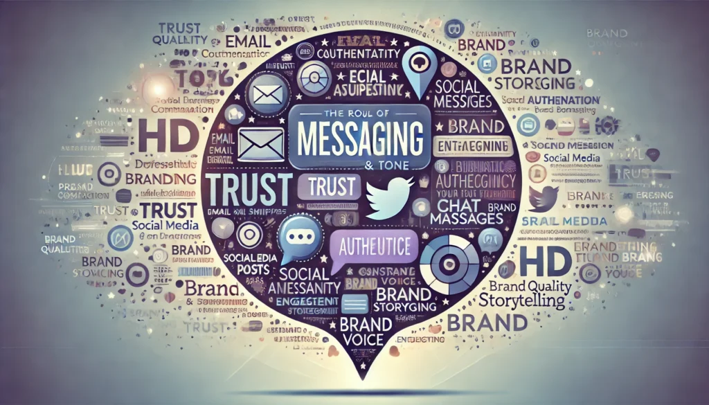
Digital marketing can vary widely in scope, from basic on-page optimization and blog posts to comprehensive strategies encompassing paid advertising, social media campaigns, email marketing funnels, and influencer outreach. The cost of marketing initiatives depends on your target audience, industry competitiveness, and the goals you’ve set. If your site relies on local traffic, your approach might differ from that of a company aiming for a global audience. Regardless of the scale, you’ll likely invest in copywriting, visuals, and promotional activities that align with your brand identity established during the redesign phase.
Maintenance is another often-overlooked aspect that should factor into your budgeting. Websites aren’t static entities; they require periodic updates to keep plugins, themes, and security protocols current. Content management systems release new versions, and security patches must be installed promptly to guard against vulnerabilities. Over time, your hosting environment may also evolve, requiring adjustments to your configuration for optimal performance. By earmarking a portion of your budget for maintenance, you reduce the risk of sudden downtime or costly repairs.
A robust content strategy helps your newly redesigned website gain traction, particularly in competitive markets. This might involve publishing blog posts, creating videos, or developing informative graphics that draw visitors through search engine queries and social shares. High-quality content, integrated seamlessly with your design elements, encourages visitor engagement and can lead to higher conversion rates. You might consider outside help for content creation if writing or graphic design isn’t your specialty. This adds another expense to your budget but can significantly boost your site’s visibility and brand perception.
Analytics and performance tracking allow you to measure the impact of your redesign and marketing efforts. Tools like Google Analytics, as well as other specialized platforms, provide data on how visitors interact with your site. Monitoring key performance indicators such as bounce rate, average session duration, pages viewed per session, and conversion rates helps you identify successes and areas for improvement. Investing in analytics not only aids immediate decision-making but also shapes future redesigns or upgrades by highlighting which components deliver the best return.
Post-launch, your website should evolve alongside your business. You might identify new revenue streams or ways to engage your audience through innovative features or content. Setting a budget for ongoing improvements or expansions ensures you’re never caught off-guard when an opportunity presents itself. This is particularly true for fast-moving industries where consumer preferences change rapidly, necessitating consistent refinements to maintain a cutting-edge online presence.
The good news is that you don’t have to manage all of these moving parts alone. At Vadimages, we specialize in not just building stunning, functional websites but also helping our clients chart a course for long-term growth. We bring together marketing strategists, content experts, SEO specialists, and developers in a collaborative environment. Whether your focus is boosting sales, capturing leads, or simply raising brand awareness, we tailor our approach to your specific vision.
A website redesign should never be seen as a one-off project. It’s more accurate to describe it as an evolving investment. By budgeting for design, development, hosting, marketing, and the ongoing work that follows, you build a stable digital foundation that can adapt to your customers’ needs and preferences. The costs might at first seem substantial, but a carefully planned, strategically executed redesign can yield returns far beyond the initial expenditure, strengthening your brand and driving business success for years to come.
If you’re looking for a trusted partner to guide you through every stage of a website redesign, from preliminary planning and graphics development to launch and beyond, Vadimages is here to help. Our team of skilled developers, designers, and marketing professionals can tailor solutions to fit your vision and budget. Contact us today at Vadimages.com and let us bring your digital dreams to life.