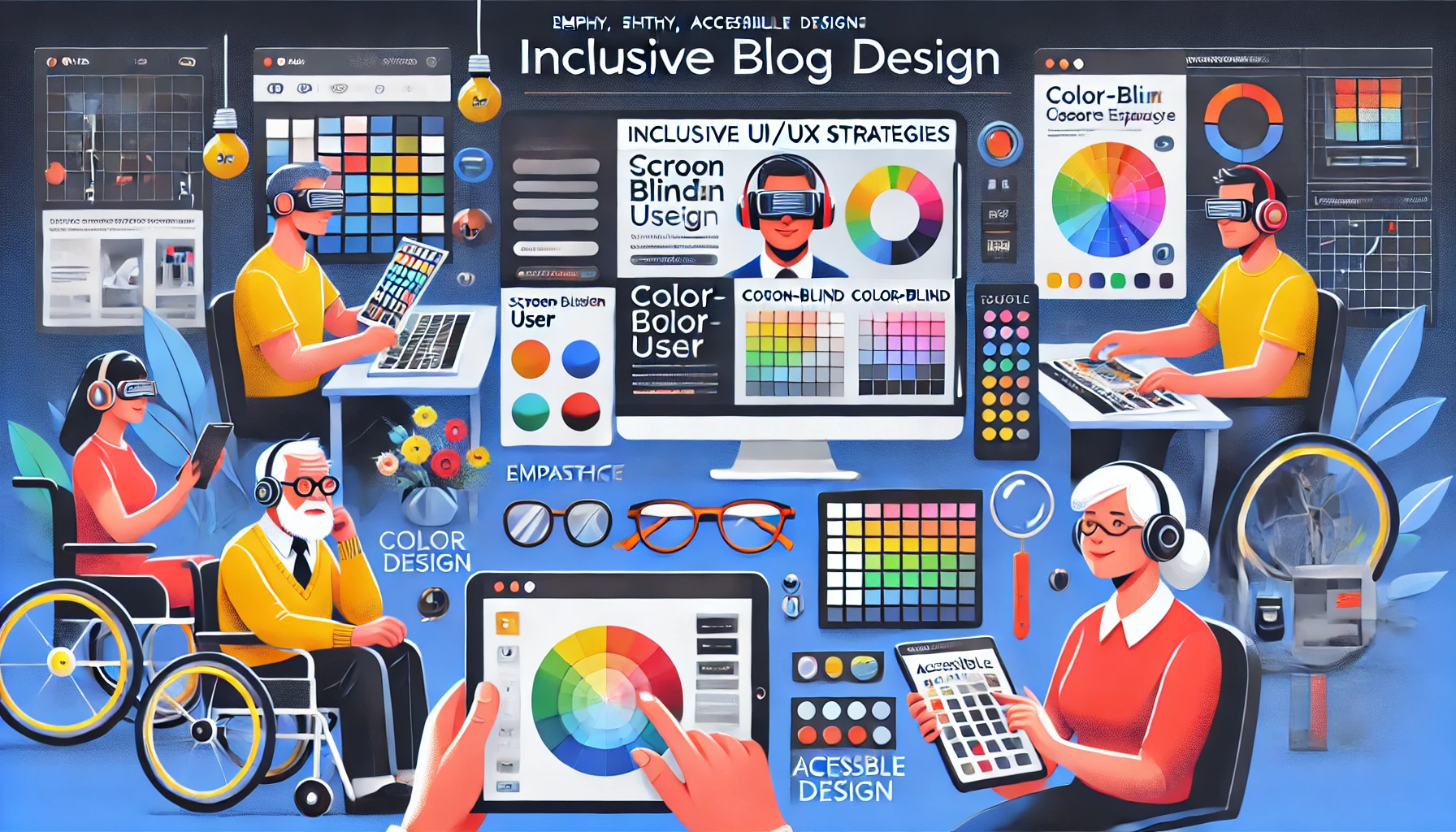
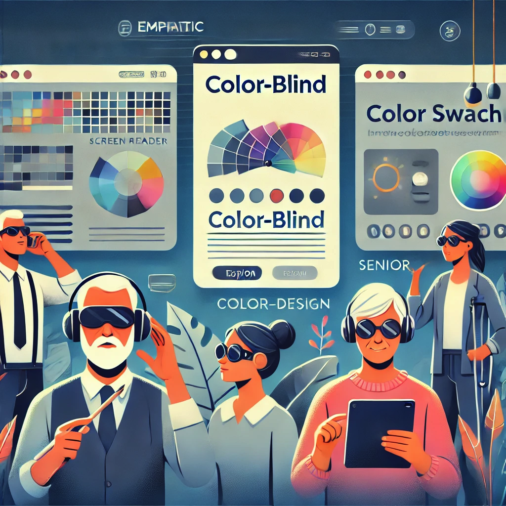
Understanding the Spectrum of User Needs
The internet feels universal only when it recognises that no two visitors experience the same page in the same way. While one user navigates confidently with a mouse and a 4K display, another relies on a screen reader that linearises content into spoken word, and yet another balances slow mobile data with limited technical know‑how. Inclusive design begins with empathy for this vast continuum of contexts. It treats impairments—whether permanent, temporary, or situational—as normal variations of the human condition rather than edge cases. Vision limitations, colour‑blindness, motor tremors, cognitive load, anxiety triggered by cluttered layouts, even the unfamiliarity a novice user feels when greeted with jargon‑heavy interfaces—all fit on the same spectrum designers must serve. By mapping personas, conducting moderated usability sessions, and auditing analytics for pain‑point patterns, teams reveal the subtle obstacles that exclude. Once those obstacles surface, everything from information architecture to micro‑interactions can be refined so that no user is forced to struggle or leave.
Building Accessibility into the Design Process
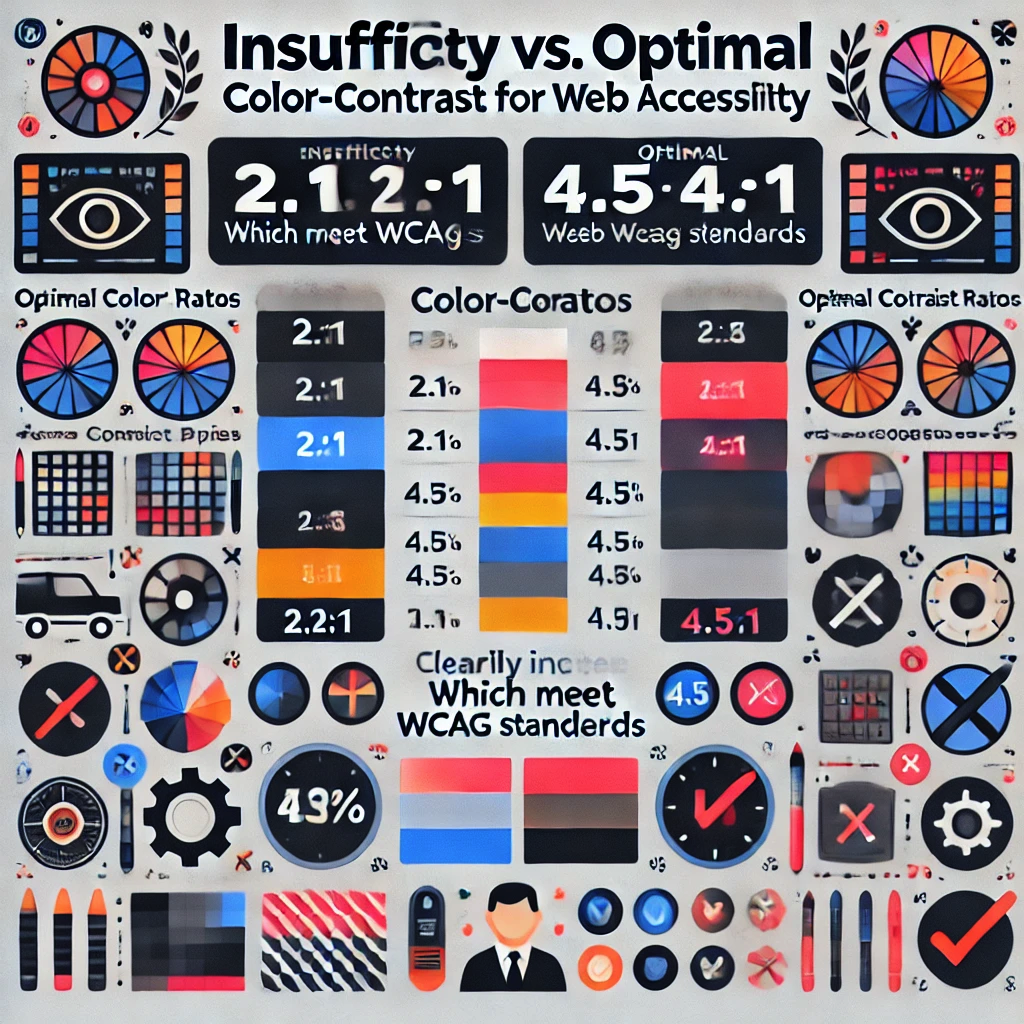
True accessibility is not a coat of paint added after launch; it is a constraint and catalyst woven through every sprint. Start with semantic HTML so assistive technologies inherit structure and meaning automatically. Choose colour palettes that maintain a minimum 4.5:1 luminance ratio to preserve readability for colour‑blind visitors and those in bright sunlight. Provide focus outlines that meet WCAG 2.2 guidelines, ensuring keyboard travellers see exactly where they are on the page. Wherever motion is introduced—parallax banners, loading spinners, micro‑animations—offer a “reduce motion” preference so vestibular‑sensitive users remain comfortable. Alt text should not merely describe what an image is but why it matters in context, turning a decorative hero shot into a narrative element a blind visitor can visualise. Form design requires both clear label association and forgiving validation messages, because nothing raises abandonment faster than cryptic red text that leaves a newcomer guessing what went wrong. Finally, continuous automated audits with tools such as axe‑core or Lighthouse must be paired with manual screen‑reader passes; only human ears can hear when an aria‑label truly makes sense. When every commit passes these gates, inclusive design stops being an extra task and becomes table stakes.
Balancing Simplicity and Power for Different Skill Levels
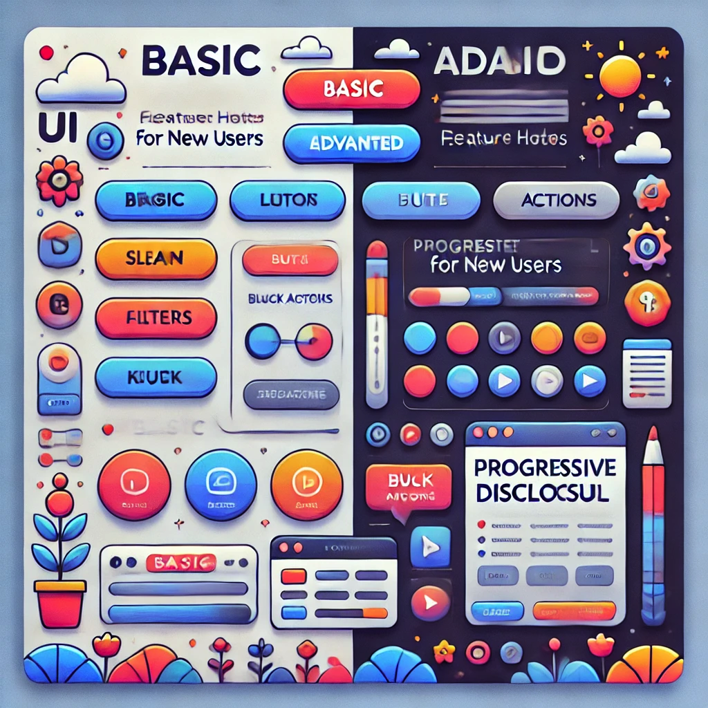
People do not share a single threshold of “tech‑savviness”; they arrive along a gradient. A first‑time smartphone user might feel overwhelmed by nested menus, while a seasoned analyst grows impatient when shortcuts are hidden behind “wizard” flows. The art of inclusive UX is offering a shallow learning curve without capping potential. Progressive disclosure is a powerful ally—surfacing only the most essential actions by default, yet revealing advanced filters, bulk actions, and keyboard shortcuts as confidence grows. Visual cues like step indicators, inline hints, and undo options allow beginners to experiment safely, whereas power users appreciate command palettes and ARIA‑labelled landmarks that accelerate navigation. Performance is part of this equation too: low‑memory devices and slow networks deserve responsive sites that stream critical content first and hydrate enhancements later. By instrumenting feature flags, designers can trial simplified variants against expert modes, measuring real engagement instead of guessing. When the same product welcomes someone setting up email for the first time and someone scripting API calls, it proves that accessibility is not only ethical—it is commercially smart.
Crafting such adaptable experiences is where Vadimages excels. Our multidisciplinary team merges WCAG mastery with conversion‑centred design, ensuring your platform delights audiences you may never have imagined while still meeting ambitious business KPIs. Through empathy‑driven workshops, rapid prototyping, and rigorous accessibility QA, we transform compliance checklists into competitive advantage. Whether you need a full redesign or strategic consulting, Vadimages turns inclusion into innovation.
If your organisation is ready to open its digital doors to everyone—regardless of device, ability, or experience level—connect with Vadimages today. Together we will build something every user can love and your metrics will celebrate.