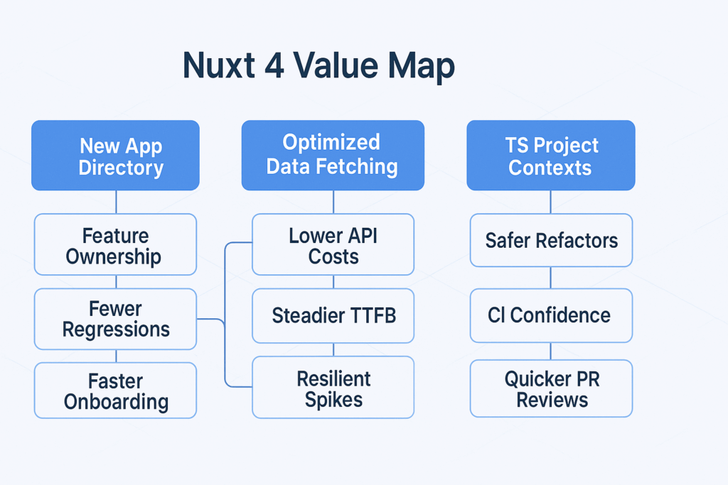
Nuxt 4 arrives with the kind of changes that matter to business outcomes, not just developer happiness. A new, more deliberate app directory organizes code in a way that scales with teams and product lines, data fetching is both faster and safer thanks to automatic sharing and cleanup, TypeScript gains teeth with project-level contexts, and the CLI sheds seconds off every task that used to feel slow on busy laptops and CI runners. Coming in the wake of Vercel’s acquisition and setting the stage for Nuxt 5, this release is less about hype and more about predictability: predictable build times, predictable rendering, and predictable roadmaps that help small and mid-sized businesses plan upgrades without risking revenue weekends. For owners and marketing leads in the United States who rely on their site for lead-gen or ecommerce conversions, Nuxt 4 represents an opportunity to refresh your stack with a measurable lift in performance, developer velocity, and reliability while staying within budgets and timelines acceptable to your stakeholders.
What changes in Nuxt 4 and why it matters for your business
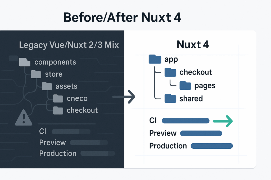
The rethought app directory is the first upgrade your users will never notice but your team will feel immediately. Instead of forcing all pages, layouts, server endpoints, middleware, and composables to compete for space in a single flat hierarchy, Nuxt 4 encourages a domain-first structure. You can group product pages, editorial content, and checkout flows into clearly bounded folders that carry their own middleware, server routes, and components. On a practical level, this makes it harder for regressions to leak across features and easier for new engineers to contribute without stepping on critical paths. In US SMB environments where turnover happens and contractors rotate in and out, that clarity translates to fewer onboarding hours and fewer avoidable mistakes when hot-fixing production.
Data fetching receives the kind of optimization that turns Lighthouse audits into wins. Nuxt 4’s automatic sharing means that if multiple components ask for the same data during a render, the framework deduplicates requests behind the scenes and ensures that all consumers receive the same result. Coupled with automatic cleanup, long-lived pages no longer accumulate subscriptions or stale cache entries that drag down memory usage on the server or the client. The effect is most visible on content-heavy landing pages and search results, which are typical growth levers for small businesses. The experience remains smooth during navigation, and server resources hold steady under spikes from campaigns or seasonal traffic without sudden hosting cost surprises.
TypeScript support advances beyond “works on my machine” into separate project contexts that keep server and client types distinct while still sharing models where it makes sense. This prevents subtle errors around runtime-only APIs or process variables from slipping into browser bundles. It also enables more accurate editor hints and CI checks, which makes your testing pipeline faster and your refactors safer. If your company collects leads or processes payments, eliminating whole classes of type confusion directly reduces risk and engineering rework, a tangible cost benefit when every sprint is counted.
The CLI gets noticeably faster. From scaffolding new routes to running dev servers and building for production, the cumulative time savings—five seconds here, ten seconds there—become real money when multiplied by the number of developers, days in a sprint, and builds in your CI. In a US SMB where the engineering team also wears product and support hats, shaving minutes off daily routines creates capacity for higher-impact tasks like improving time to first byte, refining A/B test variants, or creating better content workflows for non-technical staff.
To make these benefits concrete, imagine a typical local-services company with a service area across several US cities that depends on organic traffic and paid campaigns. The new directory keeps city-specific content and business rules isolated by region. Shared data fetching prevents duplicate requests for the same inventory or appointment slots when users filter results. TypeScript contexts catch a missing environment variable before it ships. The improved CLI shortens feedback loops during a two-week sprint. The net result is a site that feels faster, a team that delivers more predictably, and a marketing funnel that wastes fewer clicks.
app/
  services/
    pages/
      index.vue
      [city].vue
    server/
      api/
        slots.get.ts
    components/
      CityPicker.vue
      ServiceCard.vue
    middleware/
      auth.ts
  checkout/
    pages/
      index.vue
    server/
      api/
        create-intent.post.ts
  shared/
    composables/
      usePricing.ts
      useSlots.ts
    types/
      pricing.ts
      slots.ts
This kind of feature-bounded layout, encouraged by Nuxt 4’s defaults, keeps related code together and reduces the cognitive strain that often derails small teams working under deadline pressure.
Data fetching improvements show up in day-to-day code. With Nuxt 4, fetching on server and hydrating on client is streamlined so you avoid double calls, and the framework takes care of disposing listeners when components unmount or routes change. Your developers write less glue code while also eliminating a category of memory leaks that are painful to diagnose during load testing.
// server/routes/products/[id].get.ts
export default defineEventHandler(async (event) => {
  const id = getRouterParam(event, 'id')
  const product = await event.context.db.products.findById(id)
  return product
})
<!-- app/services/pages/[city].vue -->
<script setup lang="ts">
const route = useRoute()
const city = computed(() => route.params.city as string)
const { data: services, refresh } = await useFetch(`/api/services?city=${city.value}`, {
server: true,
watch: [city]
})
</script>
<template>
<PageLayout>
<CityPicker :value="city" />
<ServiceGrid :items="services" />
</PageLayout>
</template>In this example, Nuxt shares the fetch across consumers on the page and cleans it when the city changes. The business impact is consistent time to interactive, less wasted bandwidth on the client, and fewer cold starts on the server, which is exactly what your paid search budget wants during peak hours.
A practical migration and upgrade playbook for SMB teams
The safest path to Nuxt 4 starts with an inventory of routes, server endpoints, and data dependencies. For most US small and mid-sized businesses, the site falls into a few repeatable patterns: marketing pages built from CMS content, product or service listings, checkout or lead forms, and a handful of dashboards or portals. Evaluating each category against Nuxt 4’s new app structure identifies what can be moved as-is and what benefits from consolidation or renaming. Teams often begin by migrating a non-critical section—like a city guide or resources library—to validate the build, data-fetching behavior, and analytics integrations before touching high-revenue paths.
TypeScript contexts deserve early attention. Splitting shared models from server-only types and ensuring that environment variables are typed and validated prevents late-stage surprises. It is worth establishing a clean boundary for anything that touches payments, personally identifiable information, or authentication. Done well, this step reduces the surface area for bugs that would otherwise show up as abandoned checkouts or broken lead forms after a release. It also positions you to adopt Nuxt 5 features more quickly later because the contract between client and server code is clear.
Data fetching is the other pillar of a successful move. Because Nuxt 4 can deduplicate and clean requests for you, the best practice is to centralize common fetches in composables that wrap your server endpoints. This lays the groundwork for intelligent caching rules aligned with your business cadence. A catalog that changes hourly should not be cached like a pricing table updated quarterly. Making those intervals explicit, and testing them under campaign traffic, keeps both performance and correctness in balance. In regulated niches like healthcare, home services with licensing, or financial services where compliance copy must be current, the ability to pair fast pages with predictable cache invalidation is a competitive advantage.
There is also an organizational aspect to the upgrade. Nuxt 4’s directory conventions are an invitation to reassert ownership over areas of the codebase. When product and marketing agree that “checkout” lives under a single folder with its own components and server routes, day-to-day prioritization becomes clearer. This reduces meetings, shortens the path from idea to deploy, and lets leadership see progress in the repository itself. Those outcomes matter when you’re defending budgets or reporting ROI to non-technical stakeholders who want to understand why this upgrade deserves a place on the roadmap.
// tsconfig.server.json (server context)
{
  "extends": "./.nuxt/tsconfig.json",
  "compilerOptions": {
    "types": ["node", "@types/bun"],
    "noEmit": true
  },
  "include": ["server/**/*.ts", "app/**/server/**/*.ts"]
}
// tsconfig.client.json (client context)
{
"extends": "./.nuxt/tsconfig.json",
"compilerOptions": {
"lib": ["ES2022", "DOM"],
"noEmit": true
},
"include": ["app/**/*.vue", "app/**/*.ts"],
"exclude": ["server/**"]
}These separate contexts, encouraged by Nuxt 4, create a sturdier safety net for refactors and onboarding. They also make your CI happier because you can surface client-only type breaks without waiting on server tests and vice versa, speeding feedback for small teams that cannot afford slow pipelines.
Why partner with Vadimages for your Nuxt roadmap
Vadimages is a US-focused web development studio that understands the realities of SMB growth. We do not treat a framework upgrade as a vanity exercise; we tie it to outcomes your leadership cares about: lower total cost of ownership, faster page loads leading to better conversion rates, more reliable deploys that protect ad spend, and developer workflows that retain talent. Our approach begins with a discovery session that maps your current stack, business priorities, and constraints around seasonality or compliance. We then propose a phased plan that limits risk to revenue-critical paths and creates tangible wins early in the engagement.
Our team has shipped headless and hybrid architectures across retail, professional services, and B2B catalogs, often integrating with CRMs like HubSpot, ERPs and inventory systems, and payment gateways tuned for US markets. With Nuxt 4’s data fetching improvements, we design cache and revalidation strategies that suit your update cadence, so your product detail pages remain fresh without hammering APIs. With the new directory structure, we set clear ownership boundaries that align to your team’s responsibilities, making it easier to scale content and features without regressions. With stronger TypeScript contexts, we codify the contract between client and server so analytics, accessibility, and SEO checks fit into the pipeline rather than being afterthoughts.
During implementation, we measure what matters. We benchmark Core Web Vitals before and after, validate Lighthouse improvements on representative devices and network profiles in the United States, and tie changes to marketing KPIs in tools you already use. For ecommerce clients operating on headless stacks, we stage realistic traffic using your product mix and promo calendar to ensure the new build handles spikes, and we tune the CLI and CI so that your releases remain quick even as the repository grows.
We offer fixed-scope packages for audits and pilot migrations when you need predictable costs as well as monthly retainers when you prefer an ongoing partner to extend your team. If your leadership wants to understand the business case, we deliver clear before-and-after dashboards and a narrative you can take to the next budget meeting. And when Nuxt 5 lands, you will already be positioned to adopt it without rework because the foundations we put in place follow the direction the framework is heading.
To see what this looks like for your brand, we can prototype a high-traffic page in Nuxt 4 against your actual content and analytics goals, then demonstrate the page in your staging stack with a realistic traffic model. The deliverable includes code you can keep, a migration map for the rest of the site, and a month-by-month plan that balances risk and velocity. If your business depends on location-based services, complex filters, or gated content, we can also incorporate route rules and edge rendering strategies that pair with your CDN in the US regions you care about most.
If your internal discussion is already underway, Vadimages can join for a technical Q&A with your stakeholders. We will review your repo structure, identify immediate low-risk wins, and give you a fixed-price quote for a pilot migration. If you are earlier in the journey, we can start with a discovery workshop and a written plan you can socialize with your leadership team. Either path ends with a tangible outcome, not just a slide deck.
Looking ahead: Nuxt 4 today, Nuxt 5 tomorrow
Because Nuxt 4 follows a roadmap that anticipates Nuxt 5, investing now sets you up for smoother adoption later. The architectural nudges—feature-bounded directories, composable data access, stricter type boundaries—are the same ideas that underpin modern, resilient frontends. The performance work in the CLI and data layer is visible both to developers and to the bottom line: faster iterations, fewer wasted API calls, steadier hosting bills. For US SMB owners who want their site to feel premium without carrying enterprise complexity or cost, Nuxt 4 is a timely upgrade.
Vadimages is ready to help you evaluate, plan, and deliver that upgrade. We combine hands-on engineering with business fluency so that every technical decision traces back to revenue, retention, or risk reduction. If you are ready to see a Nuxt 4 pilot against your real KPIs, schedule a consult and we will show you what your next quarter could look like with a faster, cleaner stack.