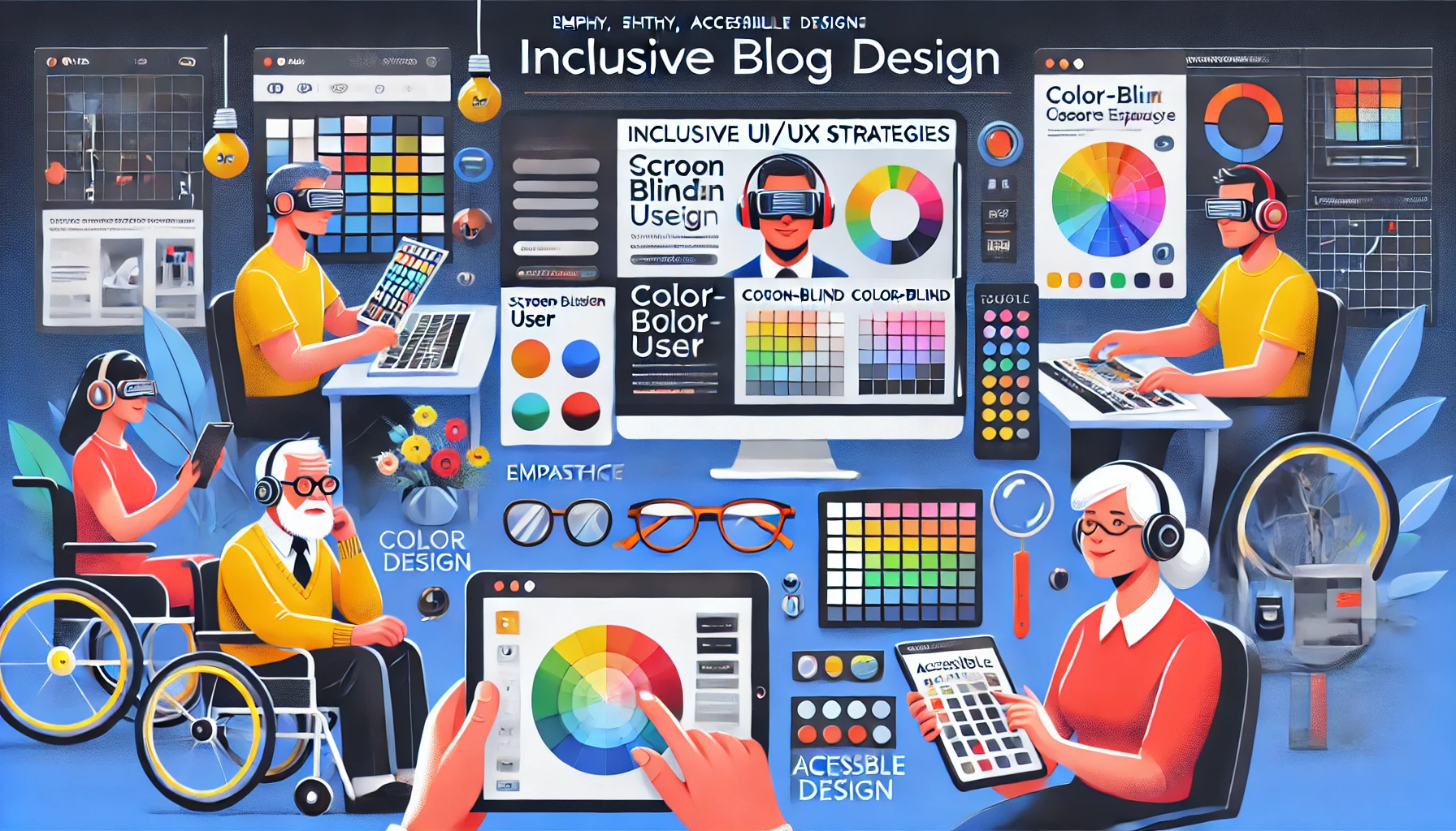
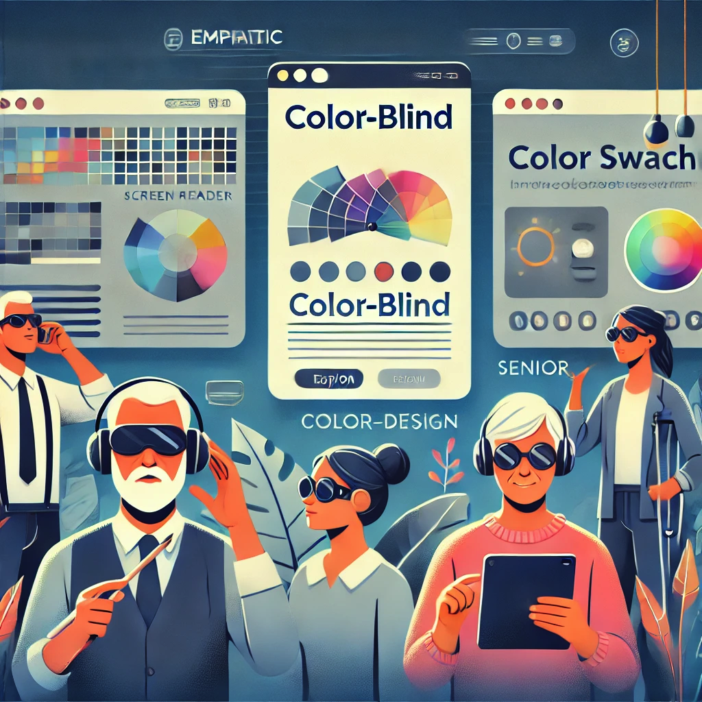
The internet feels universal only when it recognises that no two visitors experience the same page in the same way. While one user navigates confidently with a mouse and a 4K display, another relies on a screen reader that linearises content into spoken word, and yet another balances slow mobile data with limited technical know‑how. Inclusive design begins with empathy for this vast continuum of contexts. It treats impairments—whether permanent, temporary, or situational—as normal variations of the human condition rather than edge cases. Vision limitations, colour‑blindness, motor tremors, cognitive load, anxiety triggered by cluttered layouts, even the unfamiliarity a novice user feels when greeted with jargon‑heavy interfaces—all fit on the same spectrum designers must serve. By mapping personas, conducting moderated usability sessions, and auditing analytics for pain‑point patterns, teams reveal the subtle obstacles that exclude. Once those obstacles surface, everything from information architecture to micro‑interactions can be refined so that no user is forced to struggle or leave.
Building Accessibility into the Design Process
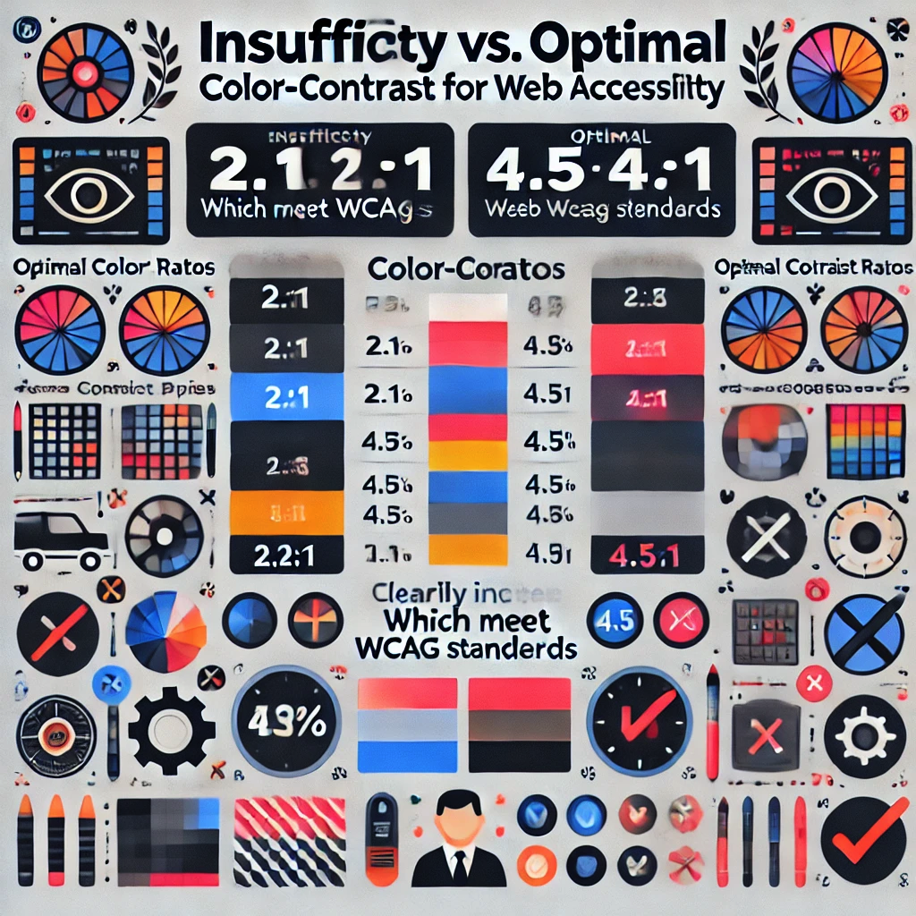
True accessibility is not a coat of paint added after launch; it is a constraint and catalyst woven through every sprint. Start with semantic HTML so assistive technologies inherit structure and meaning automatically. Choose colour palettes that maintain a minimum 4.5:1 luminance ratio to preserve readability for colour‑blind visitors and those in bright sunlight. Provide focus outlines that meet WCAG 2.2 guidelines, ensuring keyboard travellers see exactly where they are on the page. Wherever motion is introduced—parallax banners, loading spinners, micro‑animations—offer a “reduce motion” preference so vestibular‑sensitive users remain comfortable. Alt text should not merely describe what an image is but why it matters in context, turning a decorative hero shot into a narrative element a blind visitor can visualise. Form design requires both clear label association and forgiving validation messages, because nothing raises abandonment faster than cryptic red text that leaves a newcomer guessing what went wrong. Finally, continuous automated audits with tools such as axe‑core or Lighthouse must be paired with manual screen‑reader passes; only human ears can hear when an aria‑label truly makes sense. When every commit passes these gates, inclusive design stops being an extra task and becomes table stakes.
Balancing Simplicity and Power for Different Skill Levels
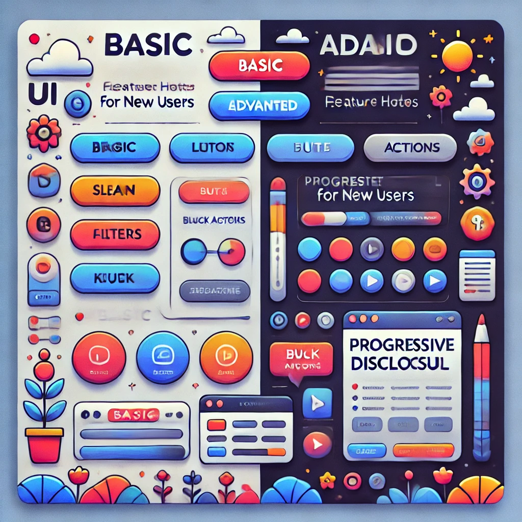
People do not share a single threshold of “tech‑savviness”; they arrive along a gradient. A first‑time smartphone user might feel overwhelmed by nested menus, while a seasoned analyst grows impatient when shortcuts are hidden behind “wizard” flows. The art of inclusive UX is offering a shallow learning curve without capping potential. Progressive disclosure is a powerful ally—surfacing only the most essential actions by default, yet revealing advanced filters, bulk actions, and keyboard shortcuts as confidence grows. Visual cues like step indicators, inline hints, and undo options allow beginners to experiment safely, whereas power users appreciate command palettes and ARIA‑labelled landmarks that accelerate navigation. Performance is part of this equation too: low‑memory devices and slow networks deserve responsive sites that stream critical content first and hydrate enhancements later. By instrumenting feature flags, designers can trial simplified variants against expert modes, measuring real engagement instead of guessing. When the same product welcomes someone setting up email for the first time and someone scripting API calls, it proves that accessibility is not only ethical—it is commercially smart.
Crafting such adaptable experiences is where Vadimages excels. Our multidisciplinary team merges WCAG mastery with conversion‑centred design, ensuring your platform delights audiences you may never have imagined while still meeting ambitious business KPIs. Through empathy‑driven workshops, rapid prototyping, and rigorous accessibility QA, we transform compliance checklists into competitive advantage. Whether you need a full redesign or strategic consulting, Vadimages turns inclusion into innovation.
If your organisation is ready to open its digital doors to everyone—regardless of device, ability, or experience level—connect with Vadimages today. Together we will build something every user can love and your metrics will celebrate.
Gamification is the art of incorporating game-like mechanisms into digital platforms, products, and services to stimulate user motivation and retention. When used effectively, it can transform an otherwise routine online experience into an engaging journey that keeps participants eagerly returning. These mechanisms can be as simple as awarding points for an action, displaying badges to highlight achievements, or adding a progress bar that traces a user’s journey toward a goal. Games have always thrived on the basic human desire for recognition, accomplishment, and progress, and these same psychological triggers can be harnessed in virtually any digital context, from educational apps to social media platforms. By tapping into intrinsic motivators—such as the drive to learn, the thrill of competition, or the joy of discovery—gamification can profoundly affect how people feel about interacting with your content.
Although concepts like points, badges, and progress bars are widely recognized, the layers of nuance behind their effective implementation are often overlooked. Leveraging gamification for maximum impact involves understanding core psychological principles and blending them seamlessly into the broader user experience. Some businesses adopt these mechanics as a novelty but miss the opportunity to craft truly immersive systems that inspire users to explore, participate, and contribute. Integrating well-designed gamified elements is not only about adding flair; it is about shaping behavior, deepening engagement, and making the online experience feel personalized and rewarding. When introduced thoughtfully, these techniques heighten excitement, foster brand loyalty, and cultivate a sense of shared community that resonates with participants long after they log off.
Vadimages, a leading web development studio, specializes in helping businesses integrate gamification strategies that go beyond superficial design tweaks. Our seasoned team understands the psychology of user engagement and is adept at weaving points, badges, and progress indicators into a cohesive digital ecosystem. By creating a website or application that resonates with your audience’s intrinsic and extrinsic motivators, we ensure that your brand stands out in an overcrowded marketplace, commanding attention and inspiring people to take meaningful actions.
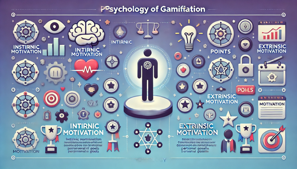
Unpacking the Psychology of Gamification
Human motivation is at the heart of every successful gamified experience. Intrinsic motivation springs from within and is fueled by curiosity or the satisfaction of learning a new skill. Extrinsic motivation, on the other hand, often comes from visible rewards such as points or tokens of accomplishment. Points, badges, and progress bars merge both types of motivation, creating an engaging blend that appeals to various personality types. Individuals who enjoy competition thrive on accumulating points and overtaking others on leaderboards, while those who prefer self-paced learning focus on achieving personal milestones symbolized by badges or tracked by progress bars.
When a user sees a progress bar that is halfway complete, a form of psychological tension arises called the Zeigarnik effect. The mind remains fixated on unfinished tasks. This mild discomfort pushes people to complete an action simply to relieve that sense of incompleteness. A well-placed progress indicator can be the difference between a user exiting your platform early and deciding to continue until they reach 100%. Meanwhile, badges activate a sense of achievement and social recognition. Obtaining a rare or noteworthy badge can improve a user’s self-image and foster a positive association with the platform. When these badges are displayed publicly, they also serve as a symbol of status that can encourage friendly competition and drive further engagement.
Points, in essence, attach a numeric value to actions that might otherwise be taken for granted. Posting a comment, watching a tutorial, or completing a profile can each earn a user a specific point value. Over time, points become more than digits; they turn into a tangible representation of a user’s investment in the platform. This helps create a sense of ownership and loyalty. People are more likely to remain active if they can see their accumulated points as a testament to their progress and expertise. By carefully calibrating the difficulty in earning points, platforms can maintain a delicate balance that encourages consistent participation without overwhelming newcomers or trivializing the rewards for longtime users.
Platforms that excel at gamification often embed these elements so seamlessly that people scarcely notice they are “playing a game.” Instead, they feel validated, motivated, and supported in their efforts to learn or share. An educational website that rewards students with incremental badges for each lesson completed encourages them to feel a sense of closure and pride. A social media app that displays a progress bar indicating profile completion inspires participants to supply more details about themselves, which can lead to richer interactions. In all these scenarios, well-executed gamification aligns user goals with platform objectives, laying the groundwork for sustainable, enthusiastic engagement.
At Vadimages, we study these psychological insights and transform them into practical design and development strategies. We take time to understand your audience demographics, behavior patterns, and emotional triggers. Then we translate these insights into tailored gamification solutions, ensuring that each point earned or badge awarded aligns with your brand identity and user experience blueprint. This is how we deliver platforms that not only look visually captivating but also encourage deeper user participation and long-term loyalty.
Implementing Points, Badges, and Progress Bars
The success of gamification hinges on how seamlessly these elements are introduced into the overall user experience. Too many points or badges can dilute their value, while progress bars that are too challenging may frustrate or discourage users. It is essential to calibrate each aspect to cater to multiple user archetypes. Some users jump into competition headfirst, always seeking to outshine others in a leaderboard. Others prefer incremental goals, feeling satisfied every time they level up or acquire a new badge. The key is creating an environment that respects and rewards different motivations while driving the platform’s main objectives.
A platform that relies solely on external rewards could inadvertently transform a pleasurable activity into a chore, leading to diminished intrinsic motivation. For example, if participants focus too heavily on earning points, they might lose sight of the original purpose, whether it is learning or socializing. To counter this, one should embed meaningful milestones and educational value into each gamified element. Badges can serve as markers of genuine skill attainment. Progress bars can reflect mastery of various competencies or steps in a creative process. Points can reward actions that contribute to the health and vibrancy of the platform, such as posting thoughtful comments or helping others with constructive feedback.
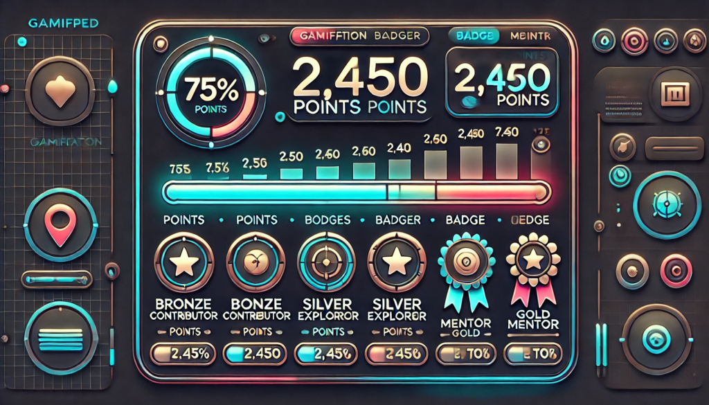
Below is a conceptual graphic element illustrating how progress, points, and badges might be showcased on a platform:
This simple visual representation shows how users can keep track of their progress through a progress bar, view their total points, and take pride in the badges they have earned. The badge showcase can be displayed prominently on a profile page or dashboard so others can see these achievements, driving further motivation and a sense of community recognition. By offering a snapshot of both short-term milestones and long-term accomplishments, you enable users to measure their ongoing journey and feel that each action they take is part of a meaningful sequence.
Vadimages, as a top-tier web development studio, excels at seamlessly integrating these gamification elements into modern, responsive designs that look and feel authentic to your brand. We offer end-to-end services ranging from conceptual strategy to user interface design, front-end development, and continuous optimization. Our team can implement dynamic point systems that adjust to user activity levels, tailor badges to highlight truly noteworthy achievements, and embed progress bars in strategic locations so they do not disrupt the flow of the experience. If you desire a more advanced approach, we can incorporate social features that let users compare scores with friends or share newly acquired badges on social media, thereby promoting user-driven growth. By collaborating with Vadimages, you unlock a wealth of expertise that ensures your platform’s gamification strategy is not just visually appealing but also psychologically sound and results-oriented.
Conclusion
Gamification is not a fleeting trend but a robust methodology for enhancing user engagement, participation, and long-term loyalty. By understanding core psychological drives—such as the appeal of incremental progress and social recognition—businesses can tap into elements that keep people returning, learning, and contributing. Points translate effort into measurable success. Badges celebrate milestones and expertise. Progress bars spark the motivation to push beyond incomplete tasks. When executed thoughtfully, these elements unify your user community, fostering an environment where curiosity, achievement, and connection flourish.
An effective gamification strategy requires more than superficial design changes. It demands an approach that marries psychological insight with technical know-how, aligning user needs with business goals. This is precisely what Vadimages delivers. Our experts approach each project with meticulous care, designing user journeys that incorporate well-balanced point systems, visually appealing badge collections, and intuitive progress indicators. We craft digital spaces where every interaction contributes to a larger narrative of growth and learning, so your audience remains inspired and loyal.
If you want to harness the power of gamification to energize your online platform, elevate your brand presence, and encourage repeat engagement, Vadimages is your ideal partner. Our web development studio will help you refine your objectives, identify the most effective gamification techniques for your unique audience, and build them into a cohesive, fully integrated digital environment. Whether you are looking to enhance an existing site or develop a new platform from the ground up, we can bring clarity, creativity, and cutting-edge expertise to every aspect of the project. Visit vadimages.com to learn more about our services, explore our portfolio, and discover how we can turn your vision of a gamified platform into a vibrant reality that users love.
Gamification works because it resonates with fundamental human drives. Points, badges, and progress bars tap into our desire to achieve, compete, collaborate, and grow. By weaving these elements into your digital ecosystem through expert design and thoughtful implementation, you can cultivate a thriving online community where user engagement, learning, and loyalty remain on an upward trajectory. Ultimately, these strategies reward both participants and platform owners, nurturing a mutually beneficial relationship that fosters continuous growth. Let Vadimages guide you toward that future, helping you stand out in an increasingly crowded digital realm and achieve your strategic goals through the transformative power of gamification.
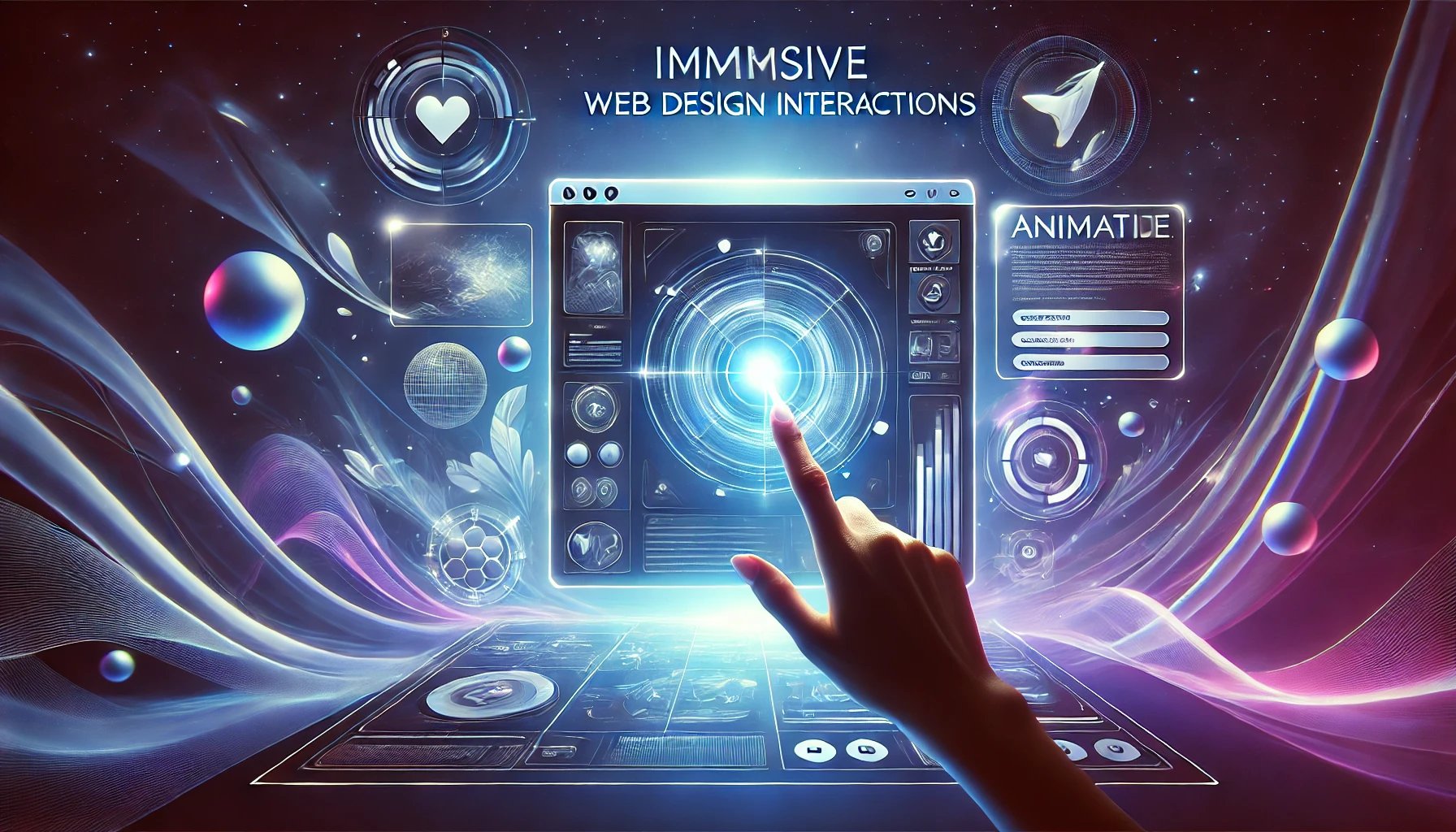
In a digital landscape where countless websites compete for attention, the finer details of interactivity and design can be the decisive factor that turns a brief visit into a memorable experience. Interactive elements that breathe life into a webpage—such as hover effects, micro-animations, and subtle transitions—do more than just add visual flair. They ignite curiosity, guide users toward key information, and foster a meaningful connection between brand and audience. By emphasizing immersive interactions, modern websites encourage exploration and keep users engaged for longer periods, transforming casual onlookers into active participants.
It can be easy to underestimate the importance of interactions that seem minor at first glance. After all, hovering over a button or noticing a small animated icon on a homepage can feel incidental. Yet, these micro-experiences are what shape our initial emotional response. They build a sense of trust and delight, showing visitors that the website they are exploring has been designed with care and precision. Small, thoughtful gestures—like a subtle shift in color when the mouse hovers over a clickable element—can simultaneously serve an aesthetic purpose while providing a navigational cue that improves usability.
Vadimages, a premier web development studio, understands the significance of these elements better than most. Our team is dedicated to crafting immersive digital environments that fuse form and function to create seamless user journeys. If you’re determined to push the boundaries of your online presence, Vadimages offers you the expertise required to incorporate the latest interactive design techniques effectively. We believe in making your brand stand out by blending creative vision with high-caliber technical execution, resulting in fluid, intuitive, and downright mesmerizing websites.
Before we explore these immersive interactions in detail, imagine stepping onto a webpage that feels alive. As you hover over images, text, or menu items, small animations guide you toward discovering more about the services or products offered. A button shifts gently in color, or an icon animates ever so subtly, drawing your attention where it needs to be. Transition effects glide smoothly between pages without abrupt jumps. Together, these elements whisper an invitation to explore—an invitation that often leads to deeper engagement and boosted conversions. When done with precision, these touches are not mere ornaments; they become crucial navigational markers and emotional triggers.
Vadimages proudly integrates these advanced interaction techniques into every project we undertake, ensuring our clients’ websites remain both contemporary in style and practical in function. We believe that a website is more than a static online placeholder—it should be a dynamic environment that entices visitors to interact with the brand narrative. By combining visually appealing aesthetics with carefully planned user flows, we make certain that every micro-animation, hover effect, or transition has a purpose that aligns with the larger business goals of each client.
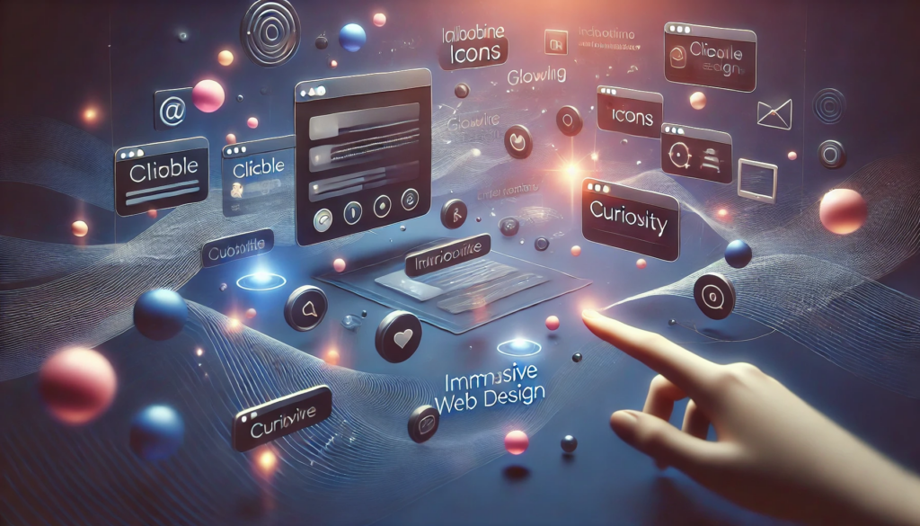
Below is a visual concept that captures the essence of these interactions at a glance. Picture a simple grid of clickable elements in a calm, minimalistic layout. As the user’s cursor glides over each box, an icon gently rotates or a soft glow appears around the border. In the center of the screen, a short micro-animation displays how a piece of text can expand or contract effortlessly, drawing attention in an elegant, almost playful manner. Meanwhile, transitions between sections occur in a fluid way, as though each element were part of a choreographed dance. Even in a static image, you can sense how these components would keep a user’s curiosity alive.
The Power of Micro-Animations
Micro-animations are small-scale movements or shifts in an interface. They can be as simple as a button darkening slightly when clicked or as sophisticated as a playful icon that transforms upon interaction. Despite their subtlety, micro-animations hold immense power because they work on a subconscious level. They create an aura of responsiveness, signaling to users that the website is dynamic and alive rather than static and unresponsive. This liveliness sends a message that the brand cares about every single detail, no matter how small.
The true magic of micro-animations lies in their capacity to maintain user interest. When you land on a webpage and notice a small shape morphing gently in the corner or an unexpectedly delightful movement when hovering over an otherwise ordinary element, your curiosity is piqued. You start to wonder: what else is hidden here? This desire to explore is precisely what micro-animations strive to achieve. Once you have someone’s attention, they are more likely to proceed further into your site, read more about your products, and ultimately become a paying customer.
Vadimages has found that micro-animations can be especially impactful when unveiling new product features or highlighting calls to action. Instead of bombarding the user with large banners and pop-ups, a more refined approach is to deploy micro-animations that subtly nudge the visitor in the right direction. These movements can show how a particular feature works in a brief loop, or gently emphasize important sections of the page that warrant closer inspection. The micro-animations themselves become part of the storytelling, driving engagement without overwhelming the overall design.
Another advantage is how micro-animations can visually guide a visitor through multi-step processes. If your site contains a sign-up form, for instance, short animations can confirm correct inputs, highlight mistakes, or even illustrate how a certain discount or benefit is applied. This interactive feedback reduces frustration and builds user confidence. By giving users immediate visual responses, you shorten the learning curve and reduce friction in the user journey.
In addition to practical utility, micro-animations elevate the user’s perception of a brand’s tech-savvy nature. When used judiciously, these small flourishes hint at a deeper level of sophistication in the brand’s identity. They suggest that the website’s creators went the extra mile to ensure an enjoyable and immersive experience. At Vadimages, we use micro-animations as subtle yet powerful threads that weave the brand story throughout the user’s entire journey. They help each webpage resonate with a distinct personality and sense of dynamism, setting the stage for richer, more rewarding interactions.
By seamlessly blending aesthetics and usability, micro-animations stay out of the way until they are needed, quietly enhancing usability and engagement. In the hands of skilled developers and designers—like those at Vadimages—these miniature visual cues can enhance brand storytelling, streamline navigation, and usher users smoothly toward conversion goals.
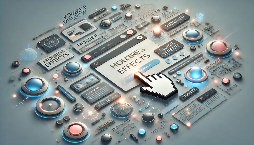
Elevating Experiences with Hover Effects
Hover effects, in many ways, are the gateway interactions that users encounter on a website. Hover your cursor over a link, image, or button, and there’s an instant visual change—perhaps a color shift or a slight enlargement. Although these effects have existed for quite some time, their potential for elevating a user’s experience remains immense when used creatively.
At their core, hover effects signal interactivity. They let visitors know that an element is clickable or worthy of deeper inspection. By doing so, hover effects also reduce confusion and frustration. From a design perspective, they present an opportunity to brand even the smallest elements of your site in a cohesive manner. The color or style shift during a hover can reflect a brand’s identity just as effectively as a logo or a header image.
Hover effects also play a major role in highlighting essential calls to action. For instance, imagine a prominent button urging visitors to “Learn More.” With a subtle glow effect or a gentle upward motion triggered on hover, users are instinctively drawn to click. The effect becomes a silent yet persuasive invitation.
Beyond guiding actions, hover effects invite exploration. People often hover over elements merely out of curiosity. If the effect that ensues is engaging—a slight movement or reveal of hidden content—that curiosity deepens. They want to hover over more elements, discover more hidden details, or unlock additional content. This sense of discovery fosters a feeling of control in the user, who navigates the page with a sense of personal agency.
For product-focused sites, hover effects can briefly display alternate product images, highlight specific features, or even provide quick textual details. This condensed preview helps users decide if clicking to learn more is worthwhile, streamlining their experience and saving them from unnecessary page loads. Minimal friction in exploring content can dramatically improve user satisfaction.
Vadimages incorporates hover effects in ways that blend cohesively with broader design schemes. We take into account each brand’s aesthetic—whether minimalist, bold, or playful—and tailor hover interactions to match. By aligning the style of these micro-interactions with the brand’s overall visual language, the user receives a seamless, unified impression. These meticulously designed experiences resonate at a subconscious level, lending a sense of harmony and polish to the entire site.
Hover effects also open the door to creative synergy with micro-animations and transitions. When layered together judiciously, they can transform an ordinary website into a self-guided tour of animated reveals and visual treats. Such synergy can appear as a subtle color fade combined with a small icon rotation, or a text reveal accompanied by a gentle scaling effect. This layering of interactions deepens user immersion.
Vadimages’ clients see firsthand how combining intuitive hover effects with thoughtful design can do wonders for engagement metrics. Bounce rates often decrease when visitors feel encouraged to explore, and conversions rise as calls to action become more noticeable and alluring. The outcome is a digital space that is not just visited, but truly experienced.
Achieving Seamlessness with Subtle Transitions
Transitions are the connective tissue that bind different sections of a website together. They range from the fade-in of elements as a page loads to the ways in which content slides into position when navigating between sections. Subtle transitions encourage continuous discovery by ensuring that changes within the interface do not feel abrupt or jarring. Instead, these transitions guide the eye fluidly, preserving the user’s sense of orientation and immersion.
Imagine visiting a site where each new section instantly snaps into place with no transitional effect. While this might be efficient from a purely technical standpoint, it can also feel disorienting, like sudden scene changes in a film. Now imagine the same site with well-timed transitions that allow each new element to appear with a gentle fade or slide. Not only does it look elegant, it also helps the user register the new content without losing context.
Vadimages knows that subtle transitions should strike a careful balance. If they are too fast or minimal, users might not notice them. If they are too dramatic, they might become a distraction or slow down the browsing experience. When executed properly, they serve as visual punctuation, signaling where one piece of content ends and another begins, or indicating how different blocks of content are connected.
One notable area where transitions shine is in storytelling or portfolio-style websites. When showcasing multiple projects or milestones, transitions can help create a narrative flow. Each featured piece glides into view, weaving together a cohesive story. Similarly, in an e-commerce environment, transitions can enrich the experience of moving from product categories to individual product pages, offering a sense of progression that feels almost cinematic.
To truly capitalize on the power of subtle transitions, it’s crucial to optimize performance. Slow transitions caused by bloated design can frustrate users more than enthrall them. This is why Vadimages prioritizes efficient coding practices and lightweight assets. Our developers meticulously test transitions across different devices to confirm they remain smooth and responsive. After all, an experience that excels on desktop but falters on mobile leaves users with an uneven impression.
When transitions are synchronized with hover effects and micro-animations, the result can be a deeply immersive environment that gently nudges users to continue exploring. These layered interactions encourage visitors to perceive the website as one continuous visual story, rather than a series of unrelated pages. By tying the brand narrative to these smooth visual cues, you cultivate a sense of cohesiveness that resonates with each visitor.
Vadimages embraces these advanced techniques to build websites that remain etched in users’ minds long after they leave. By integrating micro-animations, hover effects, and subtle transitions into an overarching design strategy, your brand can offer an innovative digital encounter. Every moment a user spends on your site can be elevated, from the first image they see to the final click that leads them to make a purchase, subscribe to a service, or fill out a contact form.
Conclusion
Designing immersive website interactions is about crafting an ongoing dialogue with your visitors. Micro-animations keep people engaged, hover effects pique their curiosity, and subtle transitions provide a smooth pathway through the digital environment. Together, they shape a user experience that is both intuitive and enchanting. When done right, these techniques create online spaces that users are eager to navigate and revisit.
At Vadimages, we believe that every user interaction—no matter how seemingly small—presents a valuable opportunity to reinforce your brand identity and form deeper connections with your audience. Our web development studio is committed to merging creativity with technical expertise, ensuring that each site we build achieves an ideal balance between aesthetic appeal and practical usability. If you aim to captivate your audience with innovative design strategies that spark exploration and loyalty, Vadimages is your partner in crafting experiences that resonate.
In a fast-paced digital world, it is easy to settle for the basics—a functional website that delivers information and nothing more. But for those who wish to stand apart and truly captivate their audience, immersive interactions are the key. By partnering with a seasoned team like Vadimages, you can transform your digital vision into a living, breathing online space that beckons users to linger, explore, and discover.
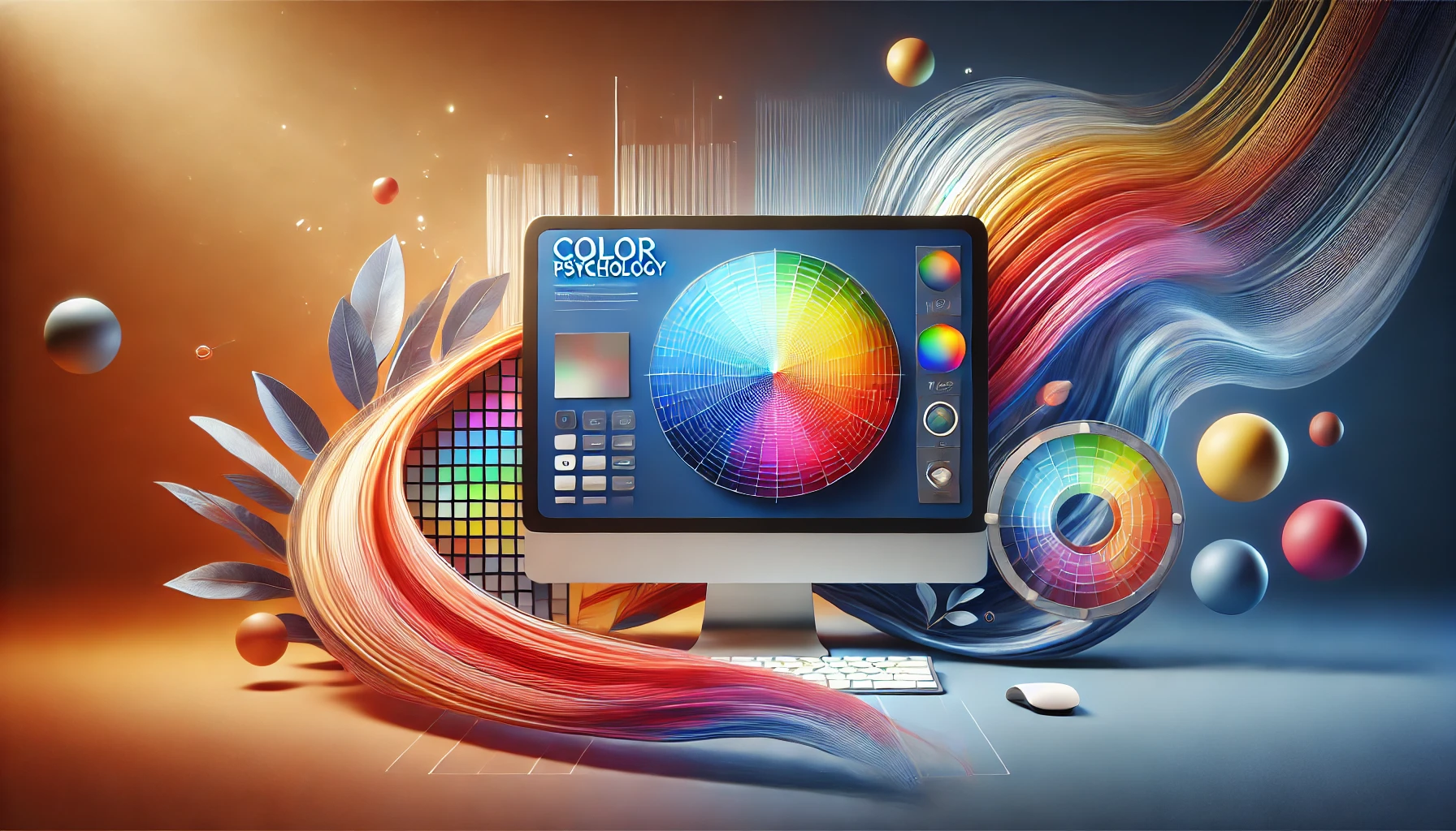
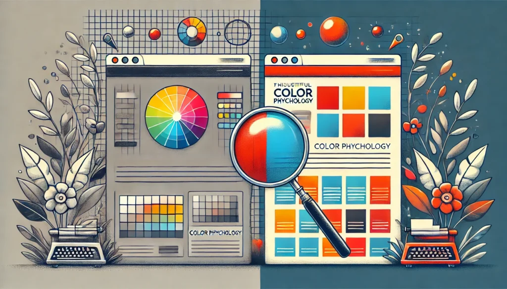
Color is far more than a decorative choice for your website. It acts as a powerful conduit for emotions, perceptions, and brand storytelling. When you land on a website, you often make immediate judgments based on color schemes before you even scan the text or explore the navigation. In web design, these judgments can translate into how trustworthy, approachable, and engaging a brand appears. Studies have long indicated that consumers rely heavily on visual cues, particularly color, to form their impressions of a product or service. This means that the right or wrong selection of colors can impact the trajectory of user engagement, brand loyalty, and ultimately, conversions.
Vadimages Web Development Studio understands how important it is for a business to communicate effectively through color. In a digital world overflowing with websites, apps, and online platforms, there is little room for bland or counterintuitive color choices. Our team at Vadimages has spent countless hours fine-tuning the color palettes for clients across various industries, ensuring that each brand message shines through the design. This blog post will unravel the significance of color psychology in web design, guide you in aligning those colors with your brand identity, and highlight how consistency builds trust in your audience.
Beyond theory, color psychology is also about cultural nuances and human emotional triggers. While red may signify passion or urgency in many Western cultures, it might symbolize good luck in Eastern contexts. Such subtleties cannot be overlooked when planning a global marketing or brand strategy. Understanding the undercurrents of color ensures that your brand resonates with the widest possible audience, leveraging color associations to build meaningful connections.
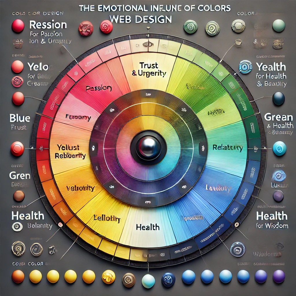
The Emotional Influence of Color in Web Design
Color triggers emotional and psychological reactions, often at a subconscious level. People may not realize it, but the reason they linger on one website and rapidly exit another can be partially traced to how comfortable or intuitive the color scheme feels. Warm colors like red, orange, and yellow can create sensations of vibrancy, energy, or urgency. Cooler hues such as blue, green, and purple often evoke calmness, reliability, and creativity. These associations are not random; they have been observed, studied, and documented across behavioral and marketing research.
When a visitor lands on your homepage, the banner or hero section typically occupies prime visual real estate. The color choices in that area can immediately set the mood. A finance or technology website might opt for various shades of blue and gray to reflect stability, trust, and innovation. An organic skincare brand might integrate greens and earthy tones to communicate nature, health, and sustainability. The central idea is to match emotional triggers with the brand’s core values and the user’s expectations.
Brand perception goes beyond mere attraction. If your website sells high-end fashion, a muted, sophisticated color palette can hint at luxury and exclusivity. Using overly bright, clashing colors might convey a sense of casualness or youthfulness, which could contradict the essence of a luxury brand. Similarly, if you’re targeting children’s products, a playful palette with brighter tones might be far more effective, as it resonates with an audience that appreciates cheerfulness and fun.
Cultural context also comes into play. While white is often associated with purity in Western cultures, it can symbolize mourning in others. A brand targeting an international audience must be aware of the symbolic weight color carries in different parts of the world. By proactively studying these nuances, you can avoid unintended missteps that could alienate potential customers.
These considerations are not confined to backgrounds and headings. Designers also need to think about how color influences the action elements on the website, such as call-to-action buttons, forms, and navigation menus. A button in a contrasting color can guide a user’s eye directly to the place you want them to click, but if that color also evokes feelings of danger or discomfort, it may create hesitation. Subtle variations in saturation, brightness, and hue can dramatically shift user behavior. By working methodically and testing different color variations, brands can hone their websites for optimal engagement.
Aligning Colors with Your Brand Identity
A successful web design doesn’t randomly pick a color palette. Instead, it stems from a brand’s personality, mission, and overall visual language. Building a color palette starts with understanding your brand identity. If your brand is known for creativity, using bold contrasts and unexpected color combinations can underscore that imaginative spirit. If your image is rooted in tradition and heritage, subdued tones or timeless color schemes can reinforce that narrative.
At the core of brand identity lie elements like your logo, typography, and brand guidelines. These components interact with color to form a cohesive design. Consider how the color of your logo can determine or at least heavily influence the rest of your palette. A bright and sunny logo might look out of place on a website drenched in dark, somber shades, unless there is a strategic intention to create that contrast for dramatic effect. Consistency across all channels, including print materials, social media graphics, and signage, cultivates a sense of familiarity and trust.
Color is also important in shaping user pathways. If your brand is particularly vibrant, you might use those signature colors sparingly so they stand out against neutral backgrounds. This approach can help key elements like calls to action or important product highlights pop into the user’s focus. On the other hand, if minimalism defines your brand, integrating white space and subtle color transitions can create an environment of understated elegance. The challenge is striking the right balance, ensuring that your brand colors neither overwhelm nor underwhelm the user.
When deciding on the final palette, testing is invaluable. Gathering feedback through usability studies or A/B testing can reveal whether users find a certain color pleasing or off-putting. Audience segments might have unique preferences, especially if you operate in multiple markets or industries. The insights gleaned from such tests can inform revisions to color choices or the broader web design concept. Iteration is often part of this journey. The color scheme you start with might not be the one you end up implementing if you discover certain issues with readability, cultural connotations, or brand mismatch.
At Vadimages, we’ve found that small tweaks in color—such as adjusting the shade of a primary color by a few degrees—can make a significant difference in how users feel and behave on a website. Our process often involves multiple design prototypes to capture the nuanced interplay between color, typography, and layout. We consider emotional cues, brand alignment, and user experience fundamentals to craft color strategies that help businesses like yours stand apart in competitive digital landscapes.
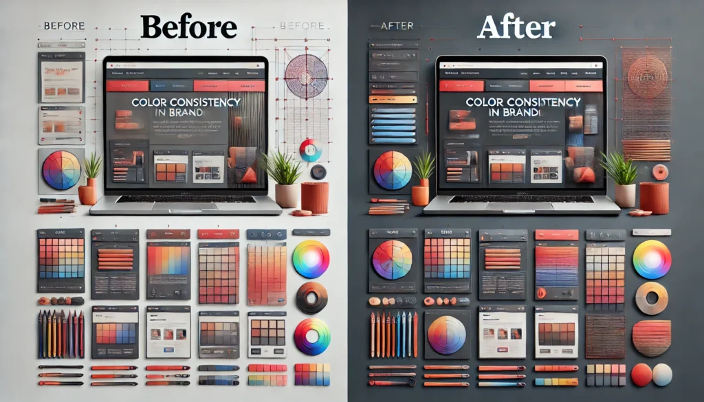
Achieving Cohesion and Consistency
A cohesive color scheme means your brand looks and feels the same across every page, landing, or subdomain. Visitors should not be confused about which website they’re on or which brand they’re engaging with. Cohesion isn’t about using the same exact shade everywhere; rather, it involves harmonizing accent colors, secondary colors, and background shades in a way that everything feels unified but not monotonous. An accent color might appear in headings or icons, while a secondary color takes on a role in navigation elements.
At the same time, maintaining consistency doesn’t mean sacrificing creativity or variety. Strategic variation in color can emphasize new sections, highlight updates, or guide user attention to calls to action. Designers often utilize color theory principles, like complementary or analogous color schemes, to ensure that variations remain visually pleasing. A monochromatic approach can also work for minimalist brands seeking a sleek, modern look, provided that each shade is purposefully chosen to differentiate content sections.
Even with a sophisticated color scheme, your website should be accessible. Some users have color vision deficiencies, and ignoring their experiences can alienate a portion of your audience. Ensuring enough contrast between background and text improves readability for everyone, not just those with visual impairments. Paying attention to color contrast guidelines can also enhance the overall aesthetic, making design elements look sharper and more intentional.
Incorporating graphical elements is a highly effective way to underscore your brand’s color palette. Imagine a diagram or banner that showcases your primary and secondary colors arranged in a stylized color wheel. This visual reference can guide users in understanding your brand’s core values at a glance. Another approach could be an interactive color mapping graphic placed on your About or Brand Story page, where visitors can hover or click to learn how each color ties into your mission and values. These creative design choices allow for storytelling that goes beyond text, transforming your brand colors into a narrative device.
Below is a conceptual example of a color wheel diagram that might appear on a design-focused website. It visually arranges warm and cool tones, with your brand’s primary color at the center. Each slice could be labeled with text describing the emotional connotation of that hue. This visual approach not only helps visitors understand the rationale behind your brand palette but also leaves a memorable impression of thoroughness and intentionality.
         (Warm Tones)
             Red
              |
  Orange  ——— [Brand Color] ———  Purple
              |
             Blue
         (Cool Tones)
In such a layout, the brand color stands as the defining element, linking all complementary or analogous colors around it. By illustrating the choices your brand has made, you create transparency and a bit of educational content that visitors can appreciate. This also helps establish trust and positions you as a knowledgeable, detail-oriented brand.
Many businesses fail to realize that color consistency goes hand-in-hand with professional appeal. When your online storefront, marketing emails, social media posts, and print materials all convey a unified color experience, potential clients are more likely to view you as authoritative and reliable. The psychological effect of consistency fosters brand recall. People start associating your particular shade of green or blue or red with your offerings, values, and style. Over time, this association cements your identity in the minds of consumers, translating into loyalty and advocacy.
If you ever find yourself in need of expert guidance to refine your existing color palette or to develop one from scratch, remember that Vadimages is here to help. Our web development studio prides itself on delivering thoughtful, research-driven design solutions. By partnering with us, you can alleviate the guesswork and benefit from a meticulous, comprehensive approach to color. We ensure that every hue on your site aligns seamlessly with your brand message, setting you up for lasting success in the digital sphere.
When you are ready to transform your website’s visual identity and make a bold, memorable statement through color, Vadimages is prepared to provide custom solutions for your brand. Our expert team brings years of experience in web development and design, using color psychology to shape user perceptions and craft memorable online experiences. Visit Vadimages to learn how we can help you build a site that captivates visitors at first glance and keeps them engaged for the long haul.
Whether your brand image is innovative and vibrant or traditional and timeless, color lies at the heart of web design’s power to influence. Deliberate, research-backed palettes can speak volumes about your brand. By understanding color psychology, aligning hues with your identity, and ensuring cohesion across platforms, you create an environment where visitors feel intuitively connected to your brand message. The next time you embark on a web redesign or launch a new product, remember that color is more than a stylistic detail. It is a foundational element that shapes user emotion, invites exploration, and ultimately forges enduring brand relationships.
User experience design has never been more critical for turning curious visitors into loyal customers. With countless competing websites and ever-shrinking attention spans, only the most user-friendly platforms can stand out. A well-crafted user experience (UX) is about more than just aesthetics. It is about guiding people toward meaningful interactions, anticipating their needs, and showing them they are valued. When a visitor lands on your website, every detail matters, from the color scheme and typography down to the placement of navigation menus and calls to action. These small, carefully orchestrated elements add up to a seamless journey that entices potential customers to take the next step.
Modern UX design is driven by personalization, intuitive navigation, and strategic layouts. Personalization resonates with users by presenting content that speaks directly to their needs or interests. Intuitive navigation ensures that no one feels lost while exploring your offerings. Strategic layout practices bring order to all elements on a page, making it easy to locate the most relevant information. Taken together, these trends can significantly increase your conversion rate and build trust in your brand’s professionalism. When done correctly, each aspect complements the others, creating a holistic experience that visitors remember. The objective is to create a site where everything feels in sync, from the moment your home page loads until a purchase or sign-up is complete.
At the forefront of implementing these trends is Vadimages Web Development Studio, accessible at vadimages.com. We combine creativity, user psychology, and innovative technologies to build websites that not only look impressive but also keep visitors engaged. By blending personalization strategies with streamlined navigation and carefully thought-out layouts, our team ensures that your site becomes a powerful tool for growth. Whether you run a small business, an expanding startup, or an established organization, Vadimages tailors every solution to your brand’s identity and target audience.
Without further ado, let us explore three of the most essential UX design trends of the moment: personalization, intuitive navigation, and strategic layout practices. These insights will help you understand how the world’s leading brands transform casual browsers into dedicated clients. Along the way, you will see why these trends are so influential, how to apply them effectively, and how Vadimages can partner with you to make your vision a reality.
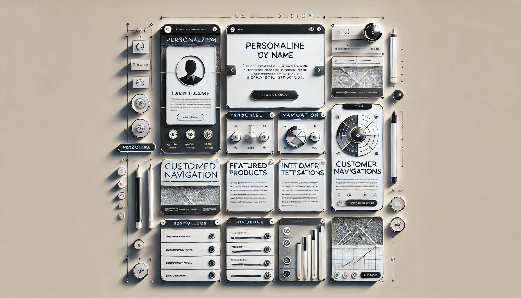
Personalization for Deeper Engagement
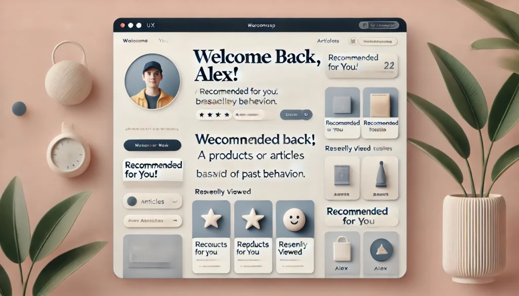
Personalization is a driving force in modern UX design. The most successful websites make visitors feel recognized by delivering content and experiences that reflect their preferences, behaviors, or demographics. This can manifest in small touches or robust data-driven mechanisms. Even a simple greeting that addresses the user by name can set a website apart from competitors that remain impersonal. Advanced personalization techniques dig deeper, analyzing browsing patterns, past purchases, or engagement metrics to tailor each session.
When users see relevant product suggestions, recommended articles, or reminders that relate to their unique journey, they are more inclined to explore further. They might even share these experiences with friends and family who would appreciate the same level of personalization. By leveraging data effectively, brands can create a sense of exclusivity and belonging. Visitors no longer feel like they are in a generic environment. Instead, they sense that the site is anticipating their interests and guiding them efficiently toward products or information they might enjoy.
When executed properly, personalization enhances loyalty. People appreciate platforms that simplify their search process, remembering their preferences so they don’t have to manually search every time. This reduces friction, shortens decision-making, and fosters positive emotional connections. The technology behind these experiences can range from simple cookies storing user data to machine learning systems analyzing patterns in real time. Yet in all cases, the human touch remains paramount. Even the most advanced algorithm must be grounded in empathy.
Vadimages Web Development Studio incorporates personalization elements into every website we develop, aligning them with the brand’s tone and audience expectations. The result is a personalized environment that feels as natural as a conversation. We believe personalization is the cornerstone of engagement and eventually drives conversions. When done correctly, it produces more than just sales; it produces long-term brand advocates. Whether you need a simple recommendation engine or a complex data-driven personalization pipeline, Vadimages has you covered.
Intuitive Navigation as a Guiding Force
No matter how brilliant your content or how persuasive your calls to action, if users cannot find what they need swiftly, they will leave. This is why intuitive navigation stands as one of the most powerful ways to boost conversions. Good navigation acts like an unobtrusive tour guide, revealing information logically and ensuring no one ever has to stop and wonder how to get from one page to the next. A visitor can instantly grasp your site’s content hierarchy, thanks to a clean, concise menu and clearly labeled sections.
Modern users expect a frictionless path, whether they are on a phone, tablet, or desktop. A well-planned navigation system adapts to different screen sizes, ensuring that your site remains user-friendly anywhere and anytime. The simpler the structure, the easier it is to keep people engaged. Subtle design cues like highlighting the current page or using contrasting colors for important links create subconscious signposts, reassuring visitors that they are on the right track.
Navigation design also interacts closely with personalization. For instance, returning users might benefit from personalized shortcuts or saved searches. Sub-navigation menus can dynamically adjust based on previous browsing behavior, making frequently accessed pages more visible. But customization should never compromise clarity. Even if the site adapts to user preferences, the underlying structure should remain consistent so as not to disorient new visitors or those who switch devices.
Vadimages refines navigation through rigorous planning, wireframing, and user testing. Our team conducts in-depth consultations to understand your brand’s core services and information architecture. We then translate that into intuitive menus, well-labeled categories, and a consistent navigational style. Every part of the user’s journey is meticulously mapped, so there are no dead ends or confusing branching paths. The goal is to ensure visitors always know where they are, where they can go next, and what to do if they need help.
Strategic Layout for Seamless User Journeys
Alongside personalization and navigation, layout is a vital piece of the puzzle. Even a site with fantastic content and strong brand identity can lose potential customers if its layout is cluttered, disorganized, or fails to direct users’ attention effectively. Strategic layout relies on design principles like visual hierarchy, spacing, and consistent styling to guide the eye and frame information in a digestible way. It orchestrates text, images, and interactive elements in a way that feels both balanced and purposeful.
The concept of the visual hierarchy is particularly influential. By using varied font sizes, contrasting colors, or whitespace, designers can subtly indicate which elements are most important. Headlines command attention, subheadings provide further clarity, and body text elaborates without overwhelming. A well-considered hierarchy encourages readers to scan pages quickly before deciding to dive deeper into specific content. If everything is placed correctly, the path from “curious newcomer” to “engaged customer” becomes a matter of simple clicks.
Layout best practices also involve responsiveness. A design that looks impeccable on a widescreen monitor should retain its elegance on a smartphone. This might mean transforming a multi-column arrangement into a single-column feed or repositioning sidebars and menus to keep them accessible. Users should never have to pinch and zoom or scroll horizontally to view critical content. A consistent, visually appealing experience across devices cements trust and loyalty.
Calls to action (CTAs) deserve special attention in any layout strategy. These elements, whether they are buttons, links, or forms, should stand out without clashing with the overall aesthetic. Placing them at logical points—such as the middle or end of a relevant paragraph—can capture users’ interest when they are most inclined to convert. Consistency is also key. Employing the same color or style for CTAs throughout your site ensures that visitors quickly recognize where they can take the next step, be it starting a free trial, adding a product to their cart, or signing up for a newsletter.
At Vadimages, we consider layout an art form that merges branding, user psychology, and the latest design standards. Our approach begins with a thorough analysis of your goals and target audience. We then sculpt a layout that organizes information from broad to specific, always aiming to create a natural flow that matches users’ thought processes. A clear, consistent style is maintained from the homepage to the contact form, maximizing familiarity and reducing confusion. Each block of content is evaluated for its importance and the role it plays in the overall user journey. From the brand’s vantage point, this approach not only magnifies conversion rates but also allows for expansions or redesigns without compromising the brand image.
We do all of this with advanced development techniques in mind. Our developers integrate layout best practices into well-structured, efficient code that loads fast and stays robust under heavy traffic. Every second of page load time matters for engagement and conversions. By optimizing the layout with performance in mind, your site remains sleek and responsive. This technical excellence, combined with a human-centered approach, has made Vadimages a trusted partner for businesses that seek an online presence capable of captivating and converting visitors.
At the intersection of personalization, navigation, and layout lies the secret recipe for a powerful UX: your site welcomes visitors, guides them smoothly through content, and captures their interest until they decide to take action. When every element is meticulously crafted, users are more likely to linger, explore additional pages, and ultimately complete a desired transaction.
Along the way, they gain confidence in your brand and appreciate the convenience offered by a user-centric design. They remember the experience you provided, and they are far more likely to return or recommend it to others. By understanding these UX trends and implementing them thoughtfully, your website evolves into an interactive brand ambassador, working around the clock to convert leads into loyal customers.
If you want to see this level of finesse on your own website, consider partnering with Vadimages Web Development Studio. Our team of designers, developers, and strategists brings a wealth of expertise in building sites that break through the noise. No matter your industry, we bring the same commitment to accessibility, efficiency, and conversion-focused design that defines our reputation. Our goal is to help you create a modern digital presence that captures hearts, minds, and wallets in a genuine, sustainable way.
Picture a website that recognizes returning customers by name, offers them curated product suggestions, and organizes its content so well that users never feel the frustration of aimless searching. Imagine calls to action that stand out at precisely the right moment, prompting a click or a purchase almost subconsciously. Envision your brand forging stronger relationships with every page load, all thanks to a design that demonstrates you value each visitor’s time and interests. That is the result of personalization done right, intuitive navigation that eases every step, and a strategic layout that presents content and CTAs where they can make the biggest impact.
Vadimages transforms these ideas into tangible realities. By melding proven UX patterns with the unique voice of your business, we ensure your website not only looks stunning but also achieves its primary objective: turning visitors into satisfied customers. Our collaborative approach keeps you in the loop from initial brainstorming to final deployment. We identify your goals, research competitor landscapes, develop wireframes, fine-tune color palettes, conduct usability tests, and refine until you have a product that meets your conversion targets and delights your audience.
UX design is not a static field. Trends evolve, and consumer preferences shift. That is why the commitment to ongoing improvement is crucial. As you gain insights into user behavior, you can refine personalization algorithms, reorganize or rename navigation menus, and experiment with new layout arrangements to optimize performance. The combination of data-driven analytics and creative thinking keeps your site fresh and relevant. When you partner with Vadimages, you gain a long-term ally that will help you navigate these changes, ensuring your online presence always aligns with the best current practices.
Your users deserve a site that feels like it was built just for them, guiding them through every interaction seamlessly and presenting every piece of information with clarity. These fundamental UX principles—personalization, intuitive navigation, and strategic layout—are not merely fleeting trends. They form the backbone of contemporary web design. They differentiate websites that struggle for attention from those that thrive with repeat visits, recommendations, and sustained growth. The question is not whether your website can afford to adopt these strategies, but whether it can afford not to.
When you are ready to offer your customers the user experience they expect and deserve, you know where to turn. Visit vadimages.com to learn more about our full spectrum of web development and design services. Our portfolio showcases diverse projects, from sleek corporate sites to vibrant e-commerce platforms. Each one stands as a testament to our philosophy: user experience is central to any successful online venture. By working closely with you to understand your brand identity and target audience, we craft websites that look remarkable and perform even better.
Whether your priority is driving sales, building a community, or simply making an unforgettable impression, an outstanding user experience will amplify your reach. Start by embracing personalization to show you care about each visitor’s unique needs. Structure your navigation so clearly that no one feels lost. Organize your layout so expertly that browsing becomes a pleasure rather than a chore. Then watch as your conversion rates climb, your engagement flourishes, and your brand reputation soars.
Vadimages Web Development Studio is standing by to guide you through every phase of this transformative journey. Harness the power of advanced technologies, honed design philosophies, and an unwavering commitment to quality. Embark on a quest to redefine what your website can achieve, and invite your audience into an environment that feels custom-built for them. This is how you turn visitors into customers, and customers into brand loyalists. This is how you achieve the next level of success in the digital age.
Establishing a cohesive brand identity in the digital realm has become an essential pursuit for businesses of every scale, from start-ups seeking to stand out in a crowded marketplace to established enterprises aiming to reaffirm their values. In a world where online presence can determine success or struggle, brand identity is more than a logo or color palette. It is the embodiment of what you stand for and how you want to be perceived by audiences across various platforms and media.
When individuals encounter a brand repeatedly and recognize its distinct personality, they begin forming a trust-based connection. This rapport stems from consistent design elements, clear and authentic messaging, and images that reinforce the company’s narrative. Yet forging that level of consistency requires a strategic and holistic approach. Every element of your online presence, from the visuals on your homepage to the tone in your email marketing campaigns, sends a message about who you are. It is the sum of these messages that influences brand perception and prompts a potential customer to click, subscribe, buy, or become an advocate.
In essence, achieving brand cohesion is both an art and a science. It demands creativity, to give your identity a unique flair and memorable style, and a systematic approach, to ensure every facet of your digital presence remains true to your values, voice, and aspirations. One brand might radiate warmth with earthy tones and heartfelt language, while another exudes high-tech precision with clean lines, minimalistic layouts, and succinct copy. Though they differ in execution, both are examples of how unified branding can speak volumes in seconds. Consistency across platforms not only helps your audience quickly recognize and understand your brand but also fosters emotional ties that can lead to long-term loyalty.
Crafting this cohesive digital identity is no small feat. It involves a focused design strategy, a well-thought-out brand voice, and carefully selected imagery that complements your overarching narrative. This process might be intricate, but the rewards are considerable. With the right balance of design elements, messaging, and imagery, your online presence can become a magnet for your ideal audience, inspiring trust and fueling growth. By delving deeper into these components and exploring how they work together, you can discover how to set your brand apart.
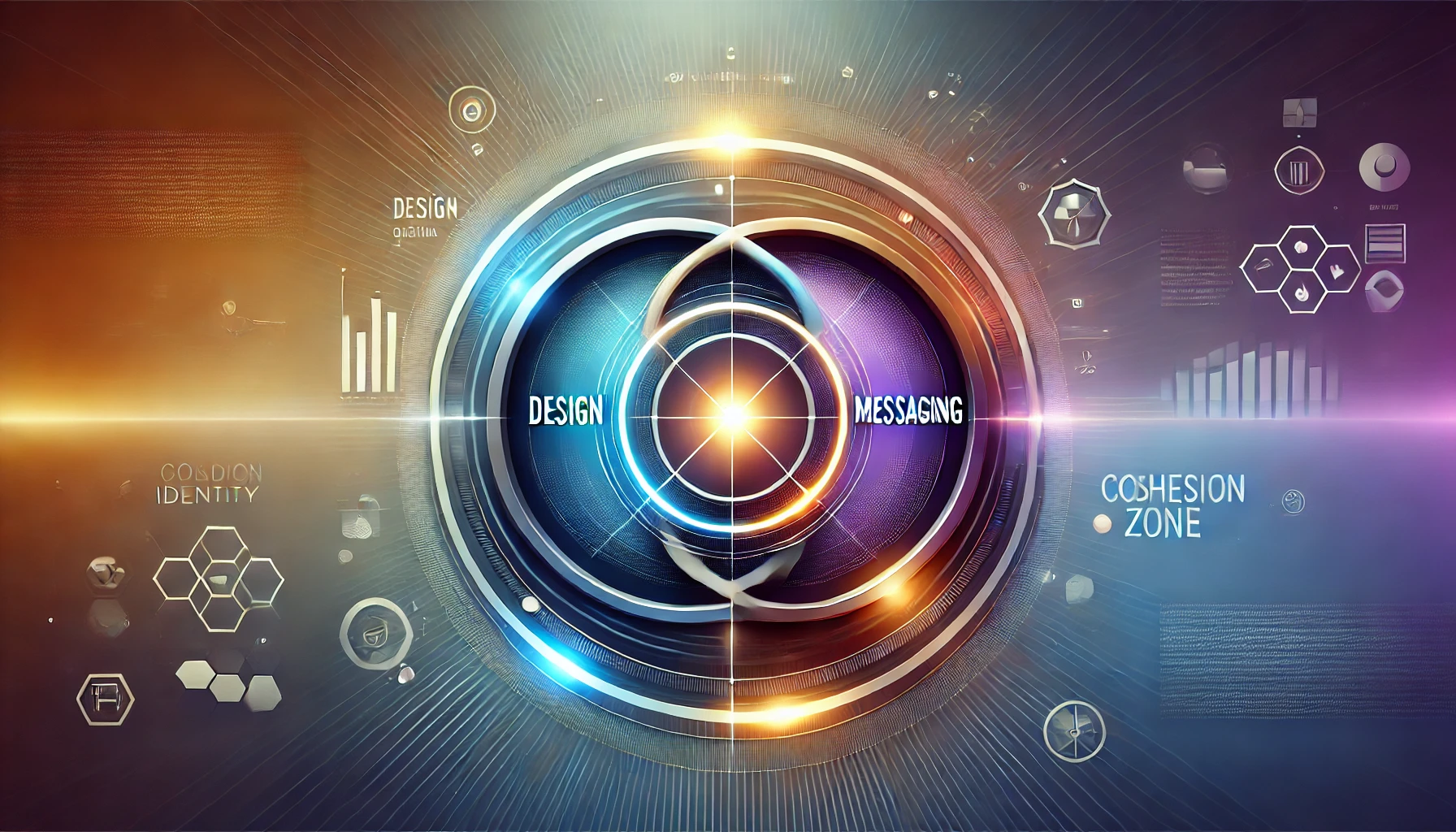
Below, you will find a conceptual graphic element that illustrates the intersection of these three pillars of brand identity. Picture a three-part Venn diagram, with each circle representing one core dimension of your brand—Design, Messaging, and Imagery. Where they overlap in the center is the sweet spot of brand cohesion: the place where consistent visuals, compelling communication, and evocative pictures unite to captivate and convert your audience into brand ambassadors.
In this simplified visualization, each circle intersects with the other two because none of these elements can thrive in isolation. Design without engaging copy can feel cold or impersonal. Messaging without consistent visuals might confuse your audience, making it difficult for them to remember or trust your brand. Imagery without an overarching narrative can be beautiful yet hollow, failing to support a deeper brand message. Achieving harmony in all three areas fosters an environment where your brand feels genuine and memorable, forming a robust and resonant identity.
The Power of Unified Design
Design represents the first facet of brand cohesion. Your website layout, color scheme, typography, logo placement, and even the spacing between elements collectively tell a story. These design choices form the foundational layer that sets the tone for everything else. People are visually oriented, and first impressions often hinge on design before they have even read a single word of your website copy.
Think of your website as a digital storefront. When a visitor steps inside, they will instinctively notice the ambiance before any details. If your design is disorganized, your brand will seem careless or unreliable. If your design is visually inconsistent—employing multiple color palettes or drastically different styles across pages—visitors may question the professionalism or authenticity of your business. In contrast, if your design is clean, consistent, and user-friendly, your audience senses a level of credibility right away. A unified visual experience subtly tells them that you have paid attention to detail, that you value quality, and that you understand the importance of consistency in building trust.
Moreover, design can convey brand personality. Bold color contrasts and edgy typefaces might suggest innovation and adventure. Soft hues and refined, elegant fonts may speak to sophistication and timelessness. The secret lies in ensuring these design elements align with the core values of your brand and remain consistent across your website, social media profiles, email campaigns, and promotional materials. If your brand identity leans toward creativity and spontaneity, your entire design ecosystem—from website layout to newsletter templates—should reflect that flair. Conversely, if your brand is about stable, time-tested solutions, your design should mirror that reliability and security.
To achieve a harmonious look, brands need design guidelines that outline proper usage of logos, brand colors, fonts, and visual motifs. When these guidelines are adhered to from your homepage to your social media thumbnails, your brand becomes instantly recognizable. These rules may seem restrictive at first, but they actually provide a clear framework for creative expression. Rather than stifling innovation, design guidelines channel it toward solutions that speak the brand language consistently. This approach is the backbone of an enduring brand identity—one that remains coherent while allowing for fresh expressions within established brand parameters.
The Role of Messaging and Tone
While design captures attention, messaging anchors perception. The words you use, the tone you take, and the stories you tell reveal your brand’s character. Messaging extends beyond mere taglines. It includes the text on your homepage, product descriptions, blog posts, email newsletters, and every snippet of content you share on social media. The aim is to communicate a personality that resonates with your audience and makes them feel seen and understood.
Brand voice and tone can range from playful to authoritative, from empathetic to no-nonsense. What is crucial is that it remains consistent across platforms and mediums. If a brand uses casual, friendly language on social media but shifts to stiff, formal language on its website, users may find the experience jarring and question the brand’s authenticity. A coherent tone, on the other hand, reassures readers that the brand knows itself and is confident in how it presents its values.
Authentic, consistent messaging builds trust by painting a clear portrait of who you are. This predictability becomes comforting for your audience. They know what to expect whenever they interact with your brand, and that reliability encourages loyalty. Over time, this sense of reliability can mean the difference between a casual reader who visits your site once and a dedicated advocate who shares your articles and recommends your products. When your narrative remains steady, it becomes the silent handshake that greets your audience at every touchpoint, reassuring them of the stability and sincerity behind your brand.
The stories you tell are another powerful element of messaging. Brand stories help humanize a business by highlighting the people, passions, and experiences behind the scenes. They offer a glimpse into values, missions, and struggles that speak to the aspirations and challenges of your audience. People relate to stories because they are grounded in emotion. By embedding narrative elements into your content, you transform your brand from a distant entity into an approachable presence. This is how an audience moves from mere observers to enthusiastic supporters of your cause.
Ensuring that every written piece—website copy, blog post, social media caption, or email campaign—upholds the same brand voice is a meticulous process. But when done well, the synergy between design and messaging can significantly enhance brand recognition. A unique color palette might catch a visitor’s eye, but it’s the comforting familiarity of your voice that fosters a deeper connection. Aligning visual branding with a consistent brand voice can lead to an online ecosystem where each element—from your site’s color scheme to the words on the page—affirms your identity and invites people to stay, explore, and participate.
Bringing It All Together With Striking Imagery
Visual storytelling is not limited to layout and typography. Imagery—photographs, illustrations, videos, and graphics—plays an equally significant role in reinforcing brand identity. Images evoke immediate emotional responses that can outpace even the most carefully chosen words. They amplify your brand’s narrative by showing, rather than telling, the spirit of your brand values and message.
Quality and style of imagery should align with the overall design concept and brand voice. If the brand voice is lighthearted and casual, whimsical illustrations or vibrant photos of people enjoying themselves might be more effective than formal, staged shots. Conversely, if your brand voice is refined and corporate, polished and professional images can reinforce that identity. The emotional resonance of these images also matters. A brand focusing on environmentally friendly products might feature lush landscapes or everyday people interacting with nature, while a tech brand might spotlight sleek digital interfaces and futuristic cityscapes.
Imagery can enhance user engagement by offering a quick window into what your brand stands for. In a split second, a visitor’s subconscious processes the colors, composition, and content of an image. This is why stock photos and random visuals that do not match the design or messaging can work against brand cohesion. The goal is to choose visuals that blend seamlessly with your written content and overall layout, creating a cohesive tapestry that immerses your audience in the essence of your brand.
The brand’s digital platforms should maintain uniformity in their visual approach. From hero images on the homepage to background photos in blog posts, consistency in color grading, lighting, and theme supports a sense of harmony. Rather than sprinkling images arbitrarily, think of them as key story elements that build or reinforce a narrative. Every image can be an invitation for the visitor to experience your brand’s world. The more consistently you curate imagery, the more robust that world becomes.
At this point, we circle back to the idea of the intersection among design, messaging, and imagery. If design sets the atmosphere and messaging conveys values and personality, imagery has the power to breathe life into your brand’s story. When all three components work in unison, your brand presence feels integrated and meaningful, which strengthens credibility and recognition. This synergy can ultimately become a compelling force, leading to an uptick in engagement, loyalty, and conversions.
In building an online brand identity that resonates, it helps to partner with experts who can translate your vision into a coherent digital reality. Vadimages is a leading web development studio specializing in creating immersive online experiences that reflect your brand’s true essence. Our team of designers, developers, and strategists ensures that every aspect of your website, from its aesthetic layout to its impactful imagery and persuasive messaging, remains consistent with your brand identity. By marrying artistry with technology, we help businesses stand out in today’s digital landscape and forge lasting connections with their audiences.
Imagine a world where every visitor to your online platforms understands not just what you offer but why you do it. Picture them scrolling through your website or social media feed and instantly sensing your brand’s spirit through harmonious design, genuine storytelling, and evocative imagery. That is the objective of cohesive branding. It is an immersive experience that grows your online presence and nurtures enduring relationships with customers, advocates, and fans.
A strong, well-defined brand identity filters through every interaction. It welcomes prospective customers with a familiar visual language, speaks to them in a voice that resonates, and captivates them with imagery that sparks their curiosity or touches them emotionally. This complex dance of elements becomes second nature to those who experience it, and over time, it carves a unique and indelible impression in their minds. Brands that manage to lock together the pieces of design, messaging, and imagery create an environment where trust flourishes, and trust invariably lays the foundation for lasting success.
The route to this level of brand cohesion may appear daunting, but it is a journey worth embarking upon. Creating guidelines, refining language, and selecting the right images may require effort, experimentation, and thoughtful iteration, yet the result is a brand identity robust enough to face the flux of the digital world. Because in a space where new content floods in daily and consumer attention can be fleeting, the clarity and focus offered by a unified brand identity becomes a beacon that guides your audience back to you, again and again.
If you are ready to amplify your online presence and watch your brand flourish, consider reaching out to Vadimages. Our seasoned team merges creative vision with technical expertise to build digital platforms that showcase the best version of your brand. From concept to launch, our collaborative approach aims to deliver seamless, captivating user experiences that unify design, messaging, and imagery into one cohesive story. Whether you are looking to refresh your existing website or develop an entirely new digital ecosystem, we are poised to help bring your brand’s personality, mission, and aesthetics to life.
The digital environment is boundless, and standing out requires more than scattered tactics. It requires a carefully woven tapestry of design, voice, and visuals that embody the values and essence of your brand. By prioritizing cohesion, you pave the way for deeper connections, higher engagement, and a reputation that can endure. Cohesive branding is the answer to carving a lasting presence in the digital age, and with the support of a dedicated partner like Vadimages, your brand can transform from a collection of disparate pieces into a vibrant, unified entity that resonates with audiences far and wide.
The world of web design never stands still for long. As the internet becomes more ubiquitous and digital experiences continue to evolve, businesses and brands are challenged to stand out in an increasingly crowded marketplace. Web design is no longer just about putting information online; it now revolves around storytelling, user engagement, and clear brand communication. That is precisely why forward-thinking studios like VadImages Web Development Studio continually research and adopt the latest techniques to ensure their clients’ websites leave a memorable impression. While it can be tempting to jump on every new idea that surfaces, not all trends hold the same transformative power or long-term value. The trends that prove most impactful are those that serve the end users’ needs while also amplifying a brand’s core message.
In today’s design landscape, minimalism, micro-interactions, and bold typography are emerging as powerful creative forces. They shape the way a site looks, feels, and performs, helping brands stand out when used judiciously. These three design approaches offer unique benefits, from enhancing clarity and intuitive navigation to fostering emotional connections and trust. Websites that employ these concepts often strike the perfect balance between functionality and aesthetic appeal. They provide the visual and experiential consistency that modern audiences demand, while also promoting a memorable user experience that encourages visitors to return. Embracing these trends can be the catalyst that propels a brand to new heights, allowing businesses to communicate more effectively and position themselves as leaders in their industries.
The Rise of Minimalism
Minimalism, as a design philosophy, has been influencing various creative fields for decades. In web design, it has grown from a fringe concept into a mainstream standard that many leading websites employ. At its core, minimalism involves focusing on essentials and stripping away excess elements. This means removing needless ornaments, large blocks of dense text, and any clutter that distracts from the primary goal of the site. By leveraging white space and only including the most necessary content and features, minimalistic websites create a sense of calm and clarity. The user’s attention is guided more purposefully, allowing them to focus on a product, service, or message without the friction that arises from excessive or irrelevant components.
A crucial advantage of minimalism is the way it enhances usability and performance. Websites that rely on fewer elements can load faster, particularly when images and code are optimized. This speed is critical because users are increasingly expecting near-instantaneous page loads. A delay of even a second or two can impact how visitors perceive a site’s credibility. By contrast, a quick-loading, elegantly simple design sends an immediate message of efficiency and user-centered thinking. From an aesthetic standpoint, clean lines, generous spacing, and strategic color palettes emphasize the brand’s identity and create a modern image that is easy to scale across different devices.
Designing in a minimalistic way goes beyond just a visual style. It requires thoughtful planning of user journeys and site architecture. Every clickable element, piece of text, or media asset must serve a real purpose. Rather than cramming everything onto a homepage, minimalism nudges brands to distill what truly matters, making sure each interaction has value for the user. This uncluttered environment reduces cognitive load, helping visitors absorb information more easily, move through the website more swiftly, and ultimately convert at a higher rate. Companies that implement minimalism correctly can communicate authority by proving they understand both their audience and the best user experience practices.
VadImages Web Development Studio adopts minimalistic principles precisely because they speak volumes without saying too much. When done right, minimalism doesn’t look barren; it looks efficient. It places the brand’s story front and center and ensures that every single design choice, from color accents to navigation menus, contributes to the narrative. This cohesive visual language can boost recognition and encourage user trust. As digital users continue to reward clarity, navigability, and strong storytelling, minimalism will likely remain a pillar of modern web design for years to come.
Micro-Interactions as a Vital Tool
While minimalism emphasizes clarity and the removal of fluff, micro-interactions insert moments of delightful engagement that can elevate a user’s experience. These small details—such as subtle animations when a visitor hovers over a button, a gentle vibration when they complete a form on a mobile device, or a change in an icon when toggling a feature—might seem minor on the surface, but they significantly influence how users perceive a brand. The reason micro-interactions have become so widespread is because they offer instant feedback and keep users engaged without demanding too much of their attention or time.
The heart of micro-interactions lies in human psychology. People have an innate desire for interaction, and when they use a website, they are far more likely to feel confident navigating it if the site responds in intuitive, almost friendly ways. When a visitor clicks a button, any immediate visual or tactile cue that acknowledges the action provides reassurance. These small moments of interaction guide the user journey like signposts, confirming that certain steps are being completed correctly. Consequently, the entire experience becomes more conversational. It is not just a static page; it evolves into a dialogue between the user and the interface.
Micro-interactions can also strengthen brand identity by adding distinctive elements that feel unique and fresh. Sometimes a well-placed animation, color transition, or playful sound can speak volumes about a brand’s personality. It can bring to life attributes such as fun, reliability, or innovation. Properly deployed, these details help visitors remember the site long after they have closed the browser tab. However, there is a delicate balance between adding engaging micro-interactions and overloading a page with extraneous effects. Excessive or poorly conceptualized animations can frustrate users, slow down performance, and overshadow content. That’s why strategic planning is crucial. Designers must identify the key interactions where subtle feedback would genuinely benefit the visitor. The goal is not to bombard users with flair but rather to create moments of genuine utility and delight.
For a forward-focused agency like VadImages, micro-interactions are an essential component of modern user experience design. By enhancing a site’s overall responsiveness and illustrating a keen attention to detail, these small touches reinforce a sense of professionalism and sophistication. Users often judge a website’s quality based on how each interaction feels. If the design responds smoothly and accurately to user inputs, it fosters trust and a sense of seamless exploration. Micro-interactions blend naturally with minimalism; the open spaces and straightforward interfaces characteristic of minimalist designs set the stage for these engaging elements to shine. The brand’s message remains crystal clear, complemented by interactive flourishes that guide and reward the user in intuitive ways.
Standing Out with Bold Typography
The written word remains fundamental to online communication. Even in a world increasingly dominated by videos and images, text remains one of the most direct ways for brands to articulate their value propositions. What has changed significantly in recent years is the way typography is leveraged. Designers are moving beyond simple, conservative type choices and exploring more creative fonts, large-size text, and typographical hierarchies that instantly capture attention. Bold typography does more than just enlarge words on a screen. It can serve as an anchor for a site’s visual identity, and in some cases, it becomes the main design element that people remember.
In a minimalist design framework, typography can carry enormous weight because there are fewer images or ornamental details vying for attention. A distinct typeface or an oversized headline can immediately set the tone for the brand. It might convey elegance, modernity, playfulness, or authority, depending on the chosen style. By emphasizing specific words or phrases in an eye-catching manner, the designer can guide visitors to the site’s most important messages. This focus on bold text not only ensures that the user knows what to read first but also encourages them to continue scrolling to discover more about the brand or product.
Selecting a memorable font can help a website stand out in a sea of generic designs. When audiences see the same typefaces used everywhere, the uniqueness of the brand can become diluted. By carefully picking a distinctive font—perhaps a contemporary serif for a refined feel or a striking sans serif for a modern edge—designers can build a strong typographic brand language that resonates with target users. Such choices should always align with the brand’s persona and mission, ensuring that the user’s first impression is both visually compelling and consistent with what the brand stands for.
Bold typography also forms a symbiotic relationship with micro-interactions. A simple hover effect that subtly changes color, size, or spacing can breathe life into text, capturing attention and inviting exploration. Combined with minimalistic layouts, strong typographic choices ensure that each word stands out exactly as intended. Bold typography also benefits accessibility, as users with visual impairments often appreciate larger, clearer text that is free from excessive decoration. A carefully planned site typography hierarchy guides these users as they navigate, showing them which sections are most critical and where key information can be found. This inclusive approach is more than just a design trend; it reflects a mindful consideration of every potential user’s comfort and needs.
VadImages often prioritizes typography early in the design process because it unifies content and visuals. It’s one of the fastest ways to make a statement about a brand’s character. When visitors land on a page and see carefully chosen headings that jump out in a compelling way, it heightens curiosity about what lies below. As they scroll, the interplay between headlines, subheadings, and body text can create a smooth, captivating narrative. The brand’s story comes through clearly, delivered in a manner that is both aesthetically pleasing and functionally sound. This blend of style and substance leaves a lasting impact, prompting users to engage deeply with the website’s offerings.
Wrapping all these threads together, a website that merges minimalism, micro-interactions, and bold typography is positioned to create a lasting imprint on visitors. Such a design not only pleases the eye but also streamlines navigation, enhances usability, and establishes a brand voice that resonates. The objective is to deliver experiences that are delightful and memorable, something today’s digital-savvy users have come to expect. A meticulously crafted site sends a subtle but powerful message: this brand respects my time, understands my needs, and is willing to innovate in order to connect with me in a compelling way.
At VadImages Web Development Studio, the goal is to translate each client’s unique story into a digital environment that captures and holds attention. With minimalism, we reduce visual noise and put the spotlight on what matters most. Through micro-interactions, we build trust and add a dash of human warmth to every click, scroll, and tap. With bold typography, we underscore the brand’s message in a manner that is not easily forgotten. When woven together thoughtfully, these trends form the backbone of a modern, powerful digital presence. They serve as proof that effective design isn’t just about looking contemporary—it’s about shaping a website that remains relevant, engaging, and distinctly on-brand, no matter how quickly the digital landscape changes.