Thriving in the Shadows of Giants: Small Retailers Go Digital
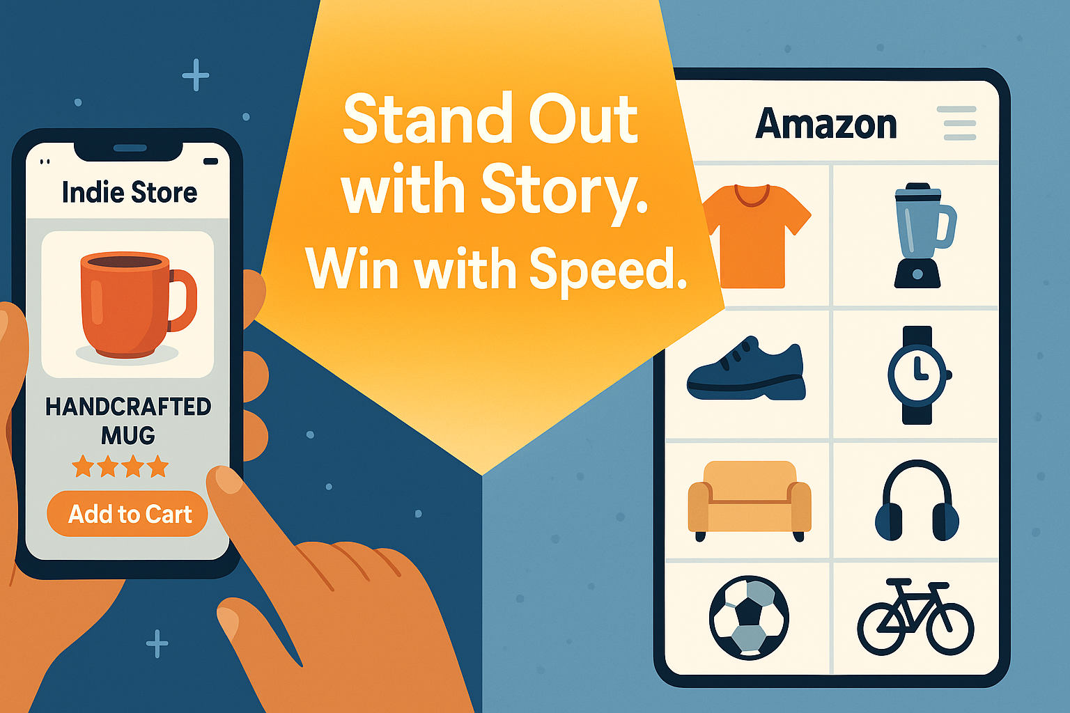
In the age of next-day delivery and mega-platform dominance, small and mid-sized retailers often face the question: How can we compete with Amazon? The answer doesn’t lie in mimicking giants but in leveraging what makes independent retail businesses unique—authenticity, focus, and local character—while using smart web strategies to amplify these strengths.
E-commerce has now become a non-negotiable part of retail. Online sales already make up nearly 20% of total retail transactions globally, and that number is only rising. If you’re a boutique, local store, or specialty brand, a strong web presence is no longer just about having a catalog—it’s about creating a digital storefront experience that reflects your brand, builds trust, and keeps your audience coming back.
At Vadimages, we specialize in building custom web solutions that help smaller businesses punch above their weight. From streamlined e-commerce platforms to loyalty integrations and high-speed hosting, our mission is to empower businesses like yours to thrive online.
Niche Brands and Digital Storytelling: Your Secret Weapon
You don’t need millions of SKUs to win over customers—you need a clear story and a product mix that connects with the right audience. Amazon can offer everything to everyone, but small retailers can offer something special to someone specific. And that’s powerful.
Custom web design allows you to emphasize what makes you different. Whether it’s eco-conscious materials, handcrafted quality, cultural heritage, or direct sourcing, your website should tell that story visually and narratively. Our team at Vadimages works with retail brands to create immersive product pages, behind-the-scenes stories, and video integrations that make customers feel like they’re buying from a trusted shop—not a faceless warehouse.
For example, a handcrafted jewelry retailer we partnered with grew their average cart size by 37% after we integrated lifestyle imagery, personal founder notes, and social proof widgets into their product pages. This kind of storytelling is impossible on mass-market marketplaces, but incredibly powerful on your own site.
Local Strength Meets Online Reach
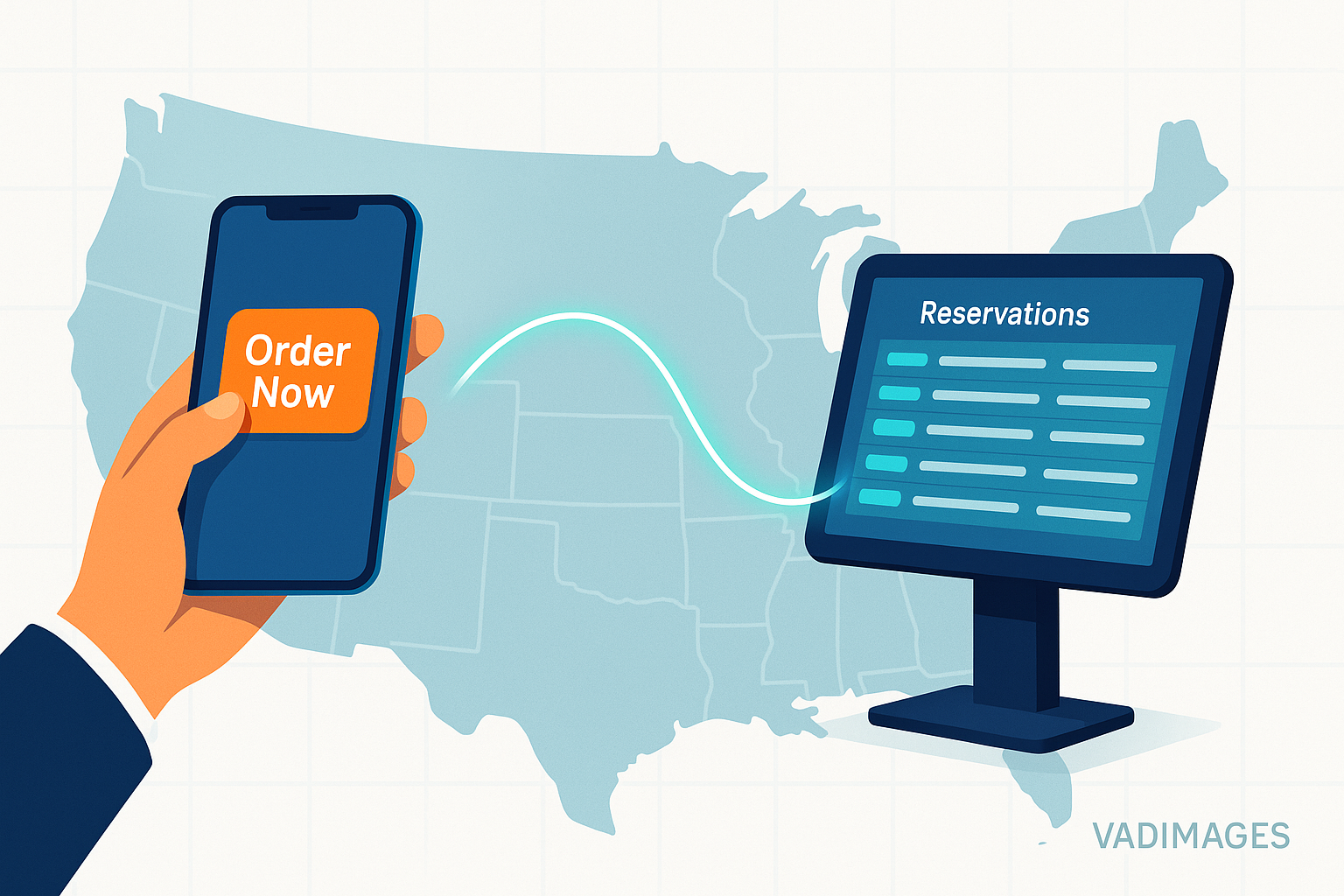
One of the biggest competitive advantages smaller businesses have is proximity. You might not be able to ship nationwide overnight, but you can offer same-day pickup, local delivery, pop-up events, and even in-store consultations. This is where omnichannel integration comes in.
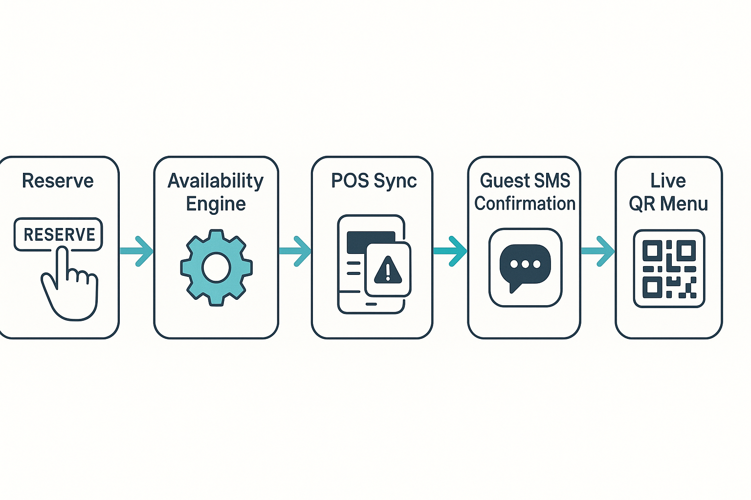
Vadimages builds systems that connect your website with your physical store inventory, booking tools, and CRM software to give customers a seamless cross-channel experience. Someone might browse online, check if a product is in stock nearby, schedule an in-store pickup, and get an SMS confirmation—all thanks to a web solution customized for your workflow.
Our U.S.-based clients who adopted omnichannel features through Vadimages saw a 22–40% increase in repeat visits and significantly reduced cart abandonment. These web strategies allow you to capitalize on your real-world presence and merge it with your digital storefront.
And let’s not forget SEO—your website should dominate local search for your niche. Vadimages specializes in location-based optimization, schema markup, and mobile-first design that puts your site at the top when nearby shoppers search for what you sell.
Loyalty, Speed, and Personalization Win Over Giants
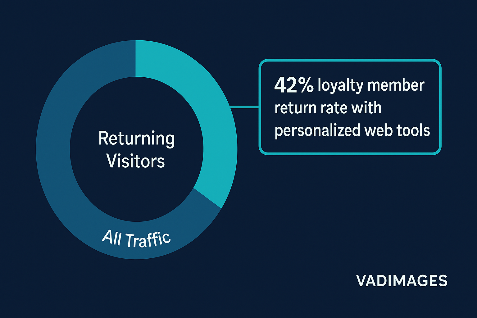
Customer retention is a cornerstone of profitability, and smart websites allow you to turn one-time visitors into lifelong clients. With custom loyalty program integrations, personalized email triggers, and AI-powered product recommendations, your online store can feel just as curated as your brick-and-mortar shop.
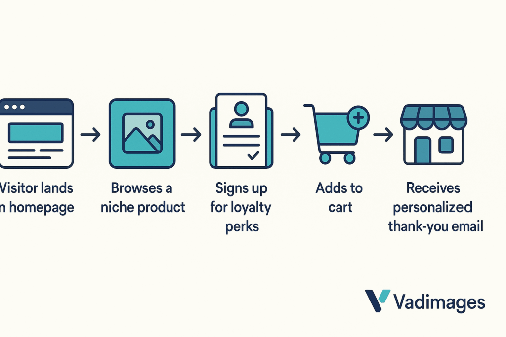
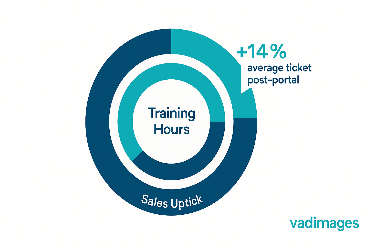
We frequently build loyalty dashboards that show point balances, milestones, and exclusive member offers—encouraging ongoing engagement. One pet supply store we worked with gained over 5,000 program members within four months, largely thanks to personalized referral and rewards tools we developed.
Performance also matters. In today’s market, customers expect fast load times and frictionless checkouts. Vadimages uses advanced caching, server-side rendering (Next.js), and optimized mobile UIs to make sure your store runs smoothly—even during flash sales or holiday rushes.
And let’s not overlook design—an intuitive, attractive layout doesn’t just boost brand perception; it directly affects conversions. We use modern design systems like Tailwind CSS and Framer Motion to create web interfaces that feel alive and welcoming.
Your Storefront, Reinvented by Vadimages
If you’re ready to take on the big players—not by copying them, but by outshining them where it matters—Vadimages is your strategic web partner. We don’t offer cookie-cutter templates. We deliver high-performing, fully custom web solutions tailored for your business model and target audience.
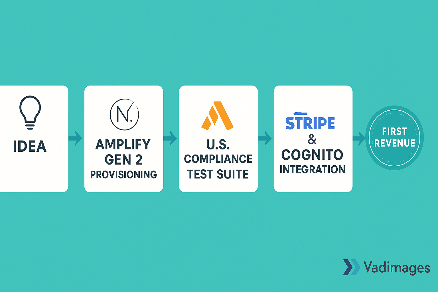
From Shopify headless integrations to Laravel-powered backends and PostgreSQL infrastructure, our stack is engineered for scalability, security, and speed. Every project we launch is optimized for U.S. search trends and built to convert.
Your customers are online. Your story deserves to meet them there.
Let Vadimages help you transform your small retail business into a web-savvy brand that customers love—and remember.
👉 Book Your Discovery Call Now and let’s craft your competitive edge.